


Case Study:BETA
Technologies
BETA is one of several advanced air mobility (AAM) manufacturers vying to operate and sell electric vertical take-off and lift (evToL) aircraft. The industry is still working through FAA certification, but there’s one component of BETA’s vertically-integrated business model that is actively being sold: electric aircraft chargers.
I conducted exhaustive industry research and stakeholder interviews, designed a distinct visual language, and built a conversion-optimized content strategy aligned with sales goals for BETA’s various charging products.


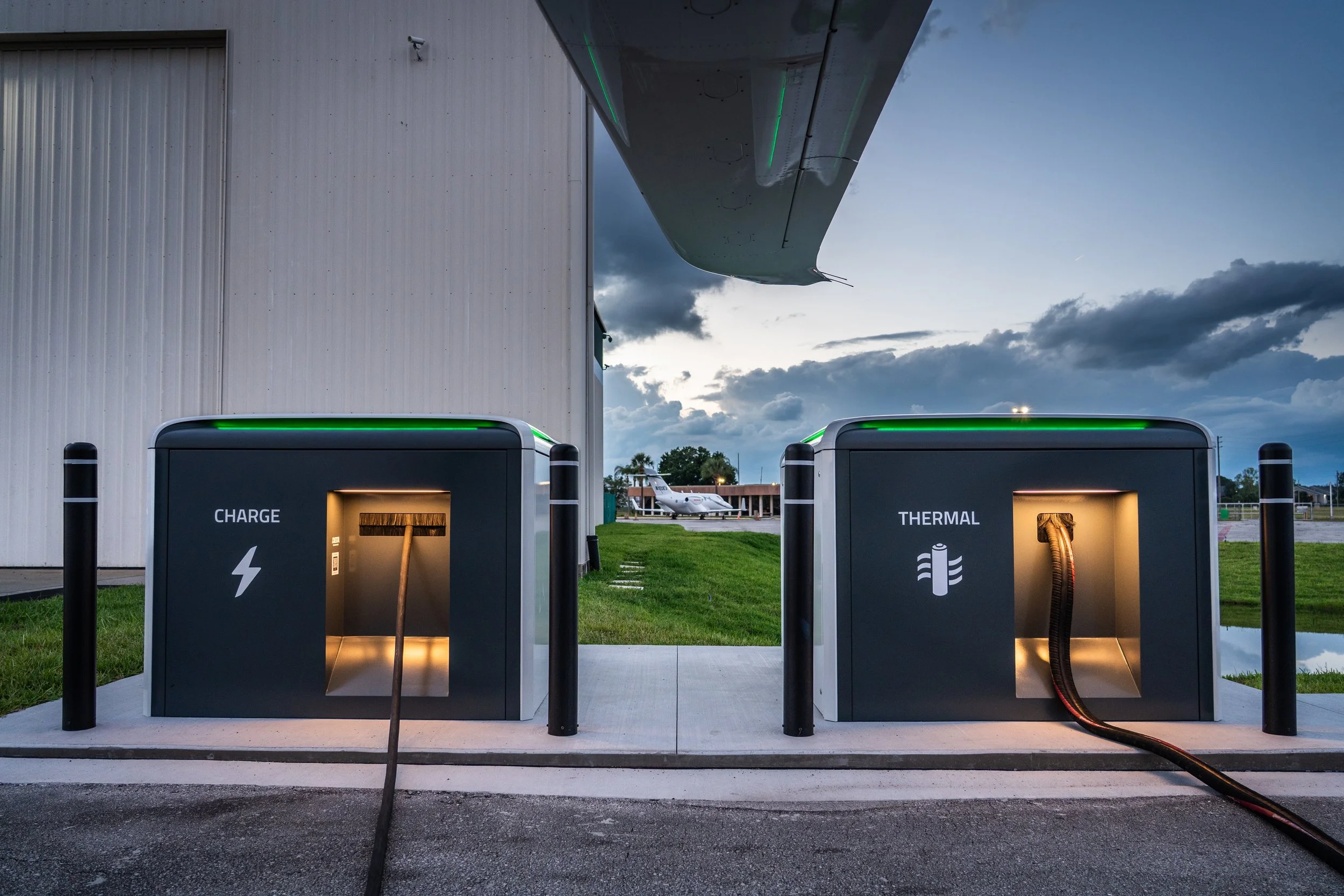
All images on this page are property of BETA.
The Client
To say BETA is unique would be an extreme understatement. In Vermont, they’ve rapidly become one of the biggest employers since coming out of stealth in 2019, building over 250,000 sq. ft. of facilities in the state alone.
In the greater context of aerospace manufacturing, electric-powered vertical lift aircraft are still regarded with cautious optimism, despite sky-high projected valuations. Even within this emerging category, BETA has flown more miles than every competitor combined, taking a proof-of-concept approach to raising funding over the VC route.
The scale of their funding also sets them apart from most companies in any industry. Through partnerships, provisional purchase agreements, and going public on NASDAQ in late 2025, BETA has raised over a billion dollars. This veritable war chest that has allowed them to grow aggressively without relying on customer-generated revenue.
Which is important, because due to the slow, bureaucratic process of certifying new aircraft with the FAA, they haven’t been allowed to generate revenue from customers. That is, until building and selling electric aircraft chargers, which are significantly less regulated, and simultaneously crucial to the viability of their core product.
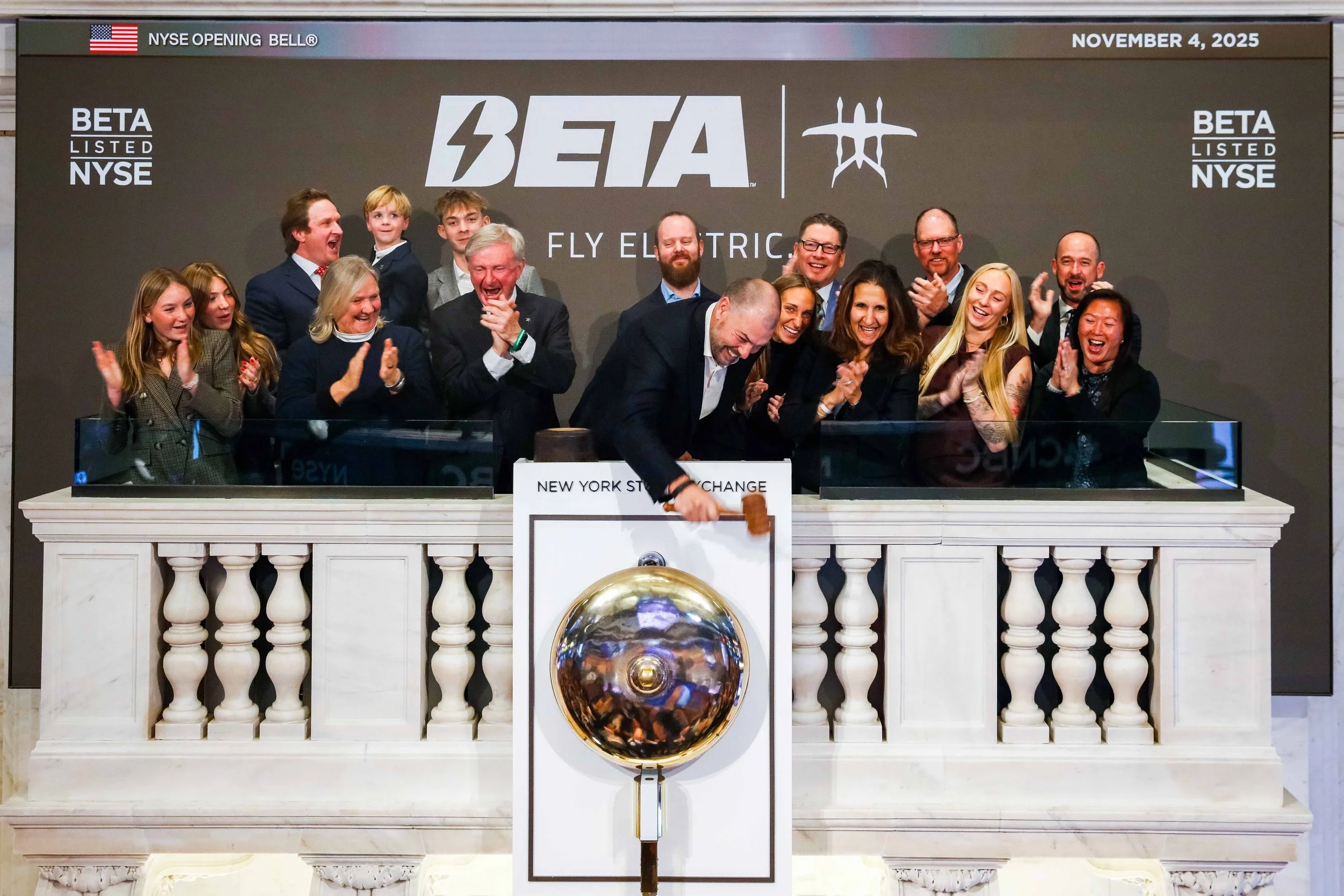
BETA turned to me to build a go-to-market strategy and design a visual treatment for selling aircraft chargers.
My experience using marketing and design to support long, high-value sales cycles was perfectly suited to navigate the complex landscape of stakeholders who purchase, approve and install electric aircraft charging infrastructure.
The Products
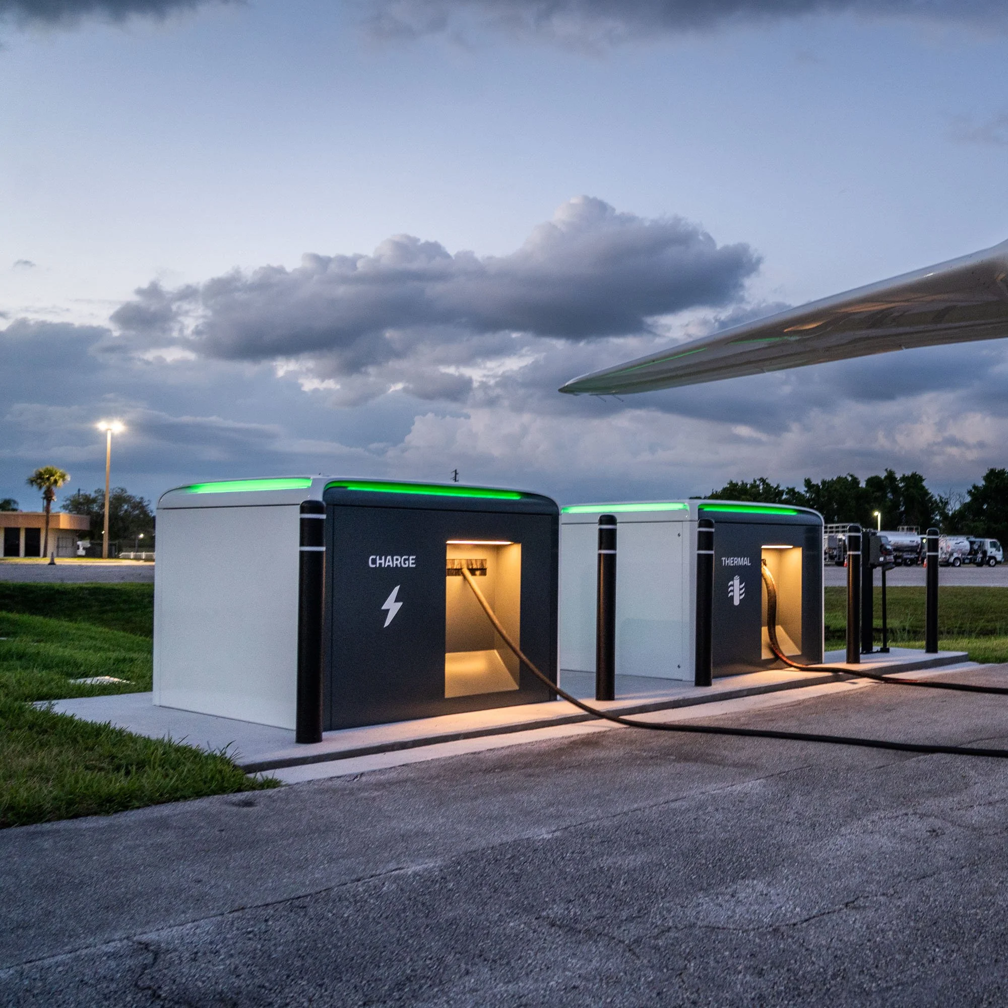
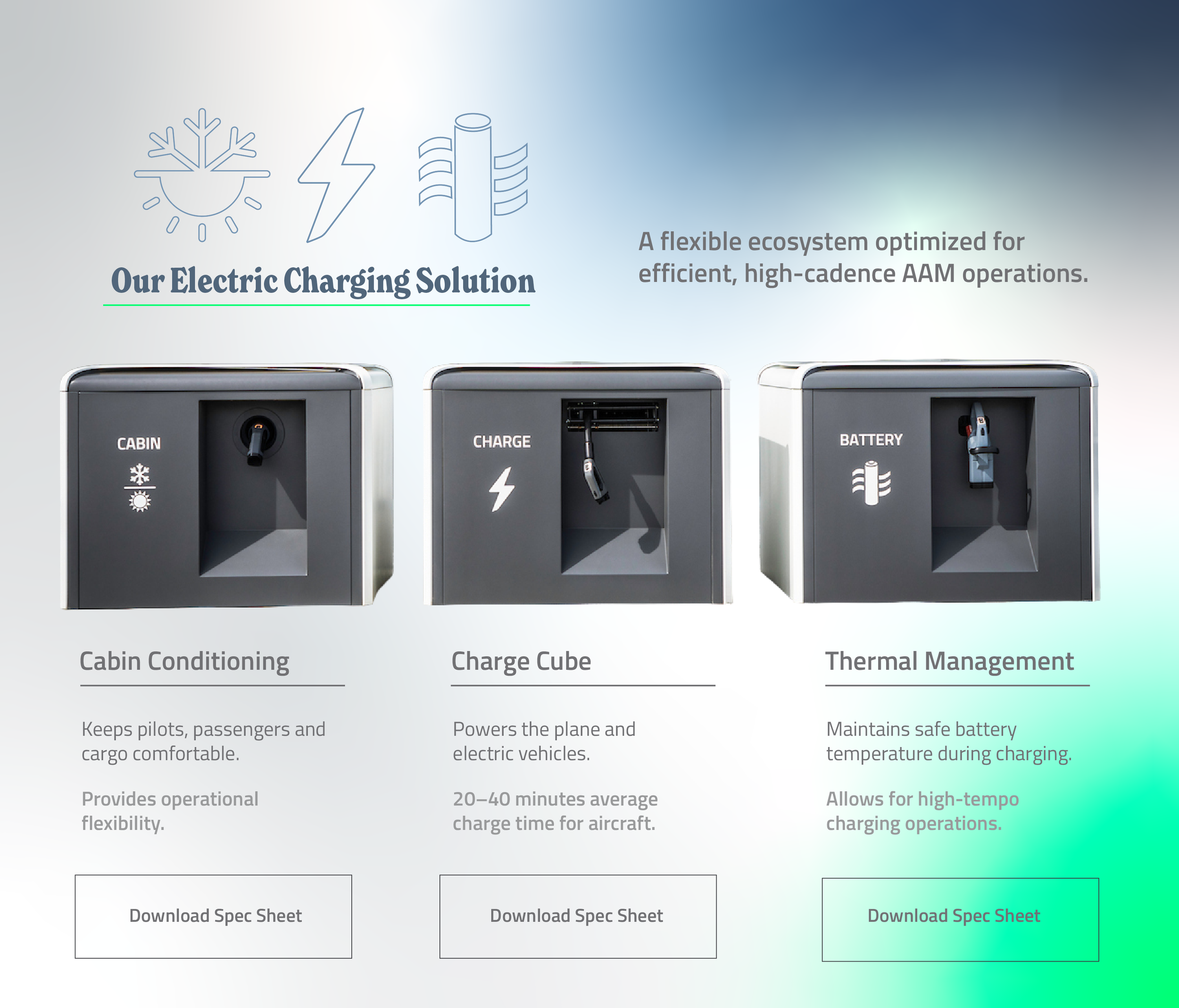
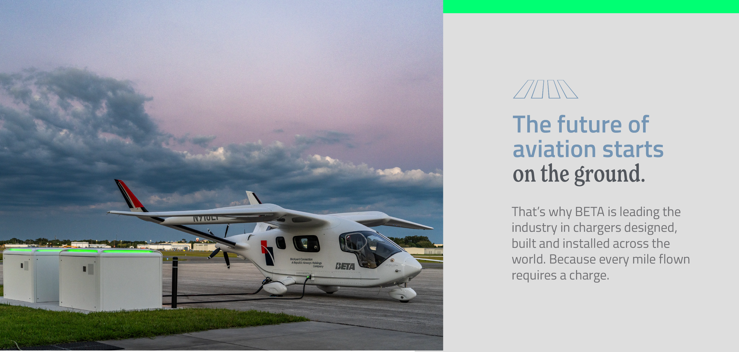
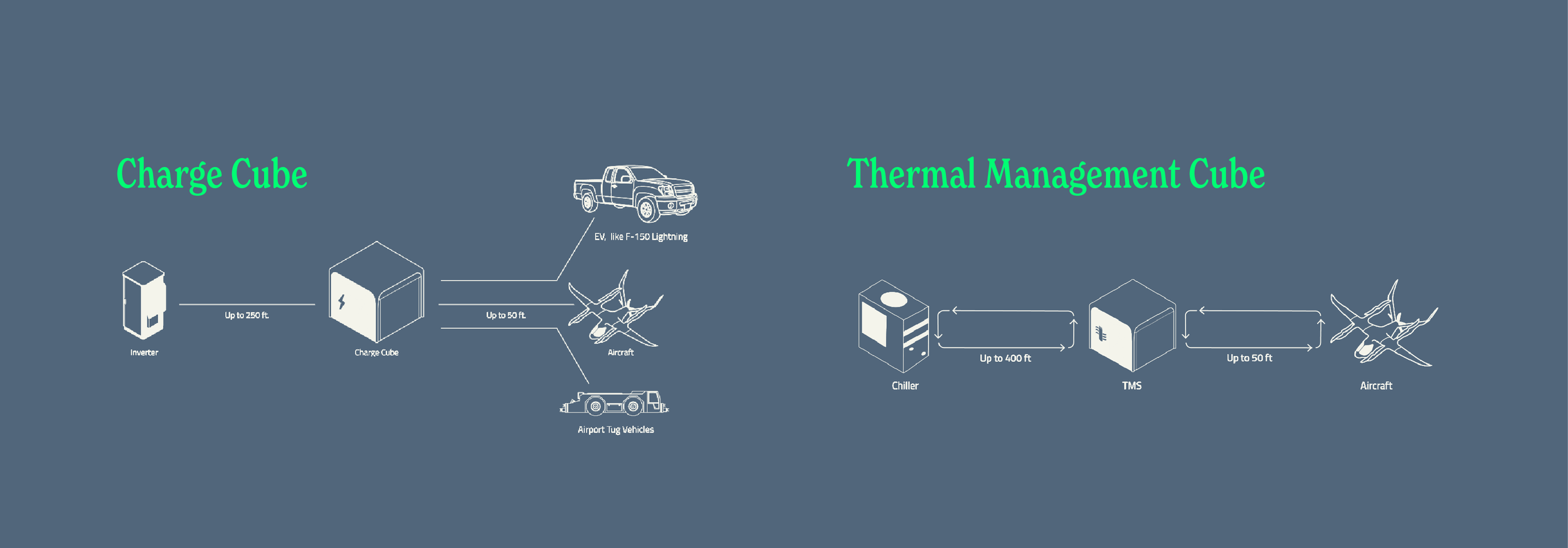
One fixed charger installed at airports (with an optional add-on for faster charging), and one portable charger that can fit in a plane or move around a hangar. Both options also power electric cars and other electric aircraft.
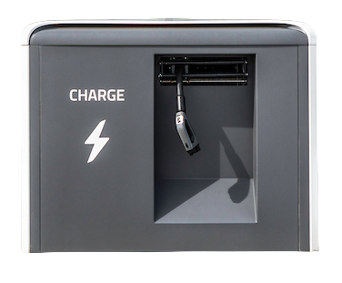
Charge Cube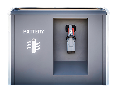
Thermal Management System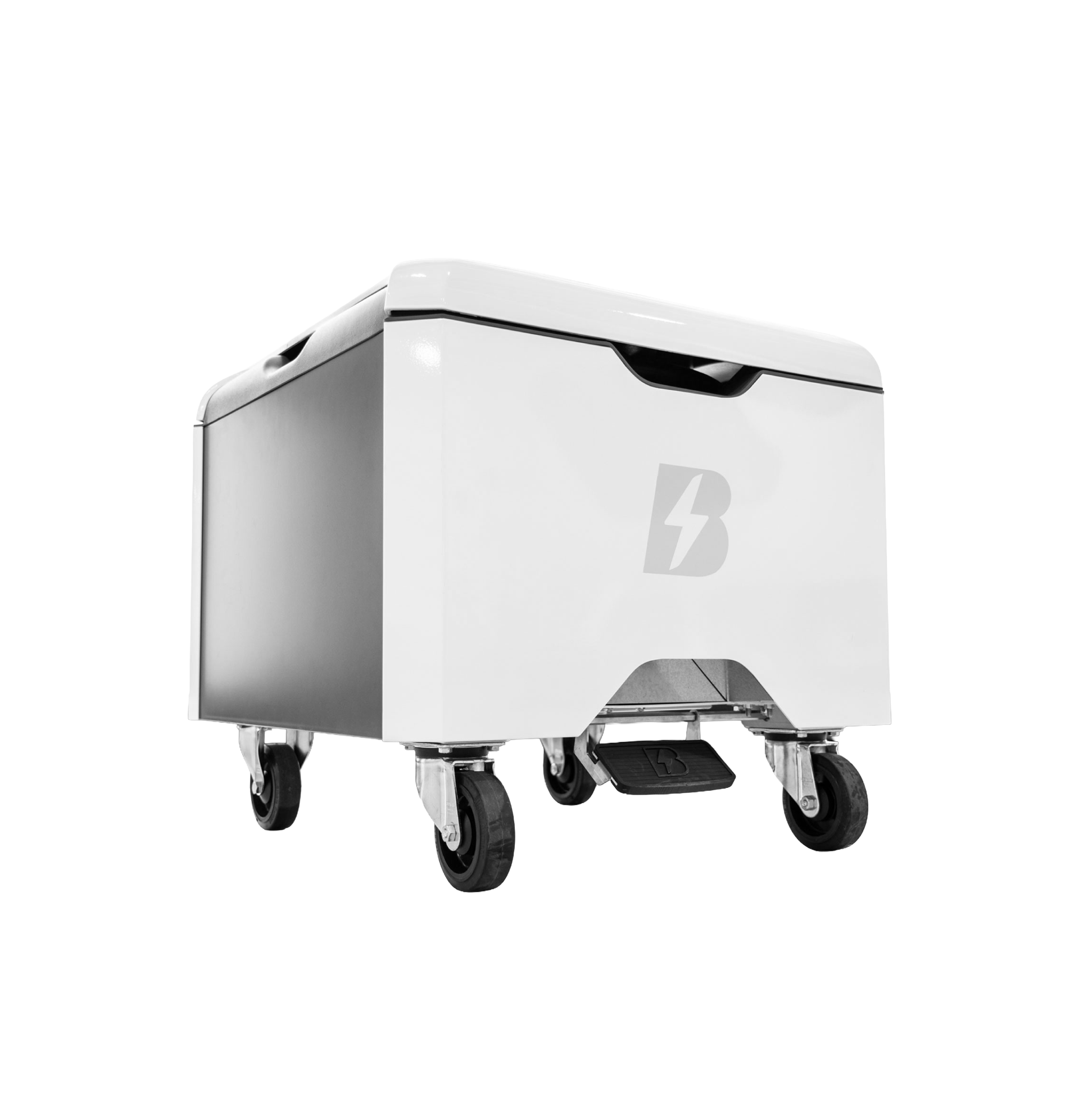
Mini-Cube
The Challenges
Electric planes need charging to fly. But the significance of BETA’s charging products goes far beyond that: It’s the first chance to sell a new type of transportation to a wider audience, including customers who may not ever purchase or even fly in one of their planes.
Build a Network
BETA is in a race to deploy aircraft chargers across the country before someone else does.
Capture Revenue
BETA is self-funding charger installations to ensure long-term success, but they need other sites to follow suit.
Align Marketing & Sales
Creative teams at BETA were not familiar with using messaging and content to move buyers closer to a purchase.
An Unconventional Funnel
As a pre-revenue company with abundant resources and considerable valuation, BETA’s lead funnel was heavily focused on awareness-stage marketing activities.
So far, it’s been enough to just get the word out. Which makes sense; some people still don’t know this technology even exists, much less at this level of fidelity. The potential cost-saving benefits of electric aviation mean that companies like UPS and Amazon are inherently interested, and only need a flight demonstration to sign a purchase agreement. Partnerships of that magnitude lead to commitment from both retail and fund investors.
These are the “conversions” that BETA’s creative and marketing teams have existed to support. They are hard-earned through the pedigree of their disruptive product and engineering acumen, but they are not the kind of income-generating moments most companies can strive for.
That changes with aircraft charging infrastructure, also referred to as Ground Support Equipment (GSE). While electric GSE boasts better profit margins than planes and is necessary for electric aircraft to become viable, the value proposition is not as clear for customers. Companies like UPS want to fly their planes in and out of airports carrying cargo, not invest in what are essentially innovative fuel dispensers.
There are businesses that exist to profit off of powering aircraft, called Fixed Base Operators (FBOs). They are essentially gas stations for planes that aren’t commercial passenger flights. FBOs are often located adjacent to airports, but they are not inherently interested in electric GSE either, because the margins on electricity don’t compare to jet fuel.
BETA needs airports, FBOs, and other sites like hospitals to see electric aviation as a path to future revenue they wouldn’t capture through existing means. That message resonates more clearly with patient money that has a long-term interest in business aviation. But selling aircraft chargers means appealing to customers who care about near-term ROI and have alternatives, like other aircraft chargers, or electric vehicle chargers that could upscale to offer aircraft charging.
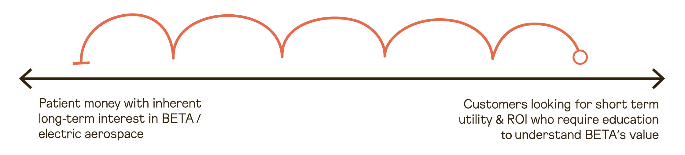
Selling GSE moves BETA from the left to the right on this spectrum.
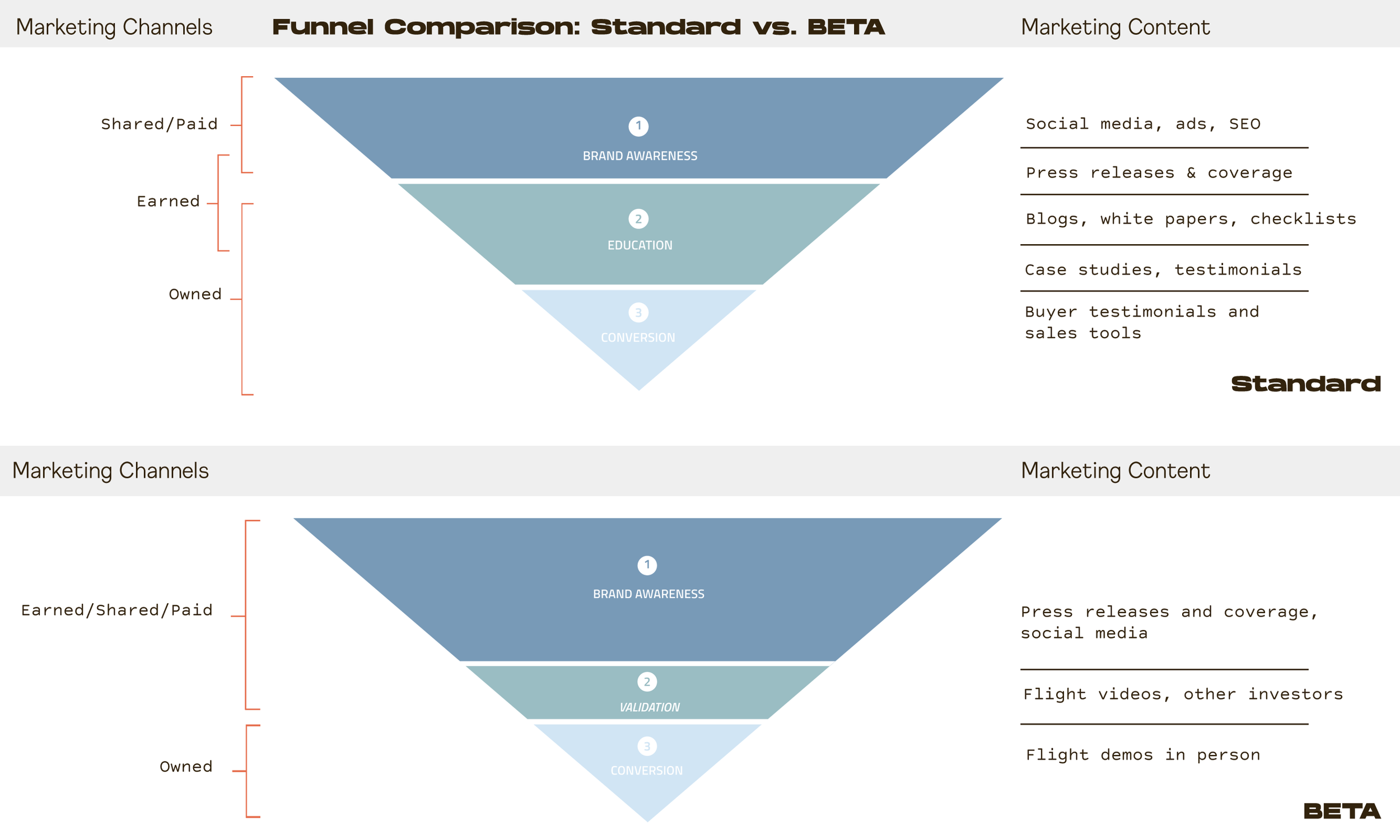
Prior to this campaign, BETA had no need or process for the kind of marketing content that is typically used to convert complex buyers like those at airports or state govt.
BETA’s products, competitors, and customers/partnerships mapped against their ROI expectations underscores the inflection point caused by selling chargers.
With this backdrop, my role was to:
document the product landscape that technical GSE team members navigate
equip the brand with new visual language to speak to a broader audience
demonstrate how content can be used to convert targeted buyers into sales leads


The Method:
Initial research prior to observing the on-boarding process for new hires.
Multiple interviews with the teams growing BETA’s charge network: Sales, Network Deployment, and Government Affairs.
Presentations to company leadership, including the CEO, to share interview findings and validate campaign goals, audience segments, and channels.
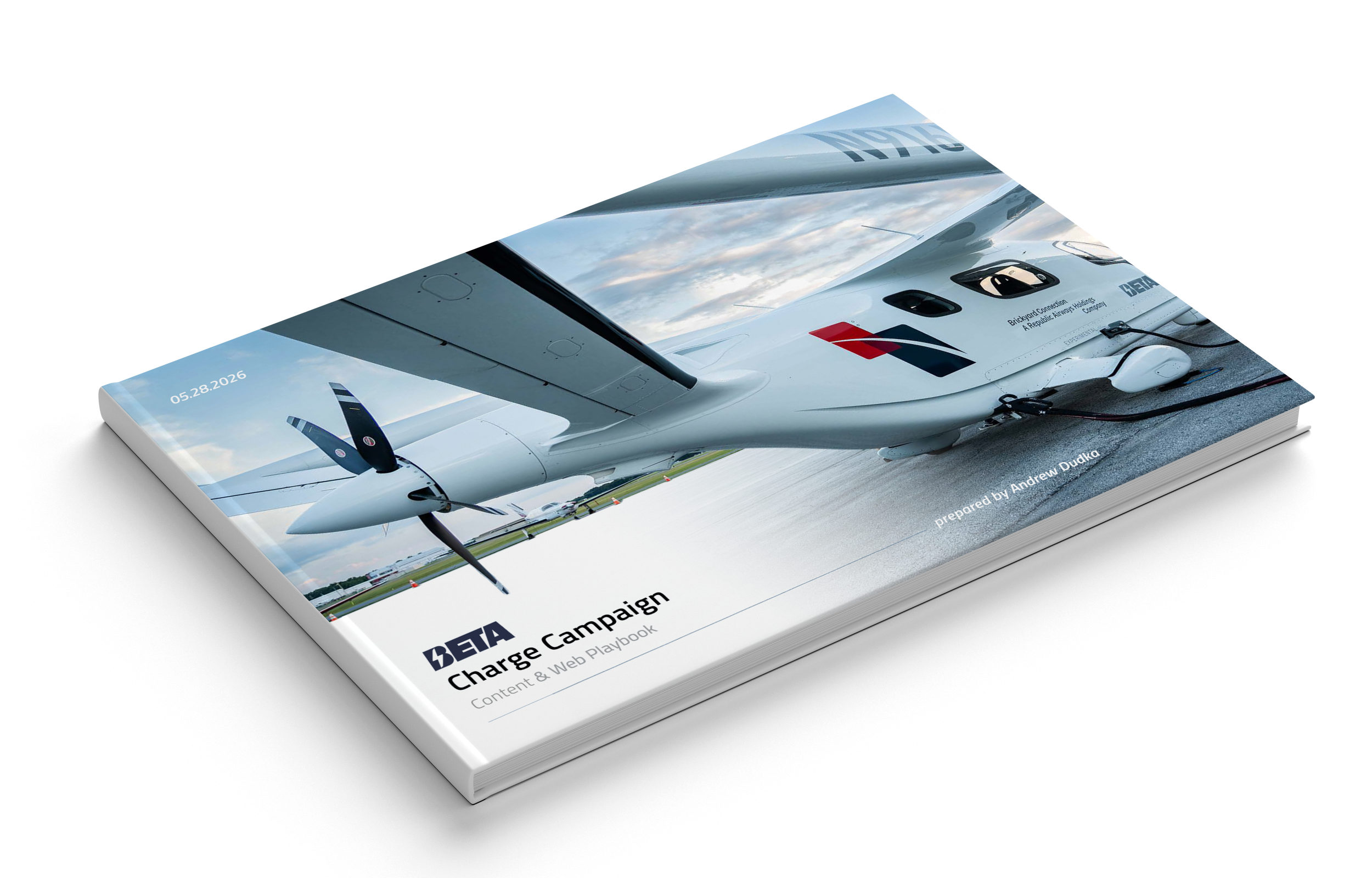
Comprehensive campaign report based on exhaustive industry and buyer research. This report included:
messaging and tone guidance
buyer personas with real examples
existing content audit
stakeholder chart
content proposals for every persona, channel, & funnel stage
over 60 sources to cite or reference in content creation
campaign KPIs
Three different visual treatment explorations + revisions as part of successfully expanding the brand’s visual language.
Art direction, design, copywriting and content outlines for Creative teams across every channel and funnel stage.
Target Audiences
Due to the disruptive nature of electric aircraft charging products, all of these various audiences need to be educated about BETA and the advanced air mobility industry to some extent. However, it was determined that State DOT, and more specifically, the Aviation Departments and Directors within them, are the most important audience segment to convert into leads for this marketing campaign.
Airports, regional airlines, and Fixed Base Operators (FBOs)
State Dept. of Transportation
Aviation Directors
Original Equipment Manufacturers (OEMs)
FAA Airport
District and Regional Offices
The Visual Treatment
Baseline & Beyond
BETA’s brand was historically quite restrained, using just two weights of one typeface and four shades of grey for the palette. Recent campaigns introduced four more colors and a handwritten font, but there was appetite to go further. Music to my ears!
I proposed and refined three different visual directions, crafting each option by referencing different aspects of the product or existing brand.
Direction 01: Reference
When proposing new styles for an existing brand, I always include a direction that closely aligns with previous visual language.
During my content audit, I immediately identified several elements from this 2025 graphic that could be used more prominently in the BETA brand.
Leadership confirmed this was a fruitful path to explore, with some caveats:
Stacked imagery must be chosen thoughtfully; for example, the plane flying into the NYC skyline was not to be replicated. The cornstalk was, “too random.”
Vector elements, such as the FAA seal and Charge Network icons need to decide if they are purely stylistic or communicating something.
The navy blue used in this graphic was a more recent addition to the brand, and is being reserved for federal government-related content.
The collage style was popular internally, but there were concerns it could easily become busy and overwhelming.
Direction 01: Visuals
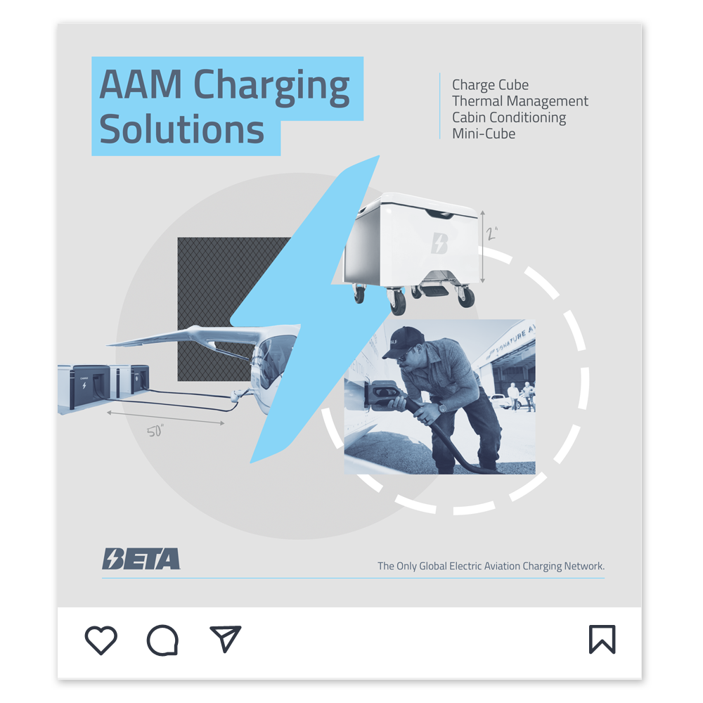
This direction combined pieces of the existing brand with details from the various environments where BETA’s charging products are found.
References were both abstract and technical, from runway asphalt textures to the airport layout plans used to install charging infrastructure.
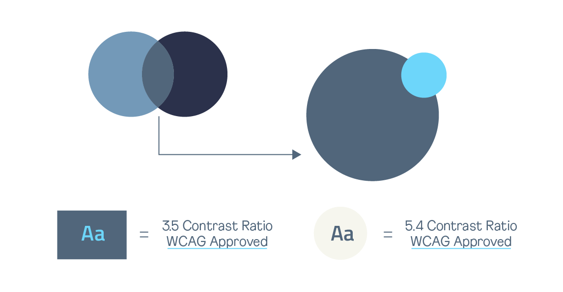
Splitting the difference between these shades of blue from the palette creates a WCAG-compliant, brand-cohesive color that works as both a background and foreground element.
Illustrator-native grain patterns in colors from the campaign palette represent the runway at all times of day.
Airport Layout Plans (ALPs) often use dashed lines and crosshatch patterns to delineate space. Since these diagrams would eventually be used in case studies about charger installations, I proposed using these same elements in an enlarged, decorative manner.
BETA often uses engineer sketches as a brand element. Since this was the first campaign for a finished product, I proposed using technical illustrations of chargers in a similar fashion, documenting them with the brand handwritten font for a personal, blueprint feel.
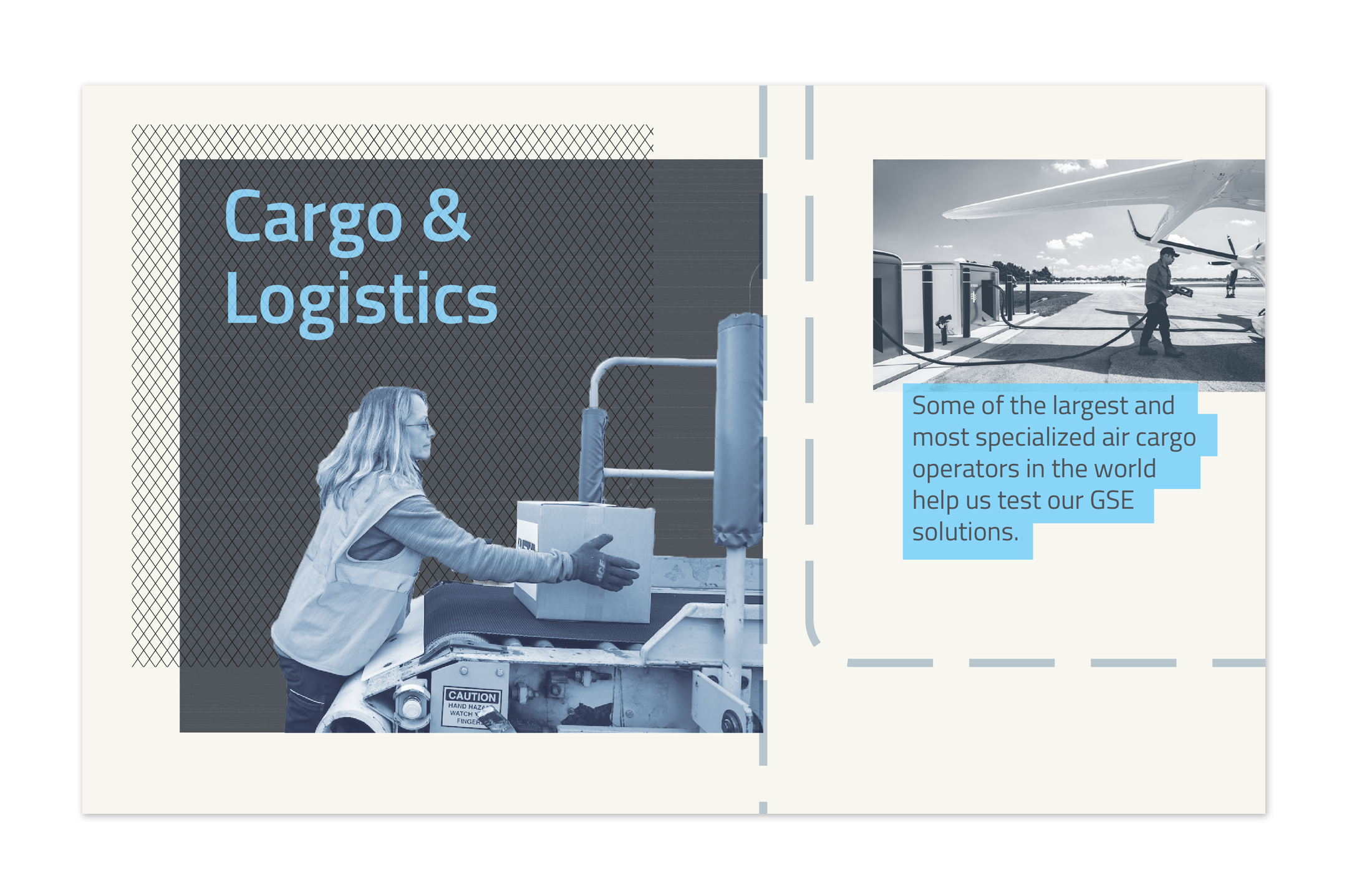
Chargers have a wider audience than planes, but are far less Instagram-worthy. Lowering image saturation and using consistent tones with this collage approach makes it possible to show people and product side-by-side.
Including people prominently in the imagery is eye-catching, underscores that widespread value, and contextualizes the product.
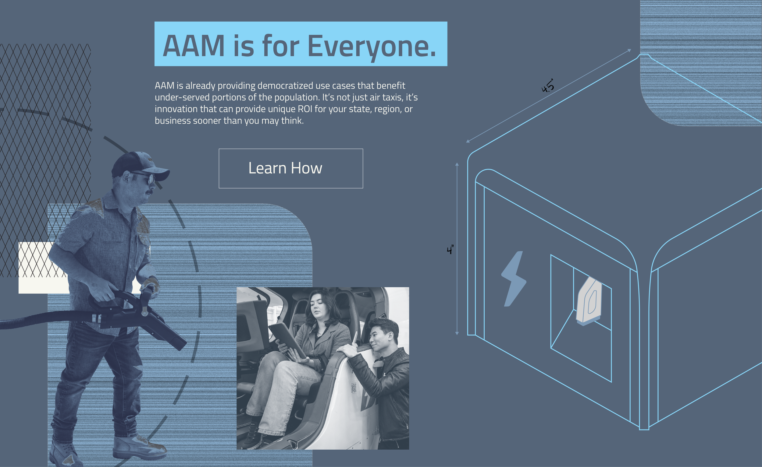
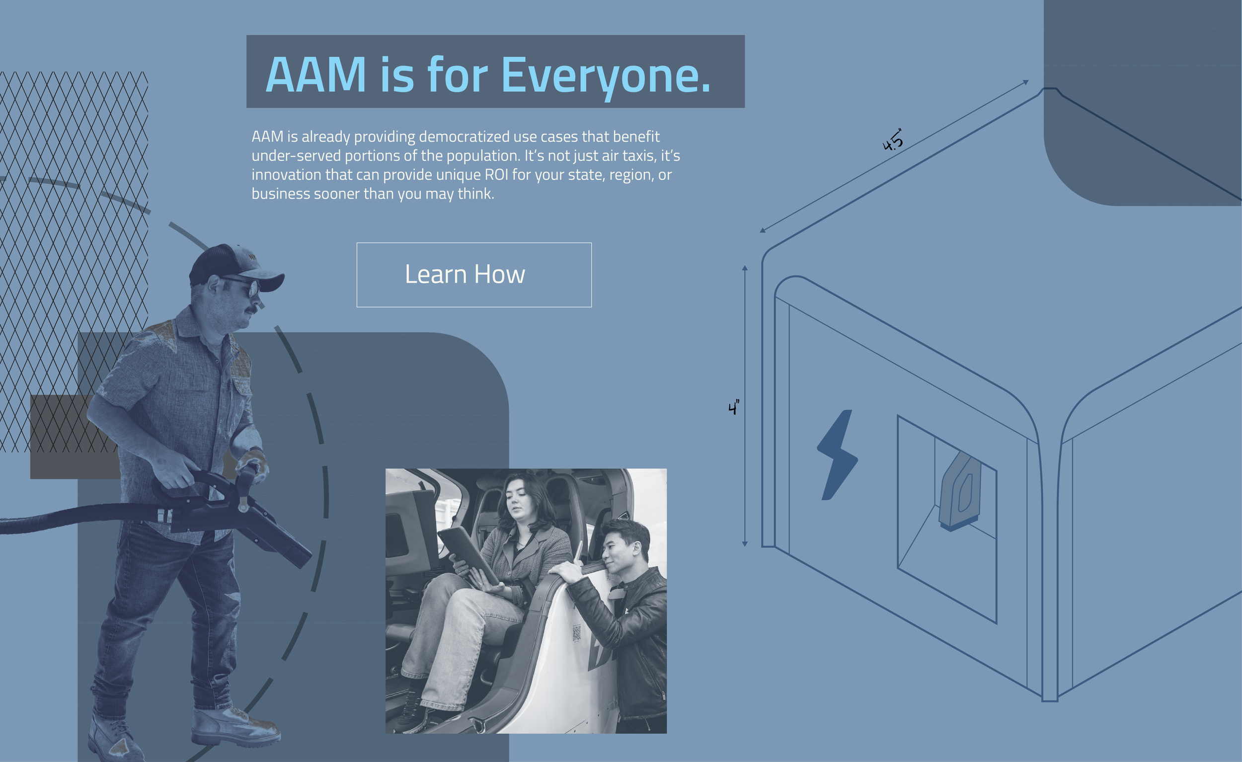
BETA’s design director and head of brand commented that this was a new style that could “still be handed to the design team for a graphic tomorrow.” Box checked, time for something new.

Direction 02:
Reference
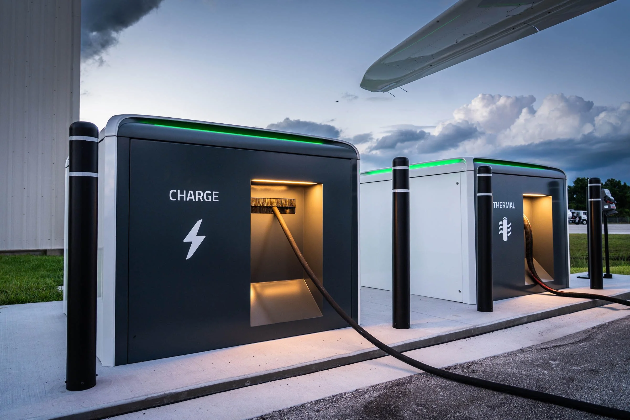
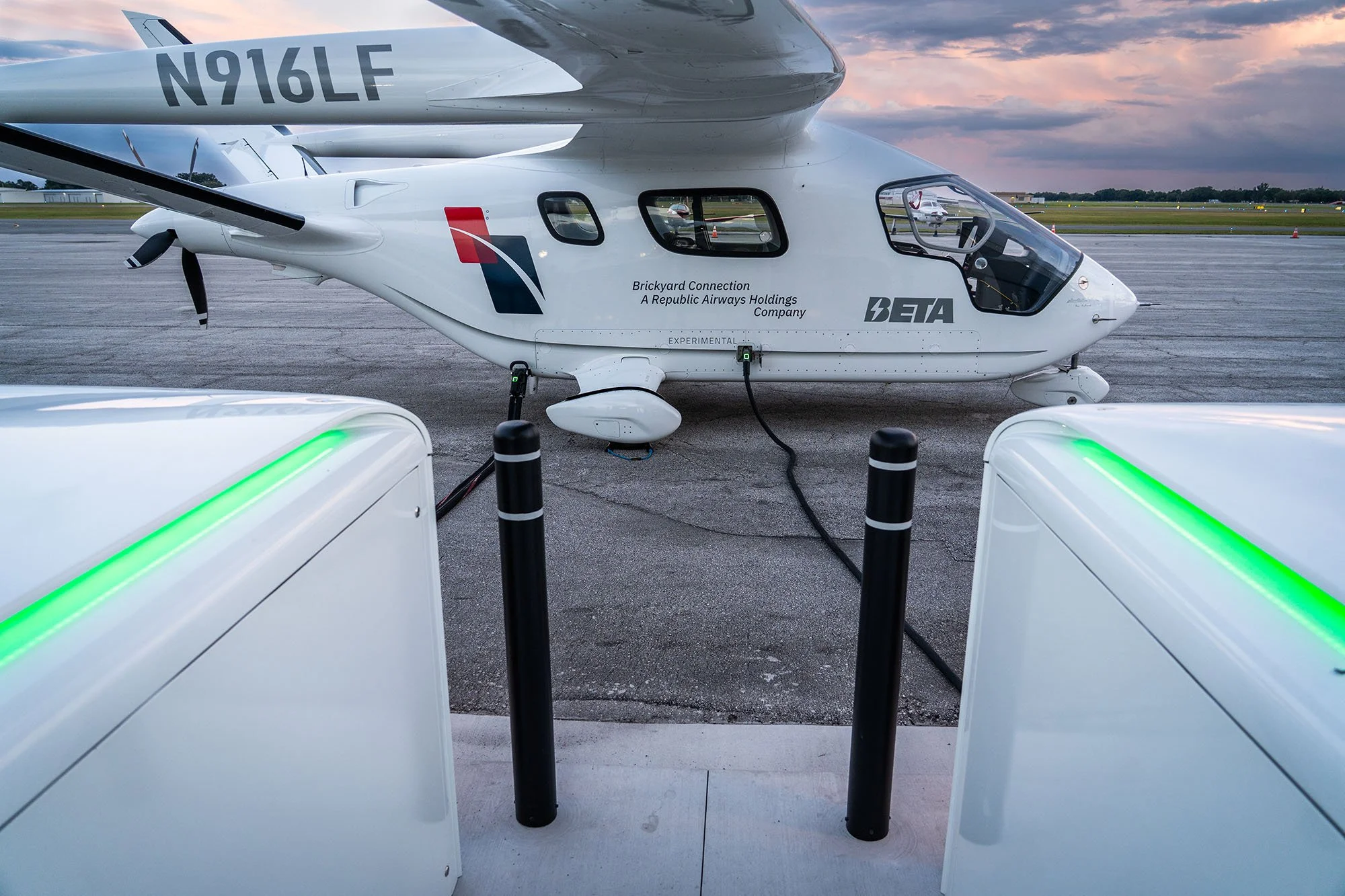
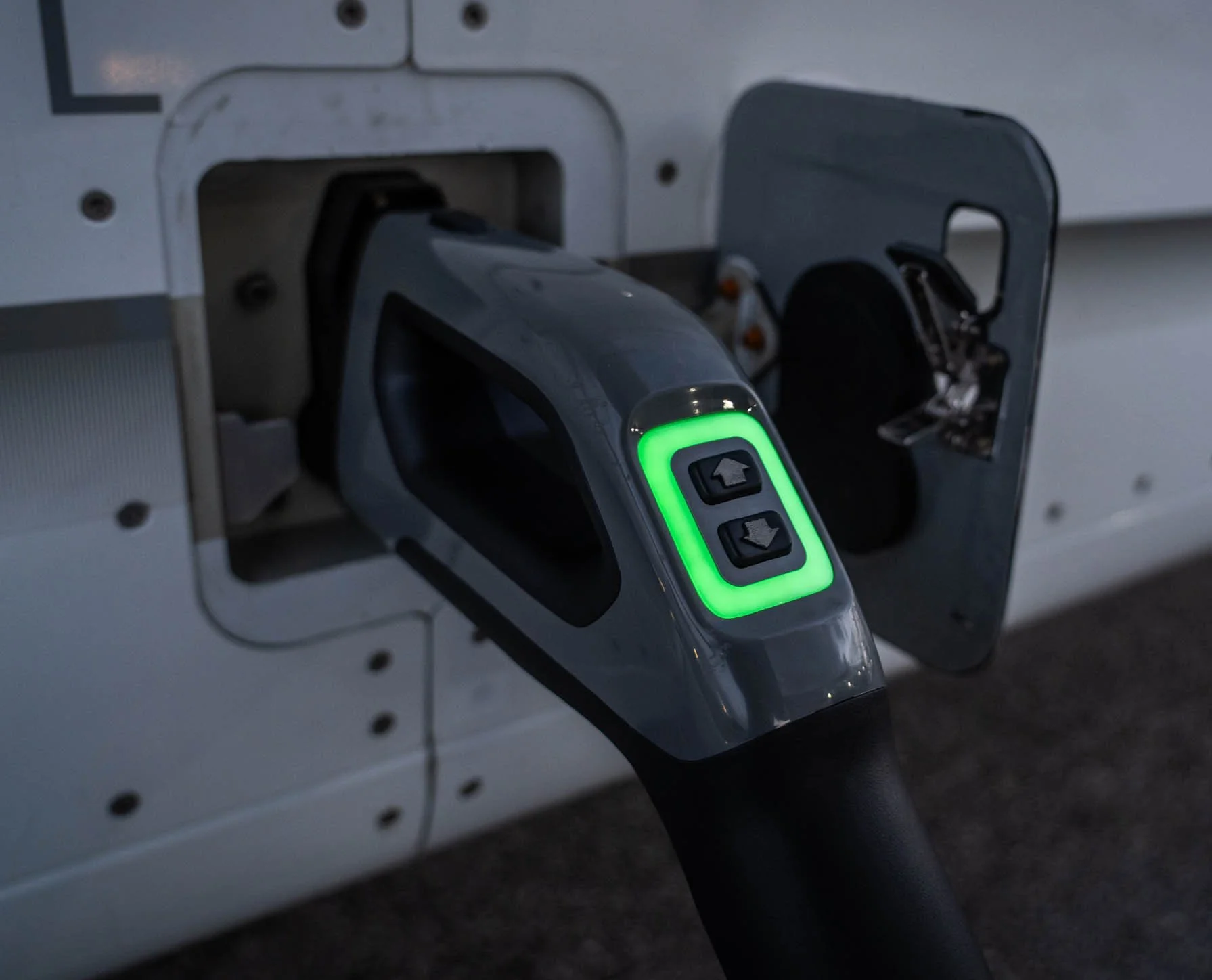
When I learned the chargers pulse with a vibrant green glow, I knew I had to present a visual treatment that incorporated that.
To stretch the brand, I combined this product detail with some recent visual trends:
the reemergence of serifs for technical audiences, led by AI companies like Claude
symbolic icons from aerospace engineering
This 1980s cycling typeface “Hinault” was my reference for finding a new font. It balances approachability with authority.
Lissajous Curves are used in autonomous flight. Icons would be new for BETA, but this geometric thin line style is both flexible and technical.
Micrographics are often a meaningless embellishment, but a manufacturing business like BETA could use them with more purpose.
The blurred lines of mesh gradients complement the ever-changing skies behind both planes and chargers.
Direction 02: Visuals
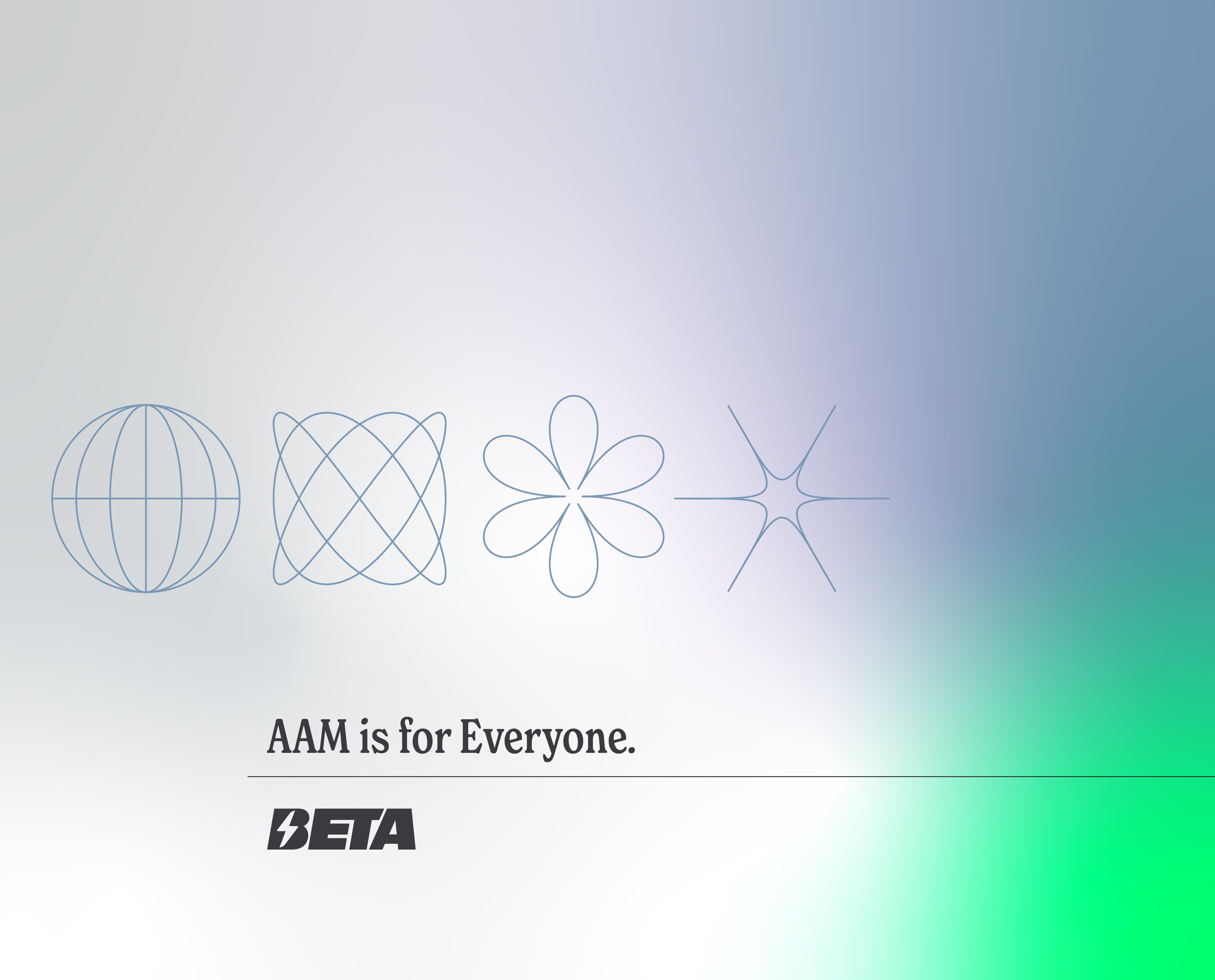
This direction is distinctly modern, but easily sits alongside the existing conservative brand.
Leaning into the vibrant green gives BETA something own-able now with chargers, and into the future with
other products.
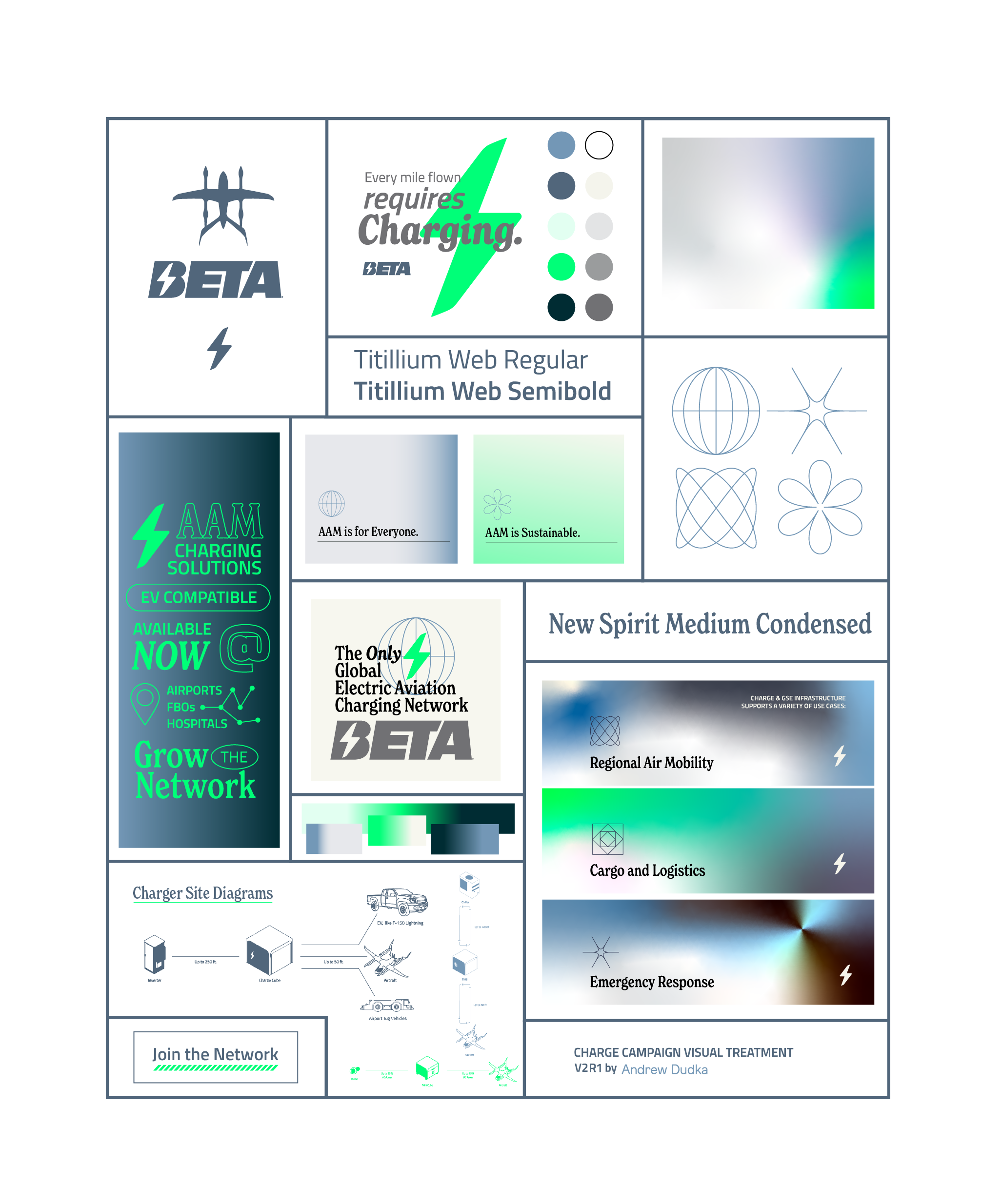
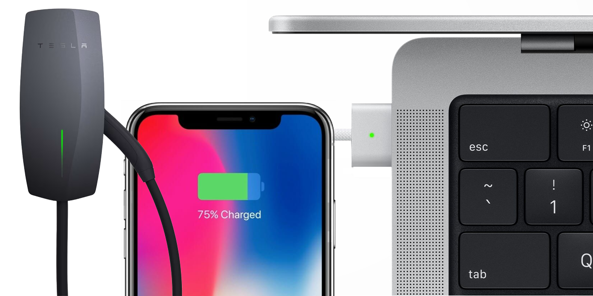
Vibrant green makes sense for the BETA brand for the same reason engineers made the Charge Cube glow green: a widely established connection with charging batteries.
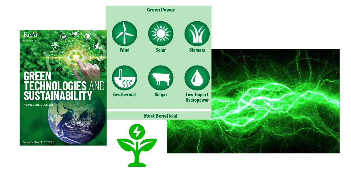
Electric aircraft, and most electric-powered alternatives are considered to be a sustainable technology. Using green visually emphasizes this association.

Notable competitors in the Advanced Air Mobility space have committed to these colors. Green is a distinct choice BETA can own for products and branding.

Vibrant green is also a color prominently used in avionics, the dashboards used to control aircraft. Using a similar color in branding supports BETA’s future products as well as chargers.
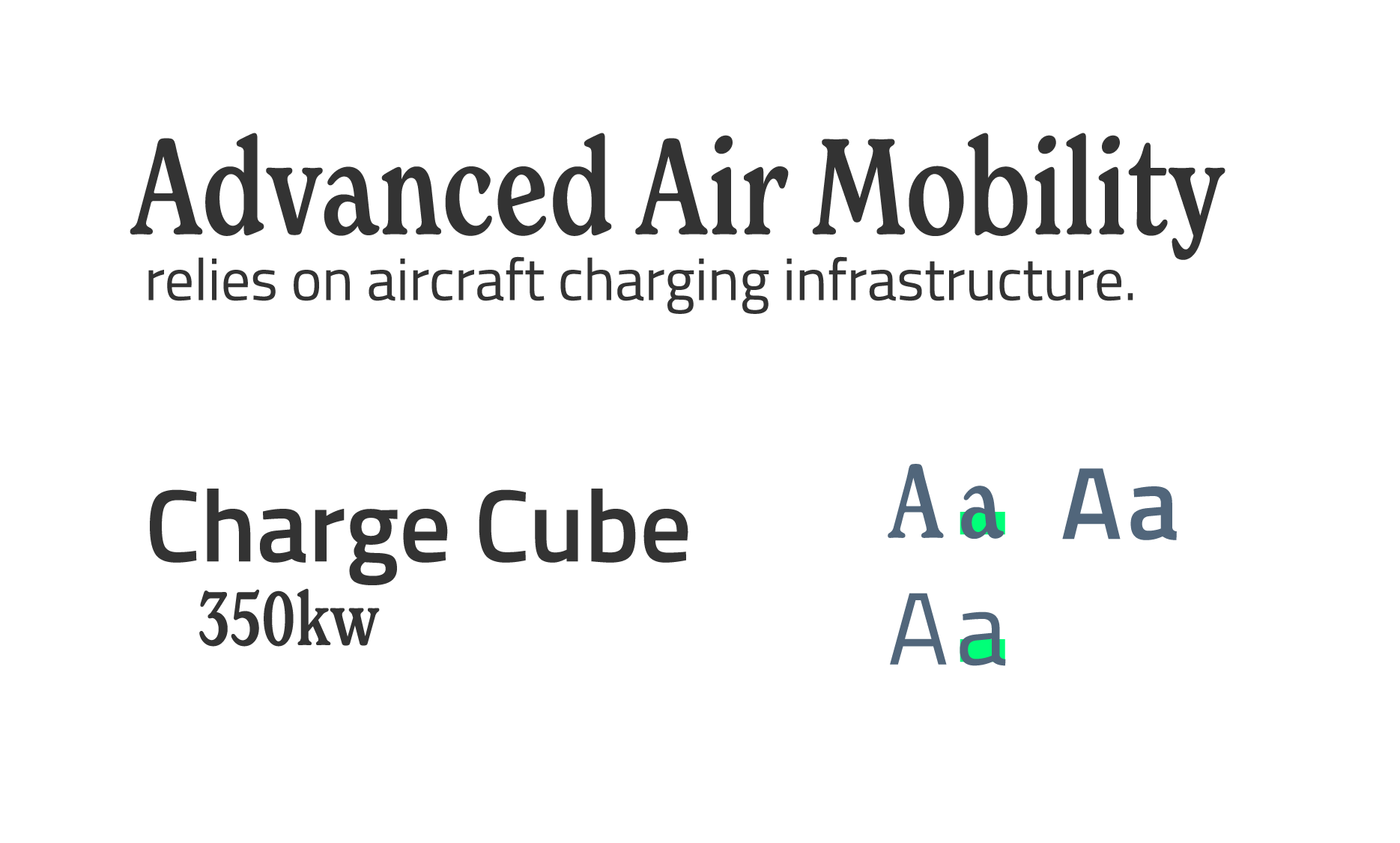
If BETA was going to adopt a second font, it needed to be done thoughtfully.
This condensed serif complements the narrow width of Titillium, and works as a headline and subheadline when paired together.


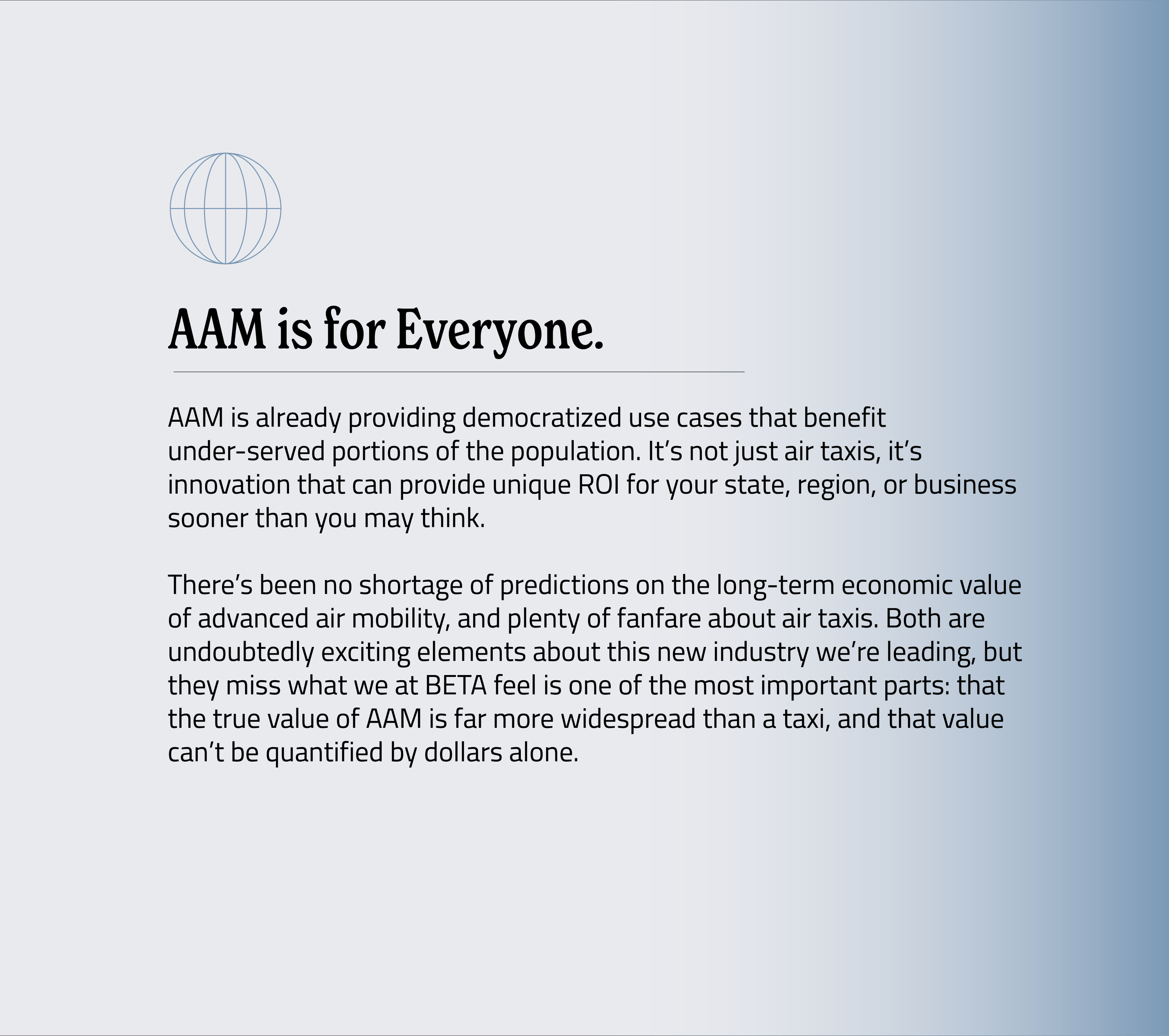
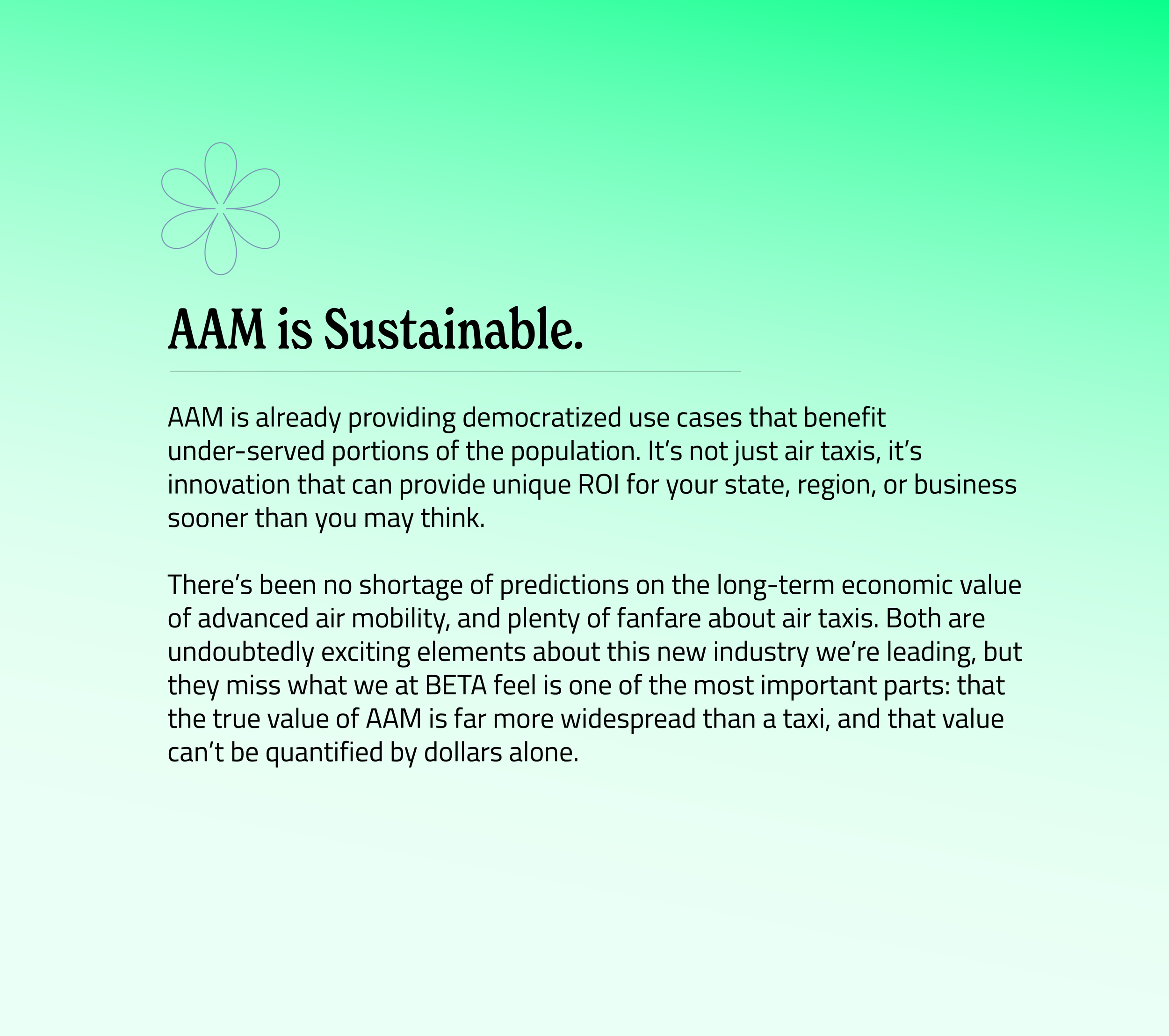
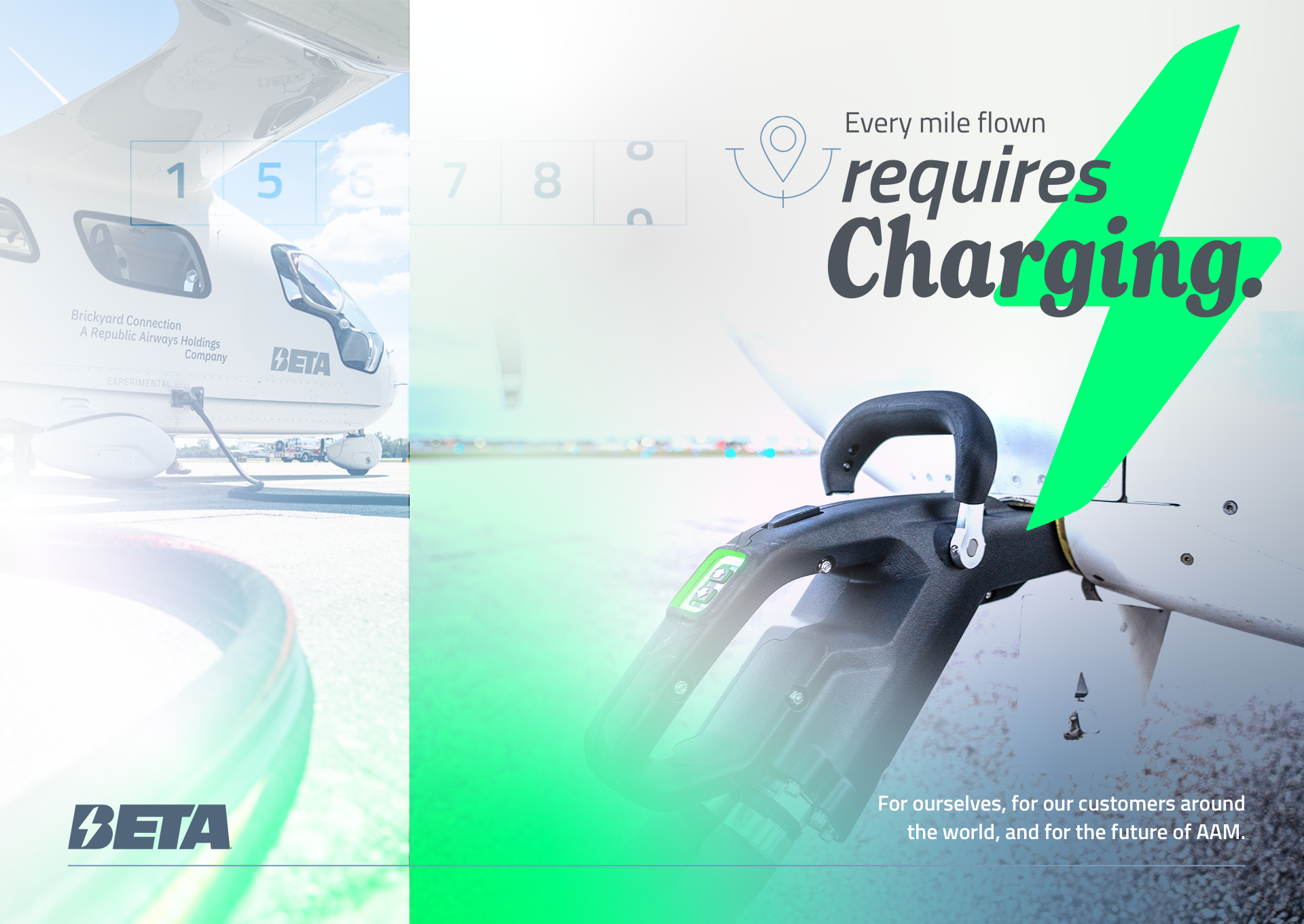
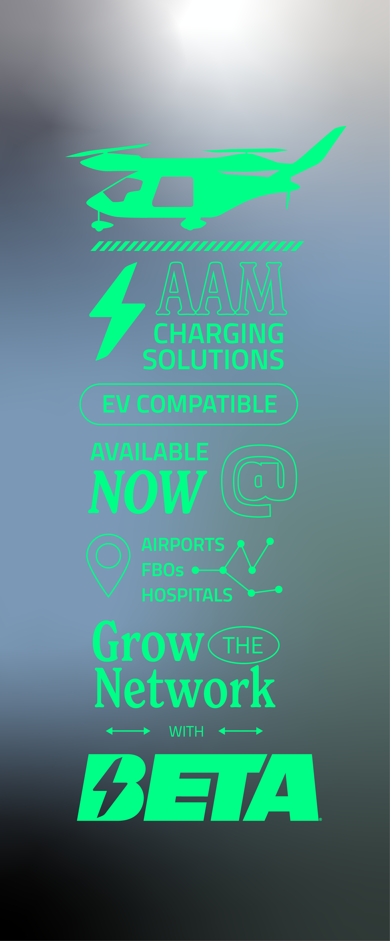
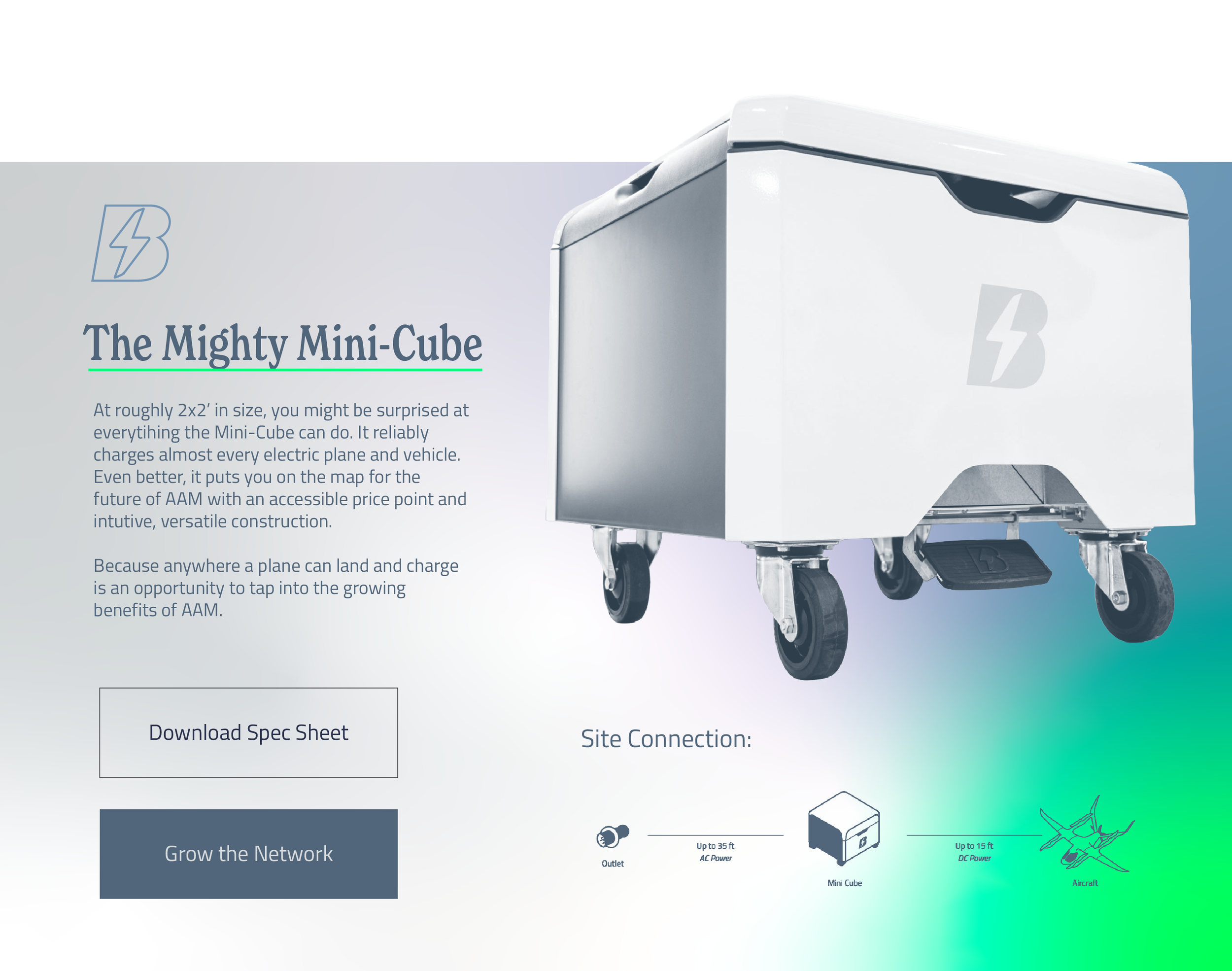

The proposed palette included a shade of light green and a darker grey-green to balance the addition of bright green.


This direction generated a lot of enthusiasm with both leadership and the design team. There was also hesitation based on the degree of new elements.
After a bit of discussion, an executive left the room saying, “well, we are from the Green Mountain State…”
Direction 03:
Reference
Having covered a lot of bases with the first two directions, I sought more abstract and conceptual references to push the brand further.
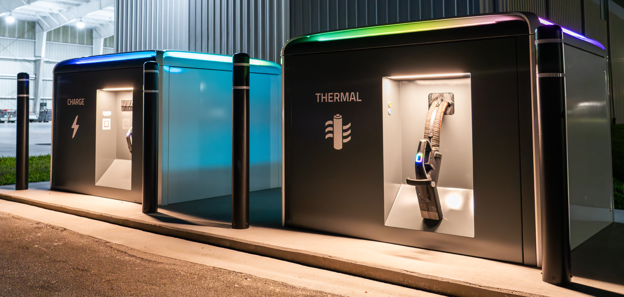
For example: if you press the right buttons on the Charge Cube handle, you can activate “party mode.”
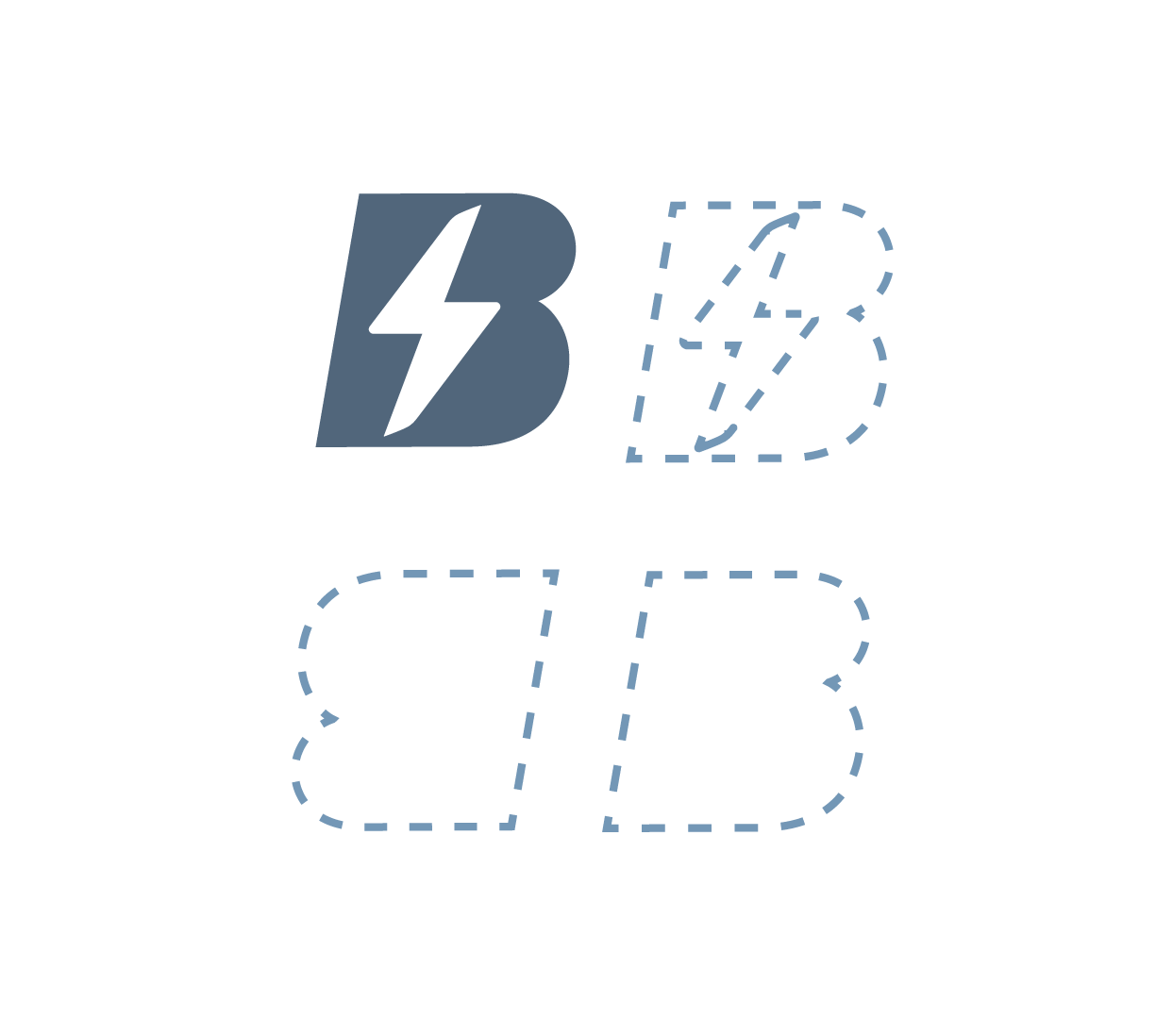
I’ve always enjoyed the shape of the BETA ‘B’. But, Missy Elliott said flip it and reverse it & we oblige.
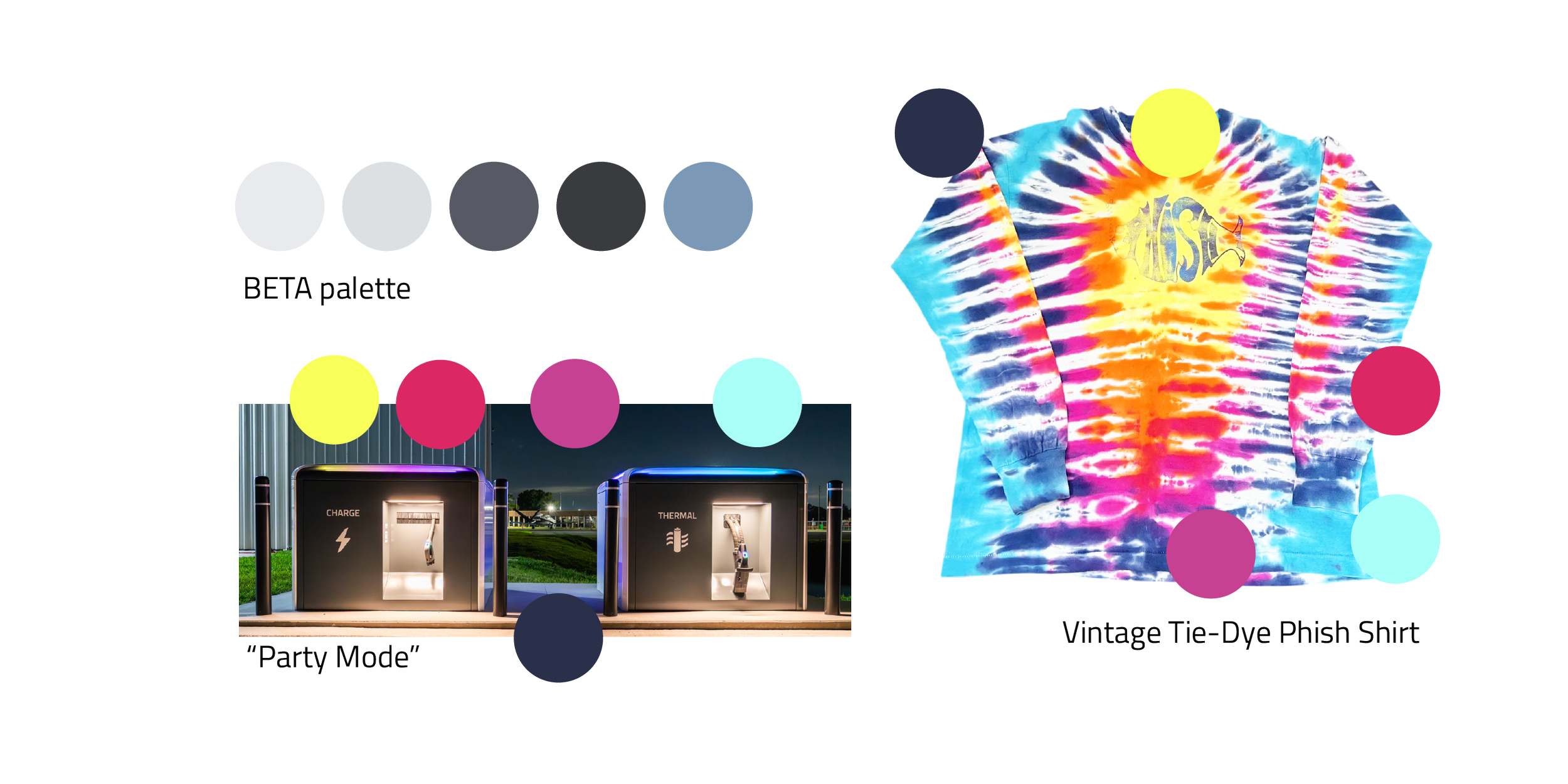
In Vermont, Party Mode means Phish concert.

The dynamic, bold gradients in Jerry Lee Bosmans work inspires thoughts of energy moving quickly.
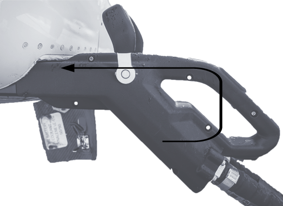
The geometry of the charger handle and the extended length of the cord resemble an arrow.
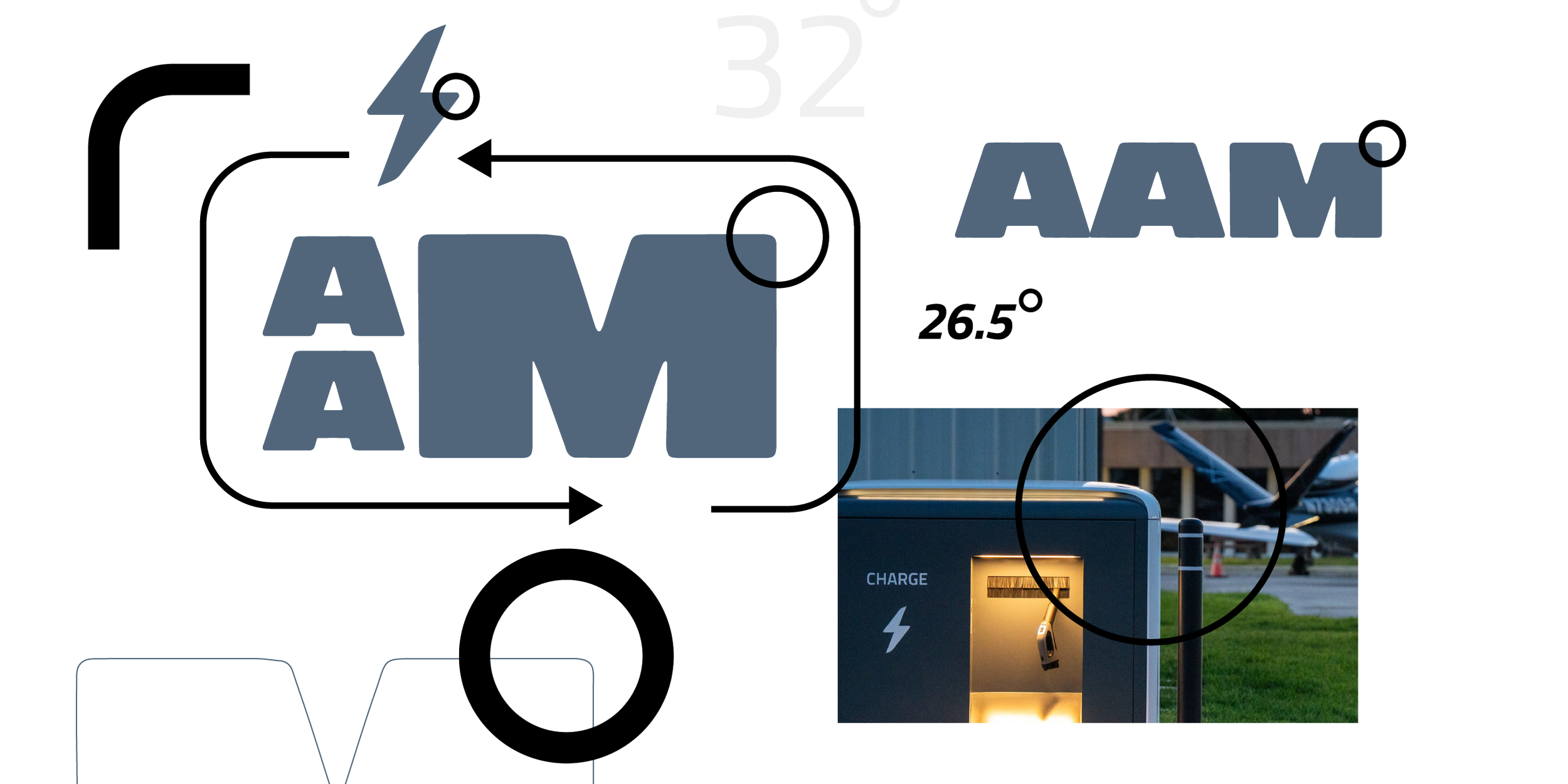
Emphasizing the rounded edges on the Charge Cube with matching corner radius on graphic elements and typefaces with rounded terminals.
Direction 03:
Visuals
This direction was focused on presenting something totally new for BETA. Styles that could make chargers feel like an “arrival” into the customer-facing market.
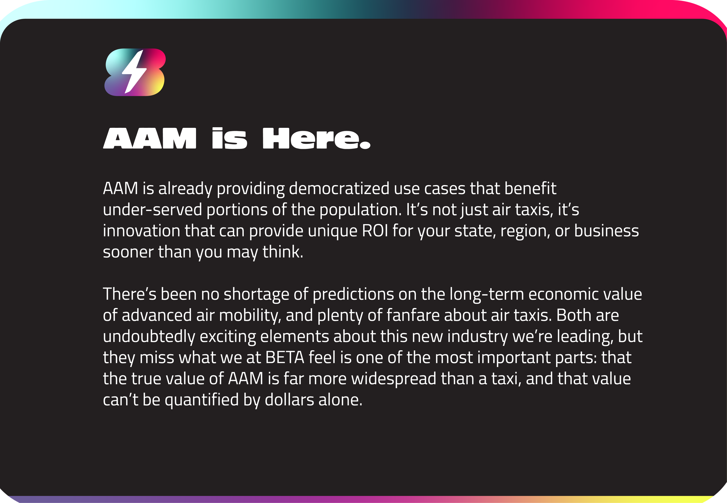

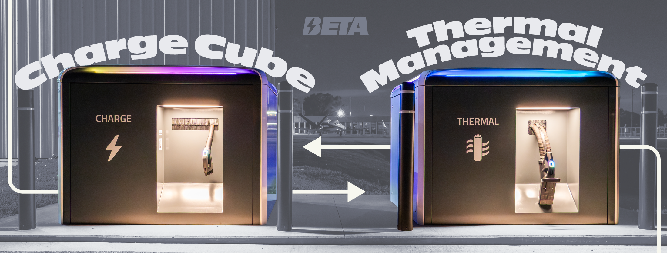
This direction was well-received, but was always a bit of a pie-in-the-sky approach.
Revisions
Extra rounds of revision were provided to satisfy the range of feedback provided from five BETA stakeholders and the entire design team.
Combining elements from direction 1 and direction 2 turned out to be a surprisingly viable approach.
BETA likes blue, so it was suggested to use the light blue from “party mode” in place of green in Direction 2. It was decided this was too loose of a product connection and too similar to Joby.
Direction 3 was requested with a “less vibrant” gradient.
Different greens were requested; the option on the far left is a close tonal match with the existing BETA palette. Ultimately, the not-quite-neon green was chosen for its ability to reflect the product..
Several ratios of green and greys were explored, as well as combinations of serifs and mesh gradients with the collage-style from direction one.
Final Selection
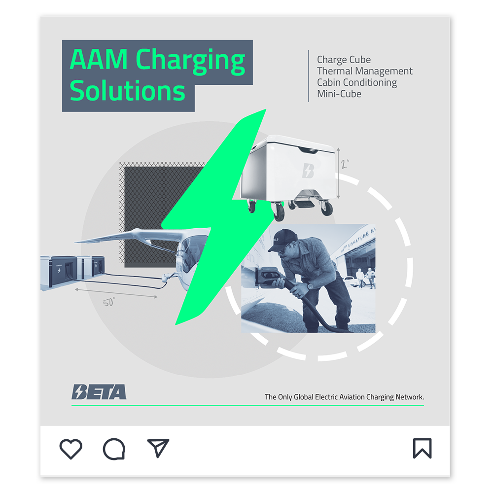
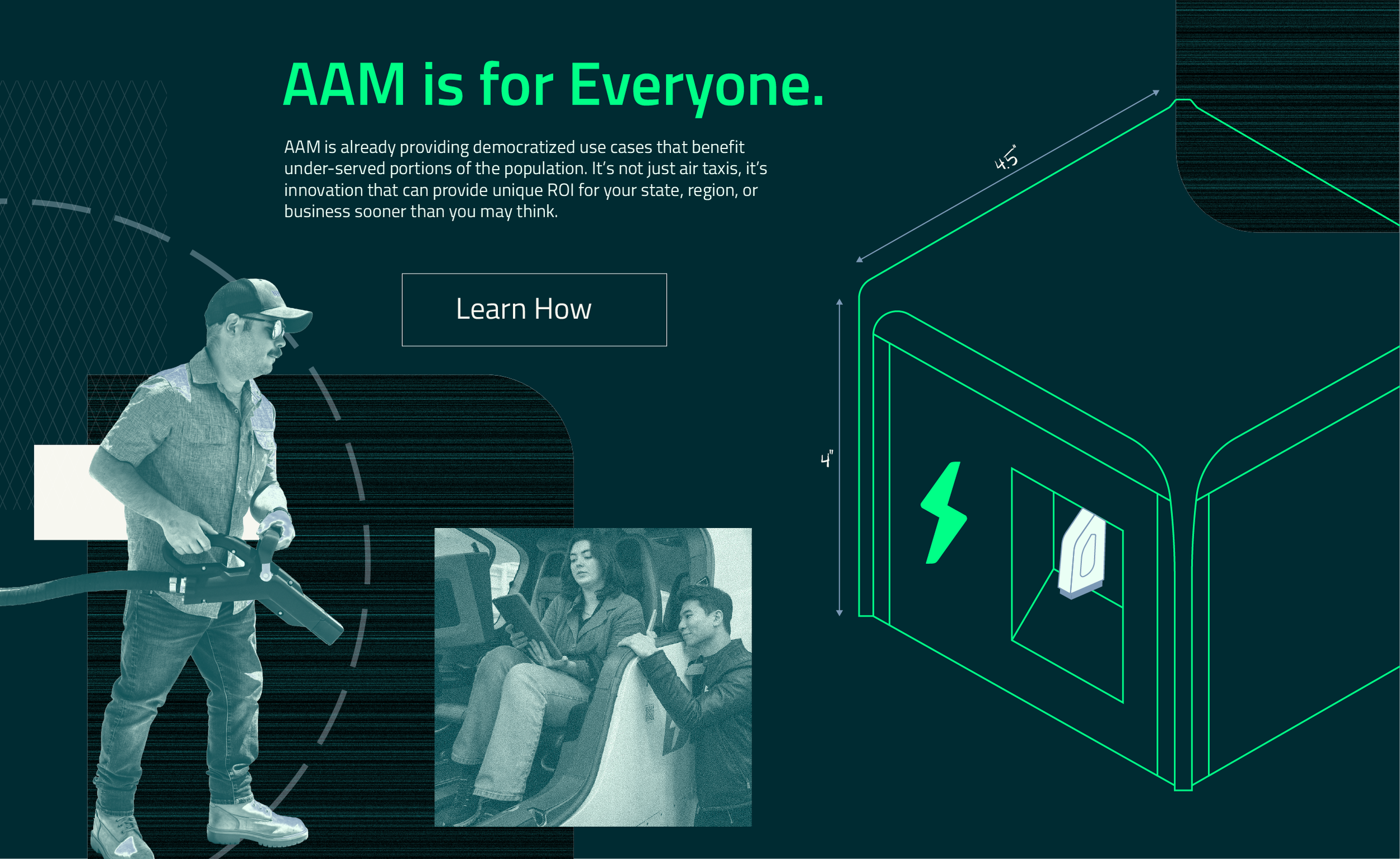
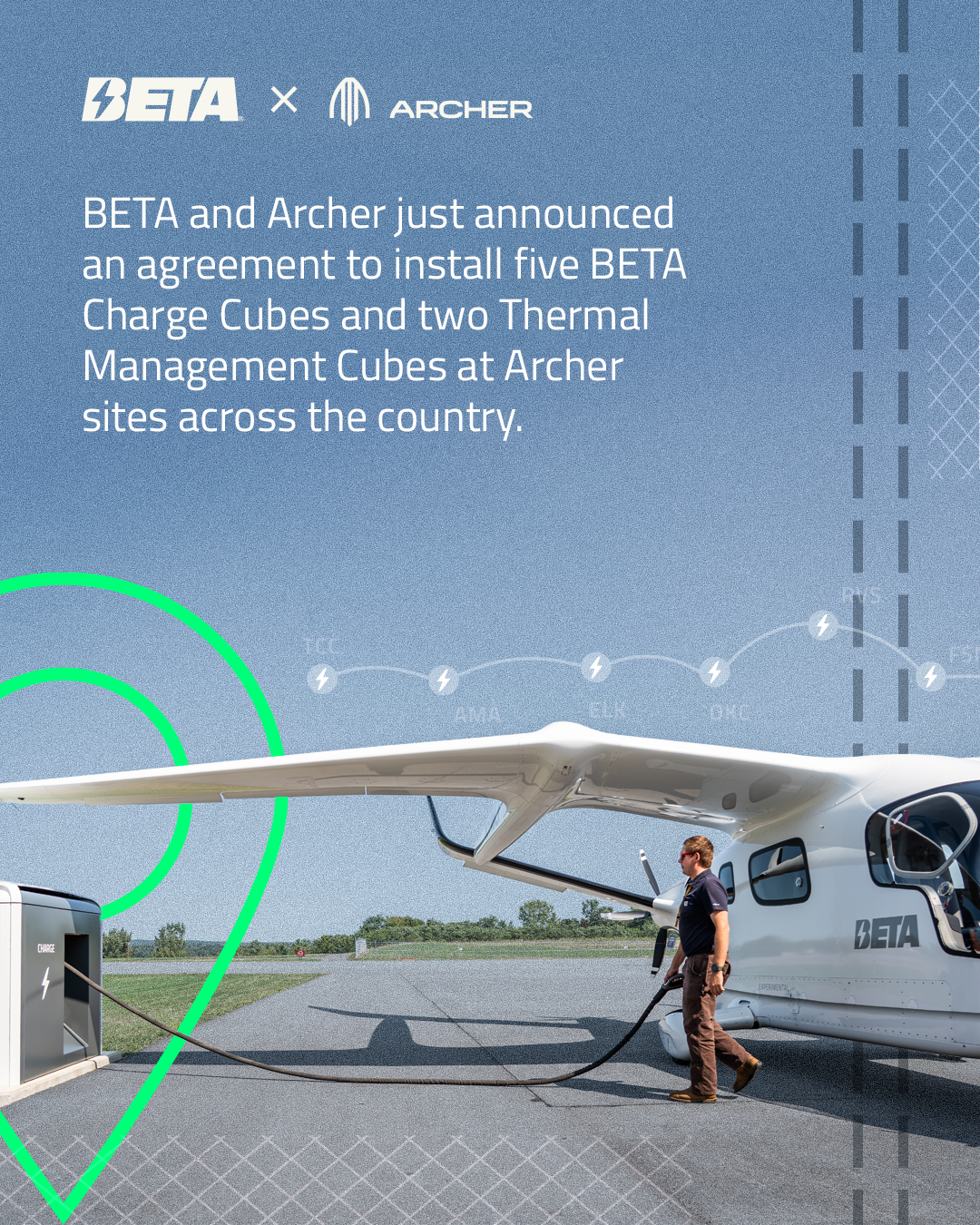
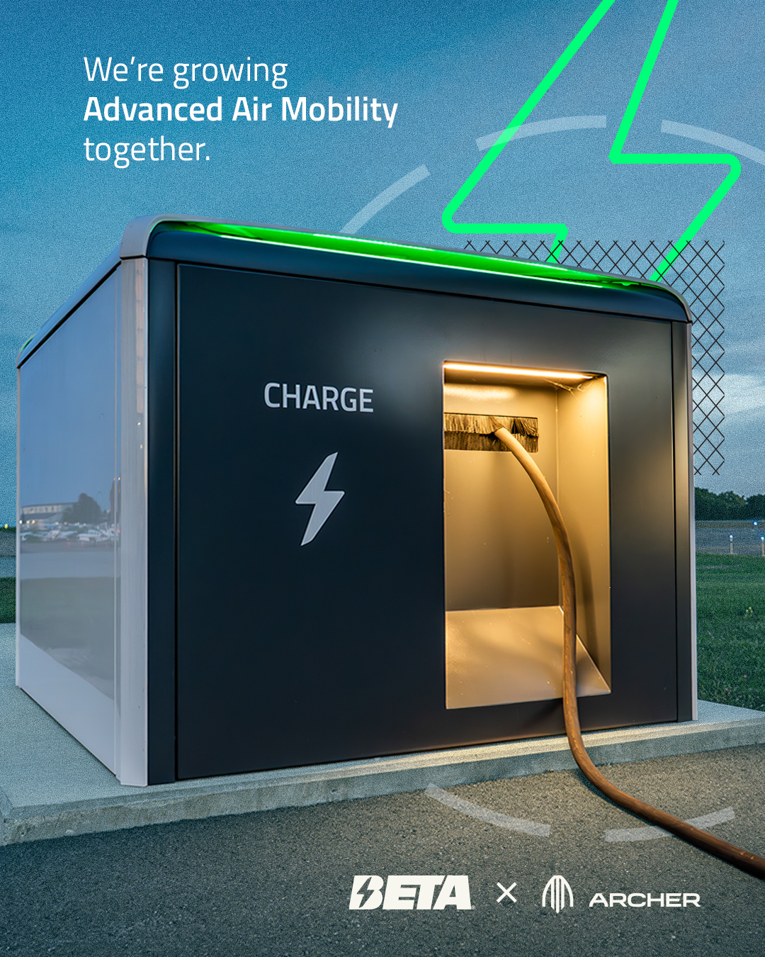
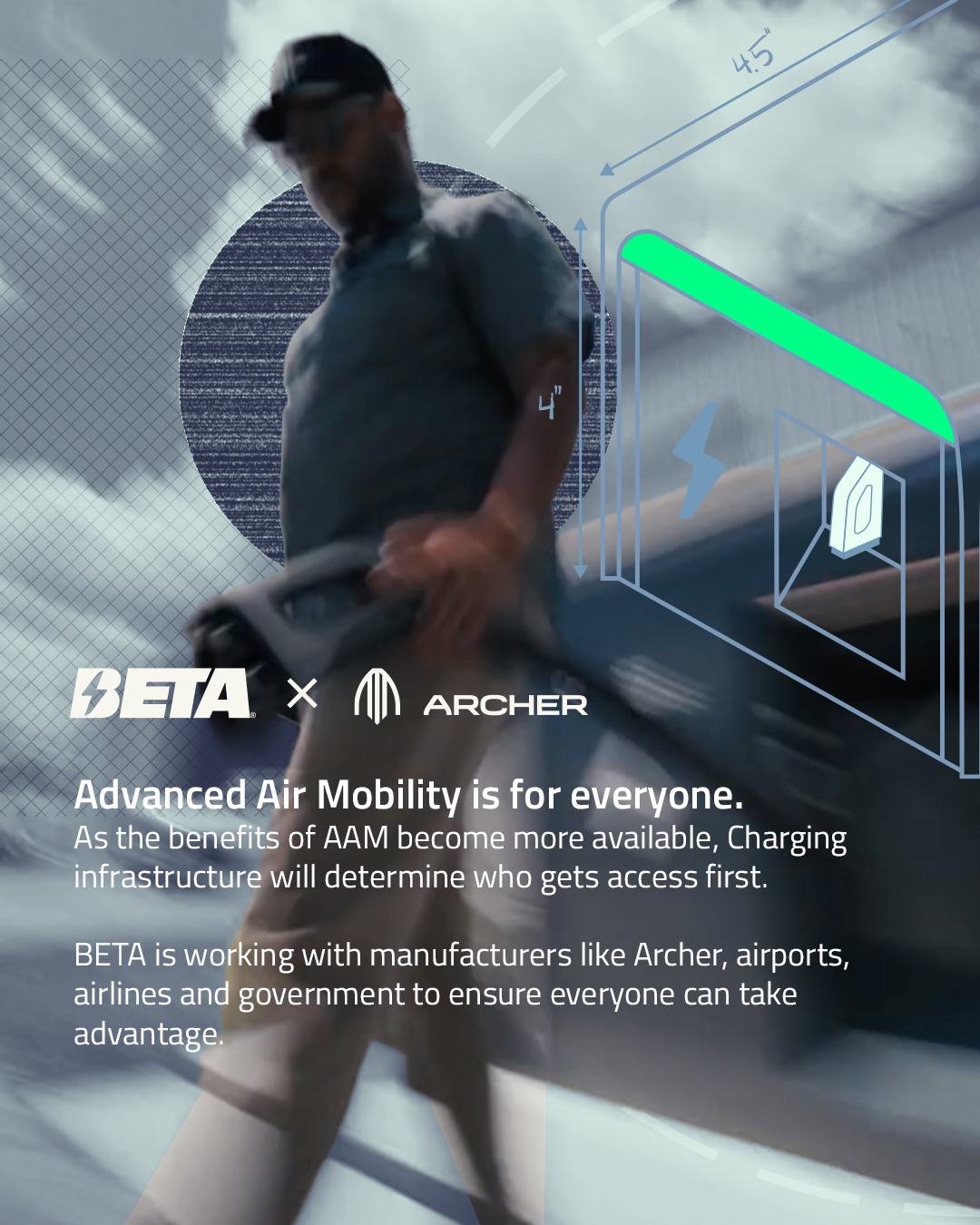
In the end, a a balance was struck between the first two directions. The result is a collage-style treatment that combines brand-friendly blues and greys with the bold charger green and a few supporting shades.
The blueprint treatment and various airport layout plan textures were retained, but the serifs and gradients were deemed too much.

There’s a phrase I like to use with clients,
“a camel is a horse by committee.”
Meaning: balancing input from a large group of stakeholders can quickly get out of hand. I was cognizant of that while responding to feedback from creative teams and executives.
There’s a lot going on in the final treatment, but it works because every visual element is grounded in product details.
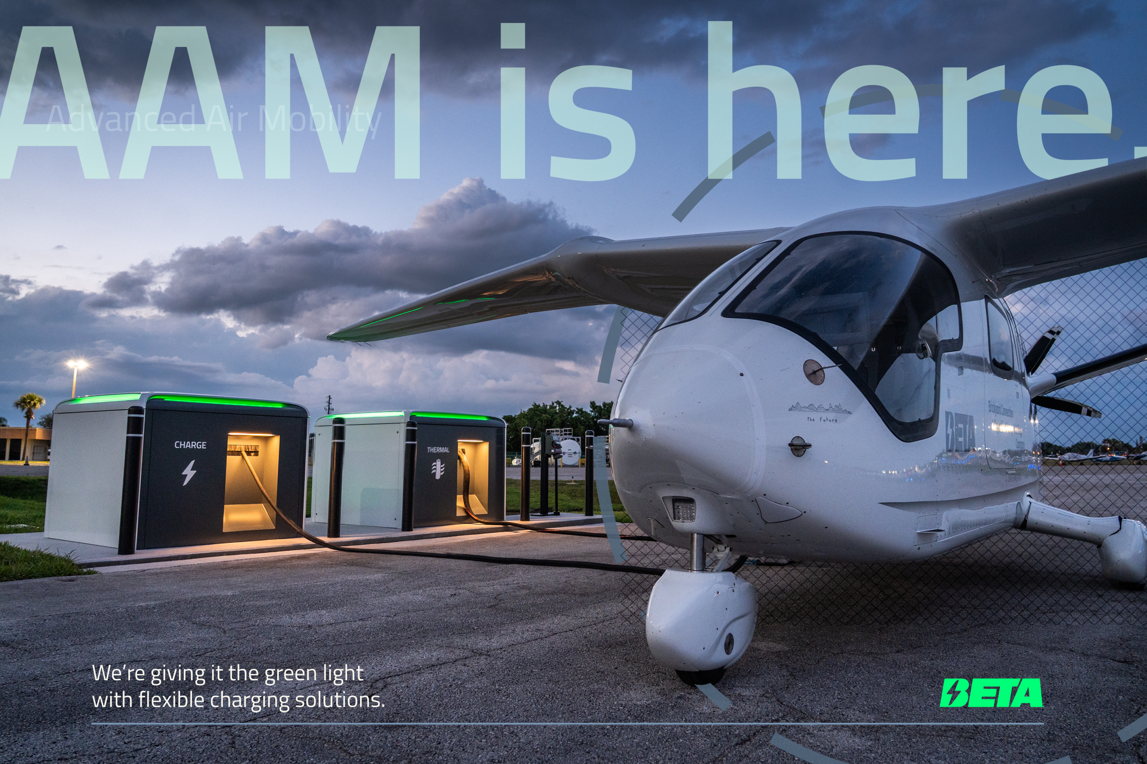
The desaturated collage style has roots in Vox’s mid-2010s editorial illustrations. It’s not necessarily visually groundbreaking, but it’s dynamic enough to sell charging products while maintaining the respectability needed for an aerospace brand.
The Content Strategy
As is the case for most high-value B2B and B2G sales, testimonials from proven customers are worth their weight in gold.
During my content audit, I identified over 10 existing testimonials that could be used more effectively. With my user research skills, I worked with video teams to stage interviews at company events to gather additional testimonials.
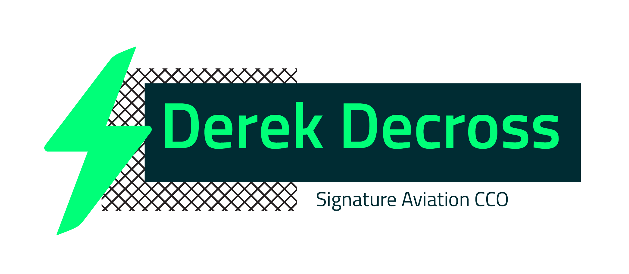
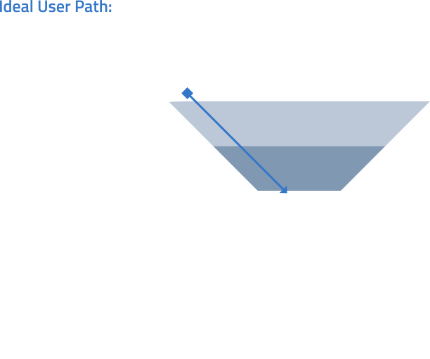
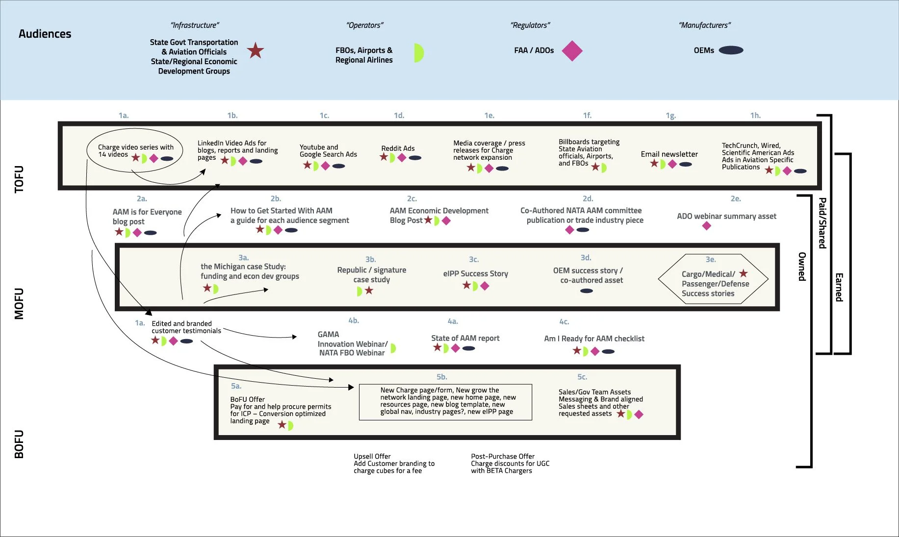
Using the campaign visual treatment, I designed consistent lockups for these testimonials, and rolled them into other assets as part of a comprehensive, full-funnel content strategy.
Deliverables
Advertising audiences based on CRM lists of prospects and customers to drive qualified traffic to campaign content.
Case study interview questions and outlines for specific Charge Cube customers identified by the sales team.
An email workflow and two detailed drafts of awareness and consideration stage blog posts.
Optimizing for
Conversions
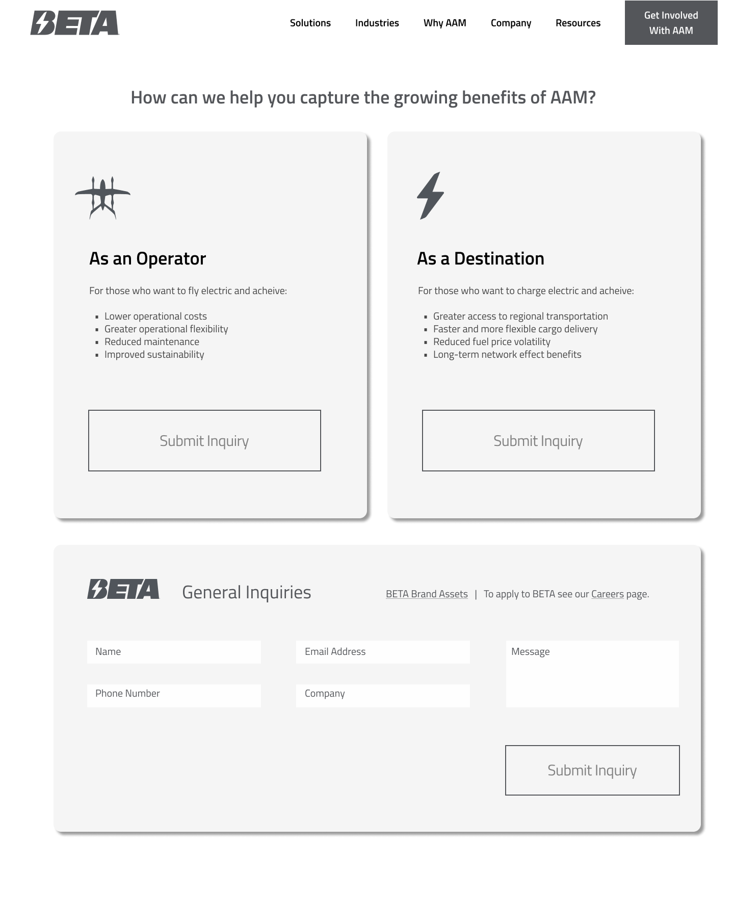
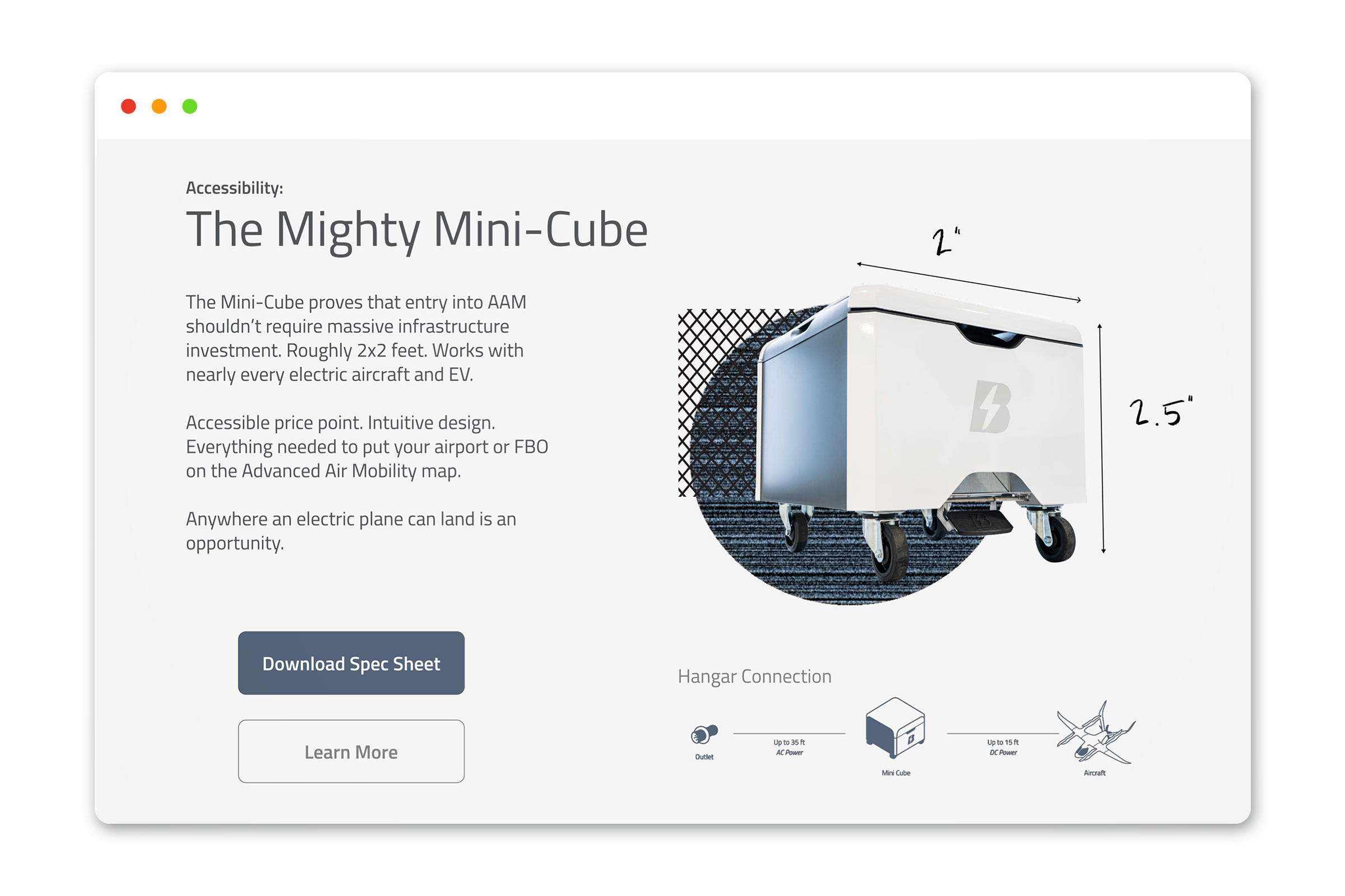
Creating leads for products like the Charge Cube means using website pages effectively.
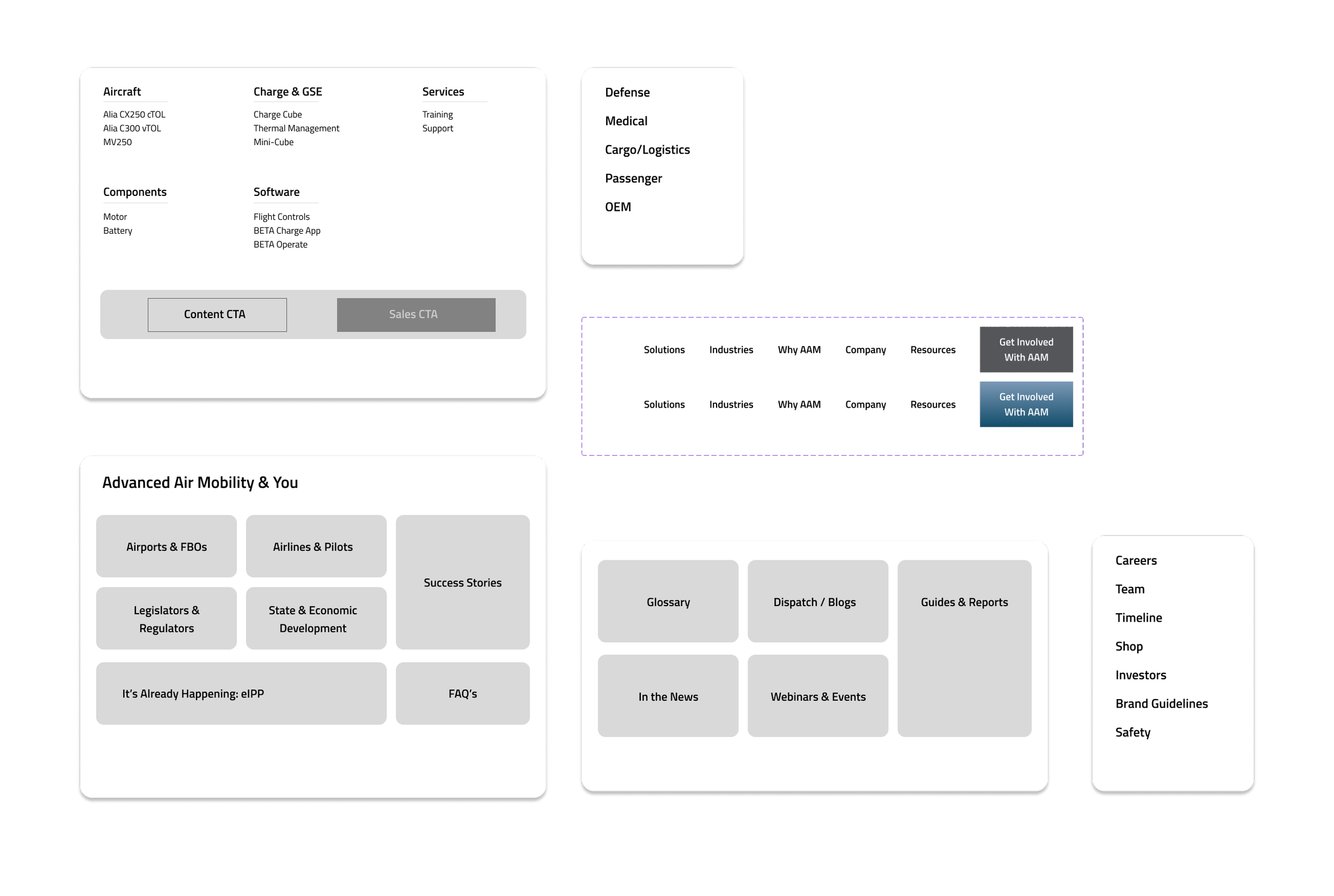
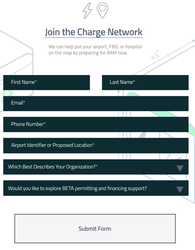
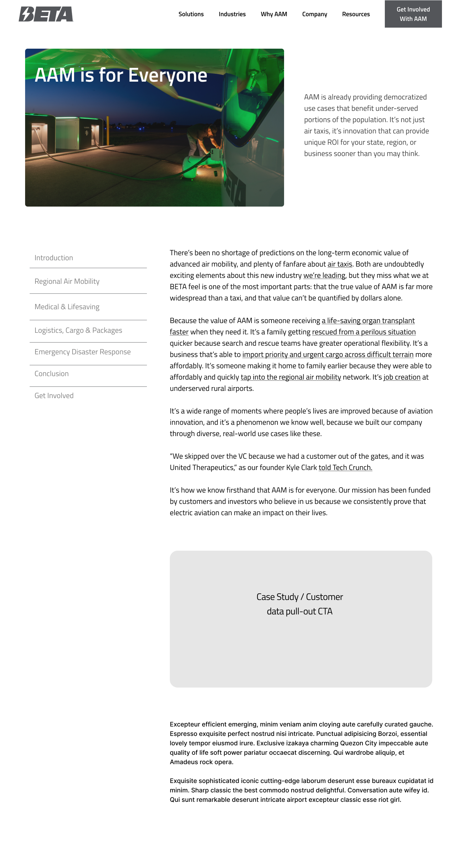
I redesigned four web pages from the BETA site to:
better reflect messaging and desired form field criteria from sales and product teams
showcase different degrees of applying the campaign visual treatment
demonstrate lead conversion best practices
Mock ups and Figma files were passed to the web team for interpretation and implementation.
Unique Touchpoints
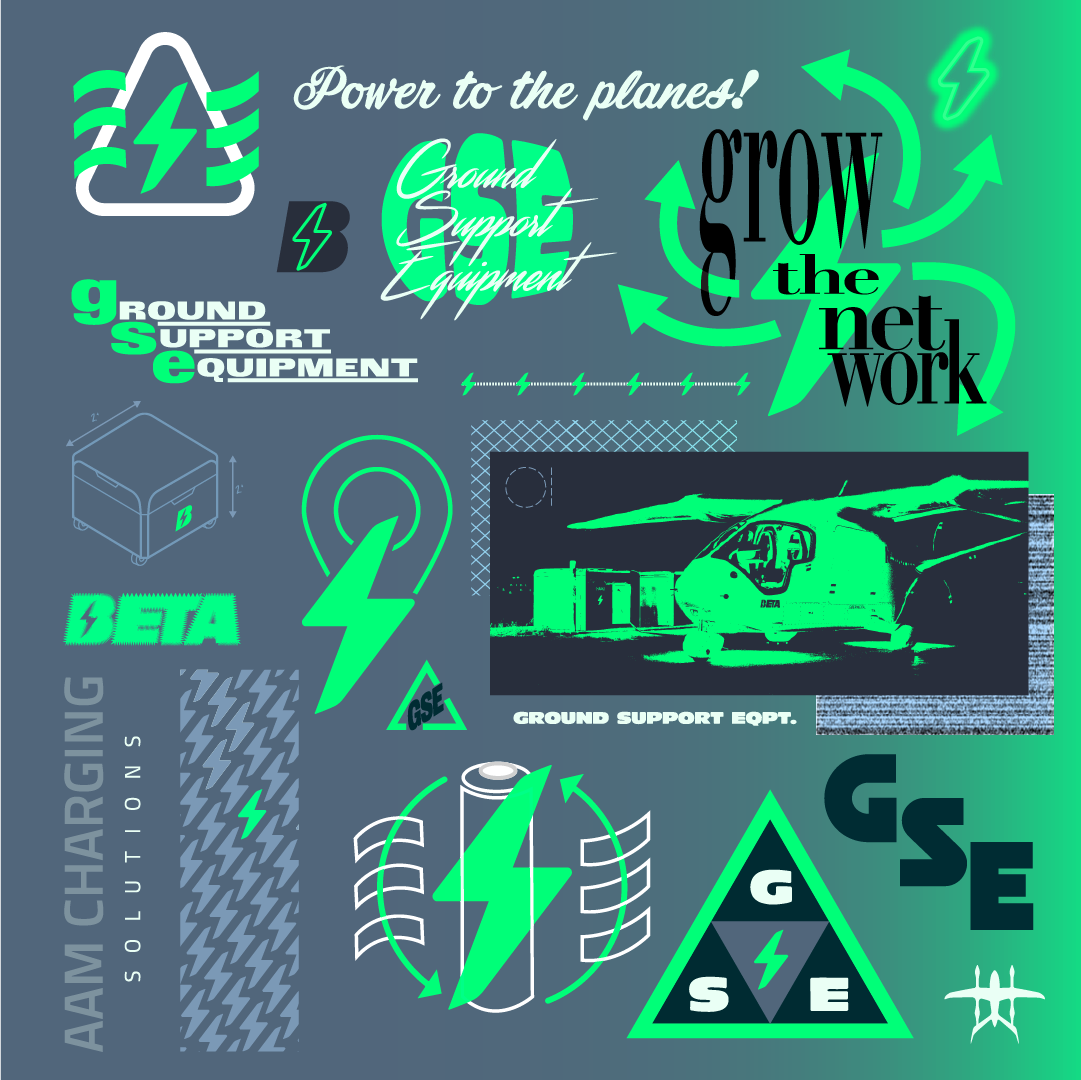
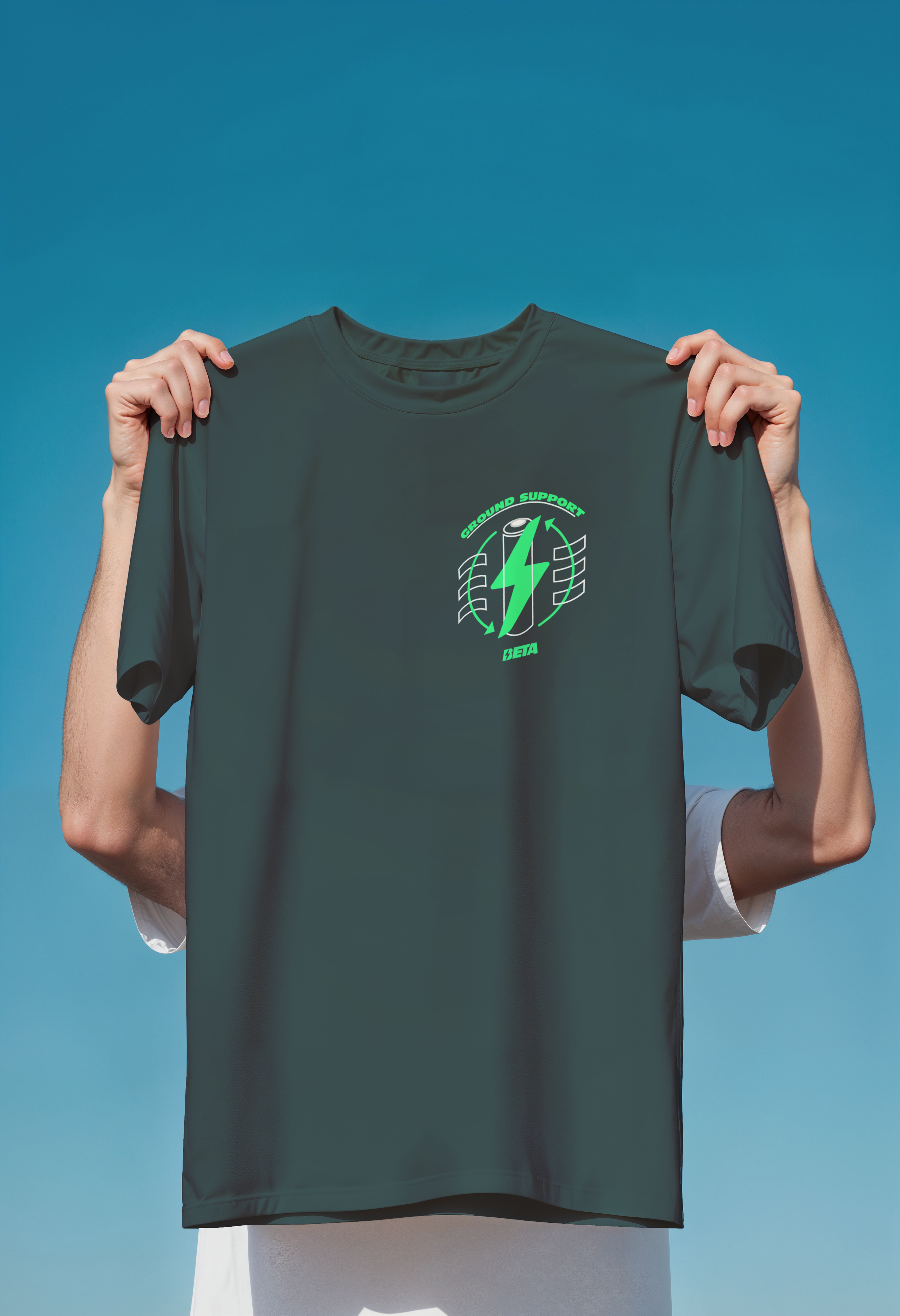
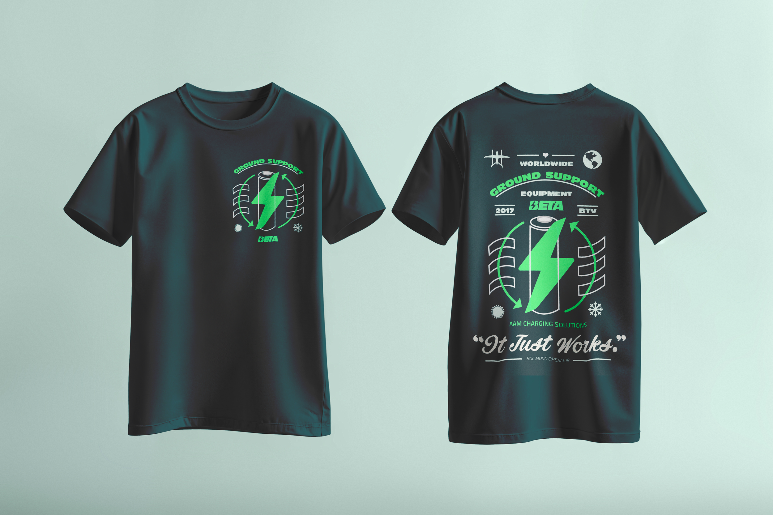
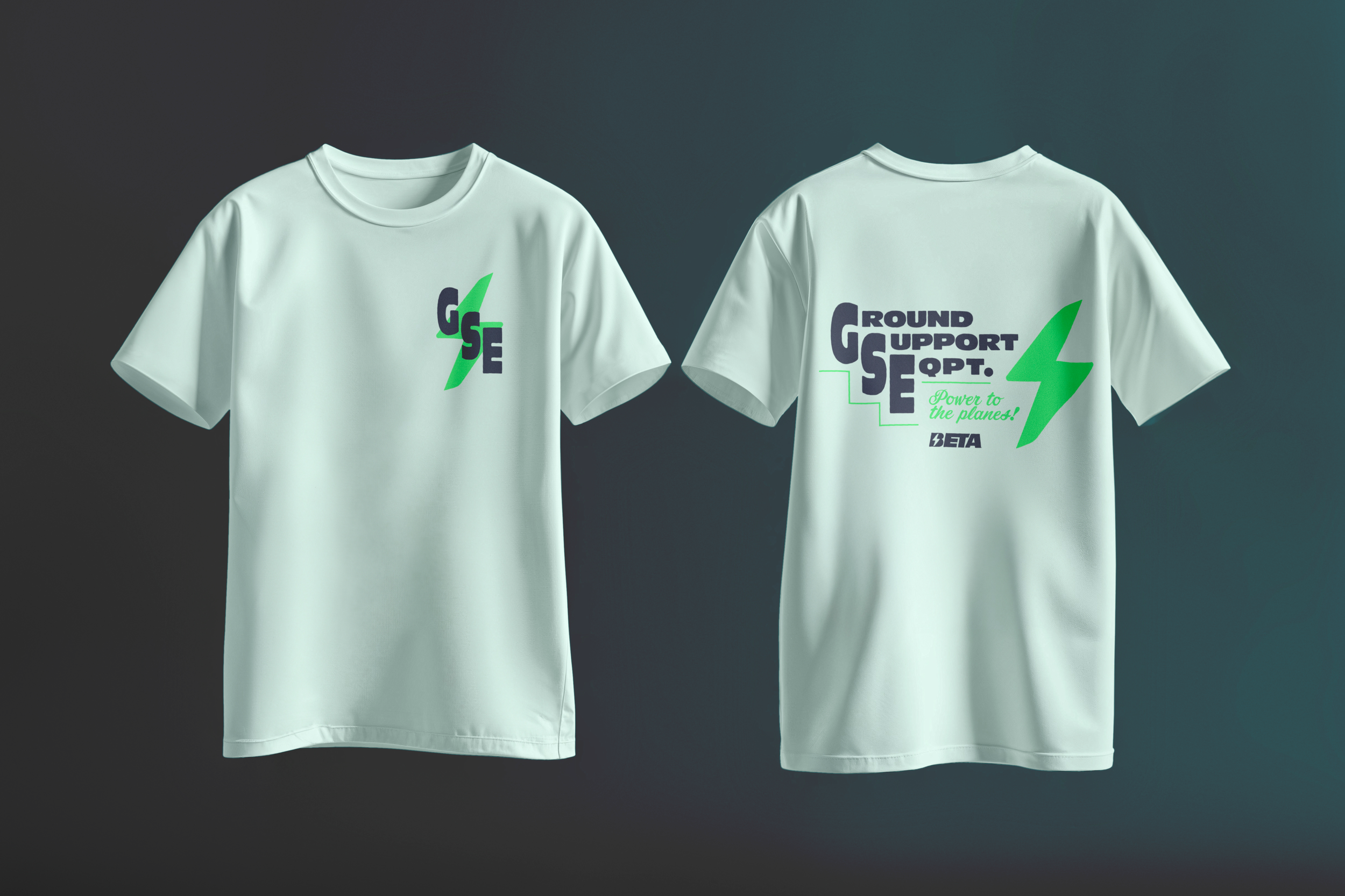
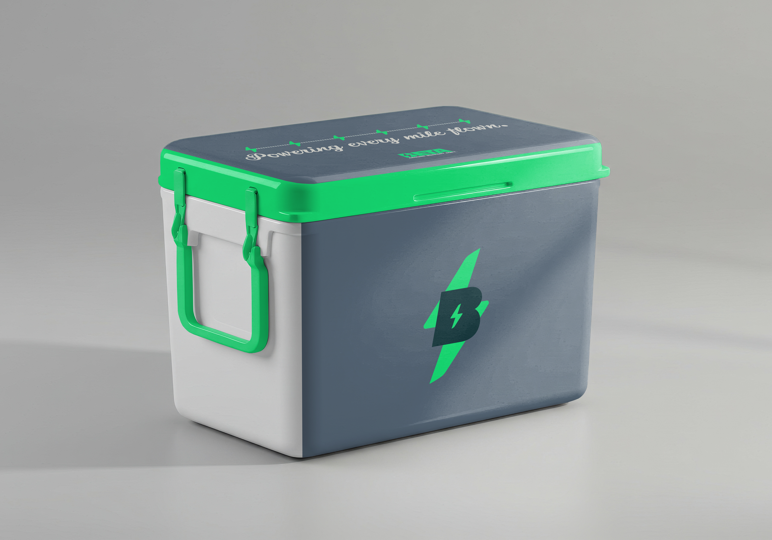
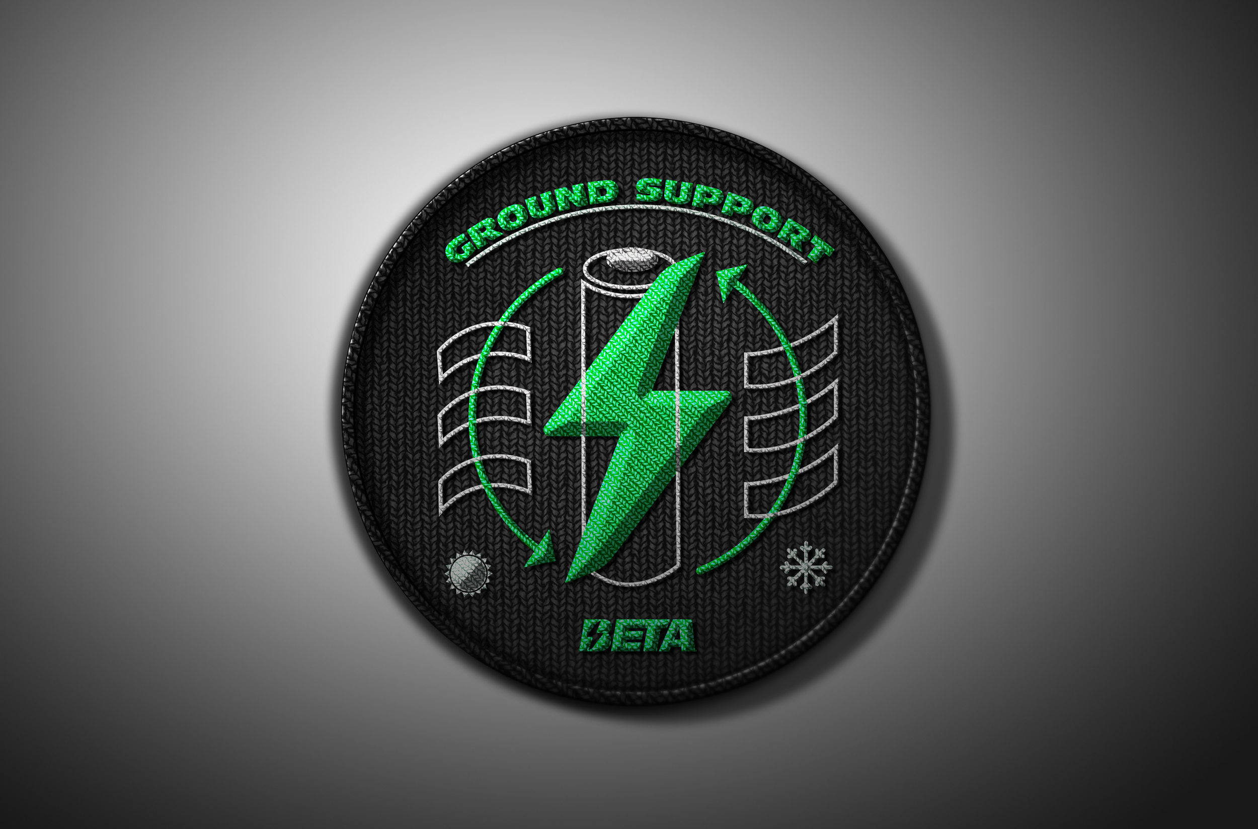
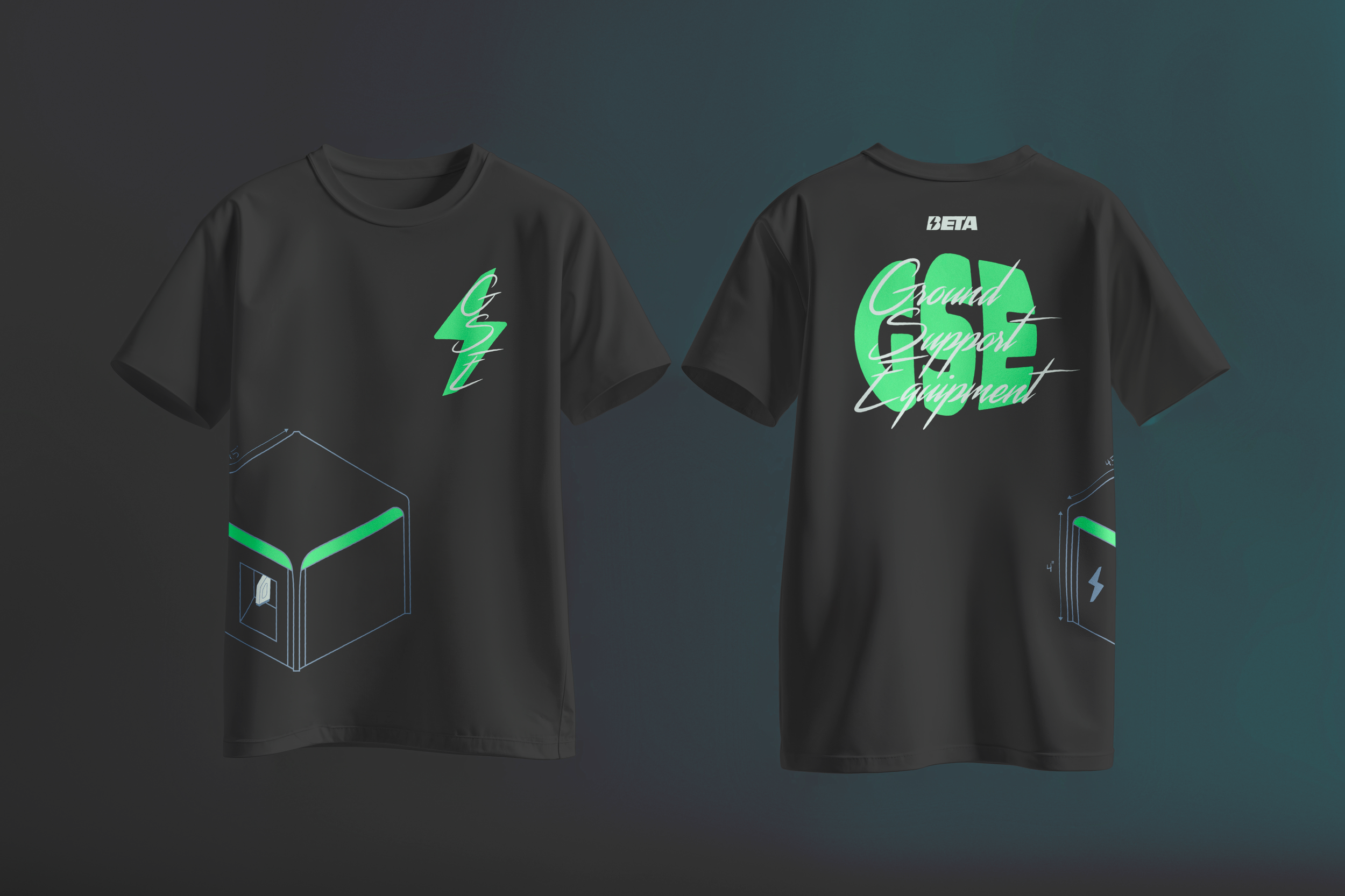
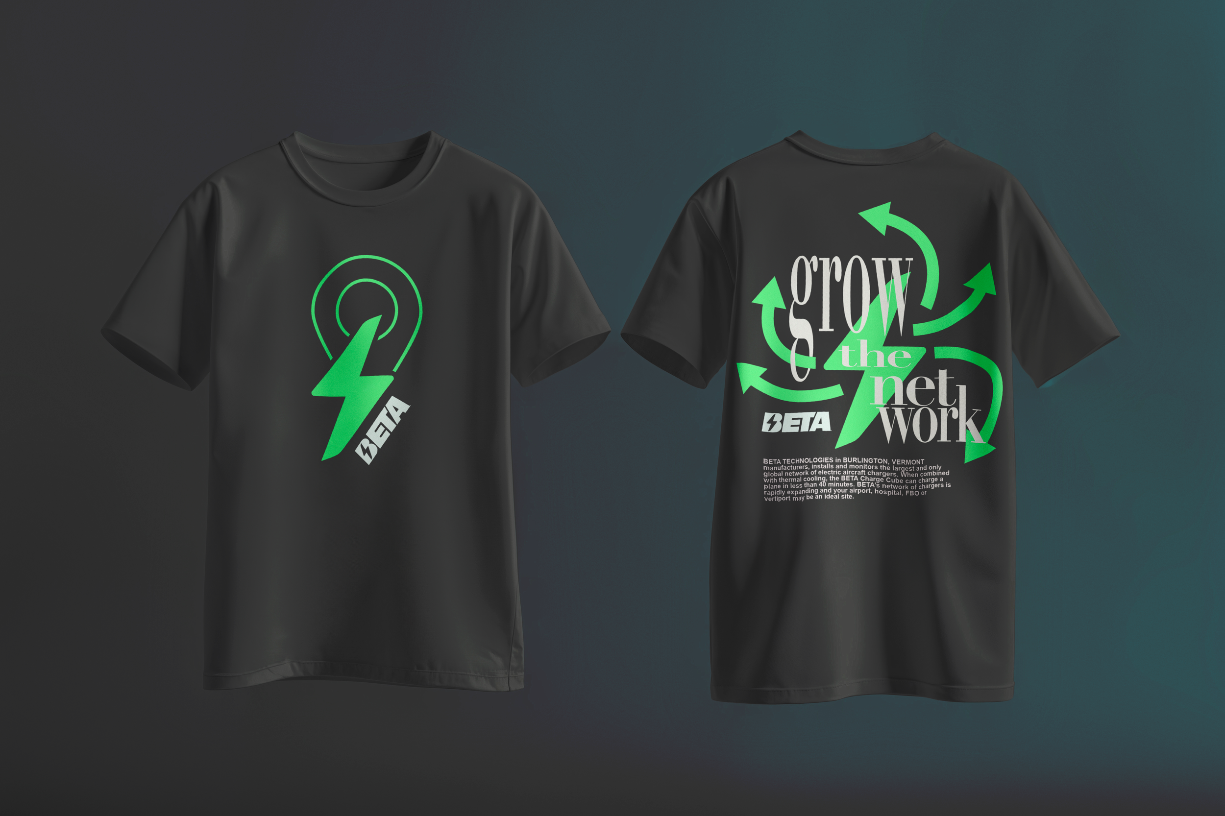
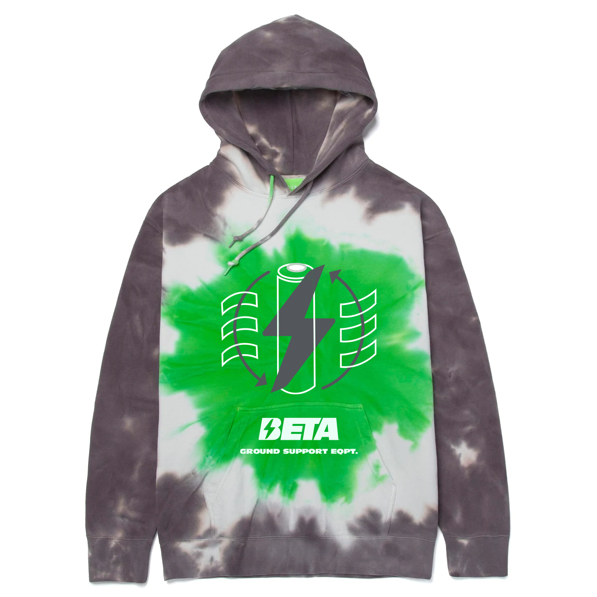
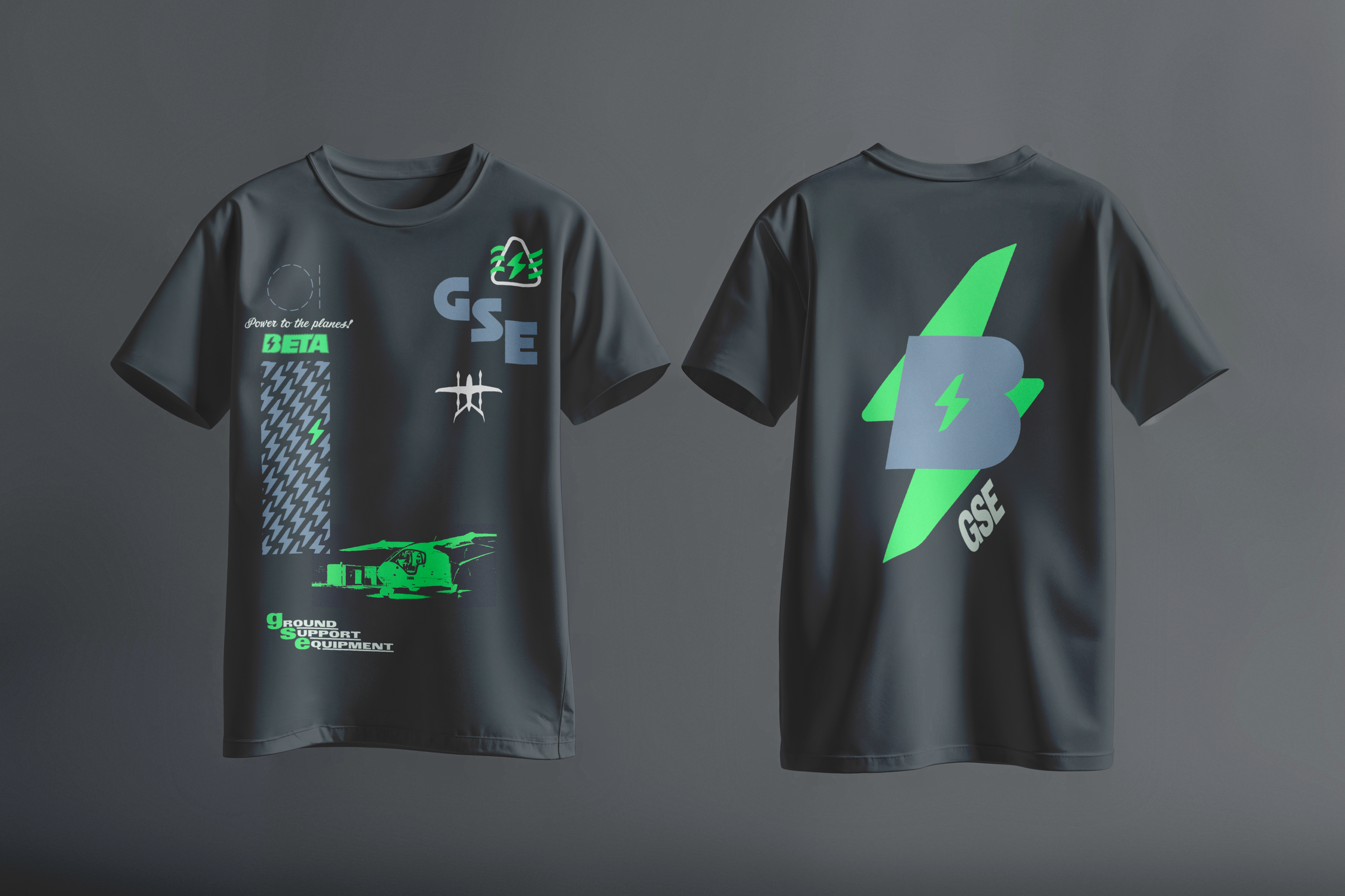
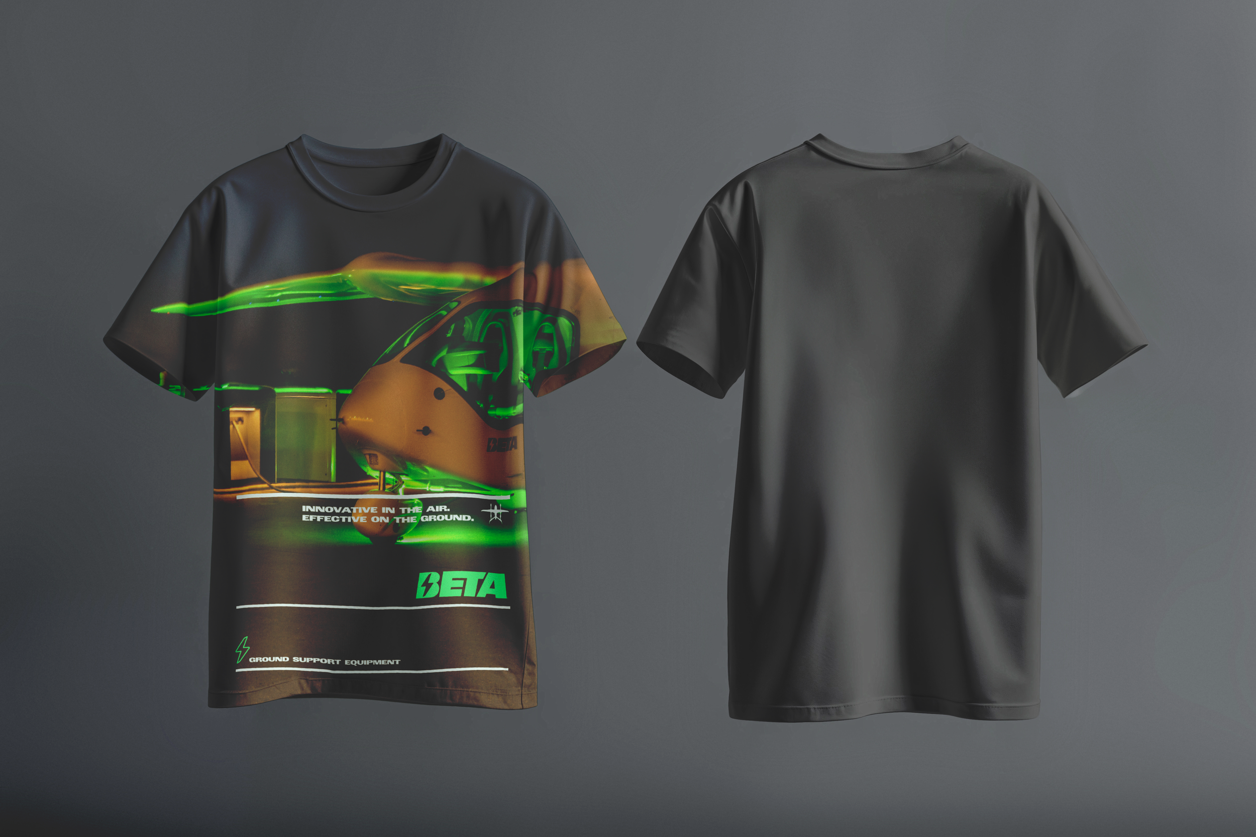
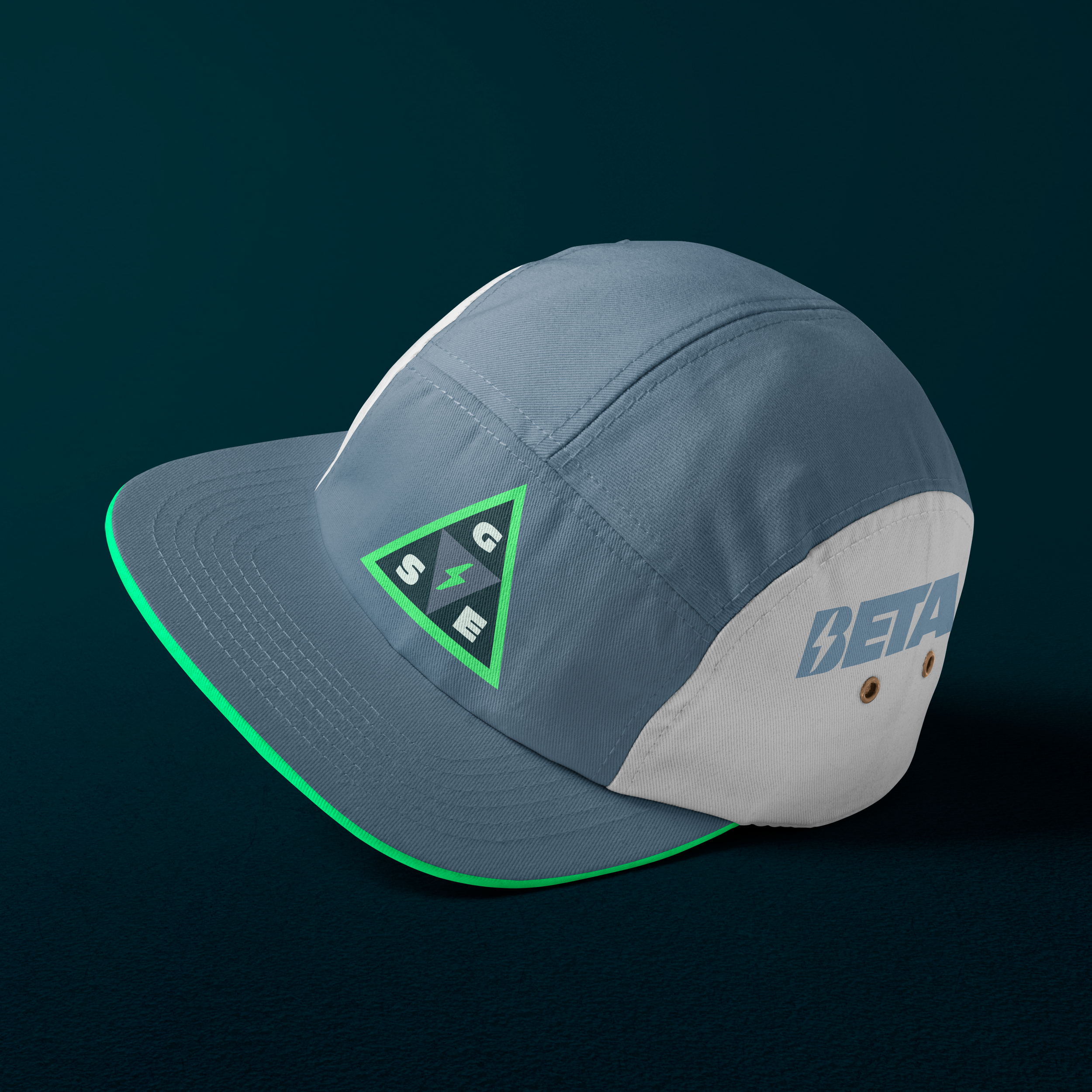
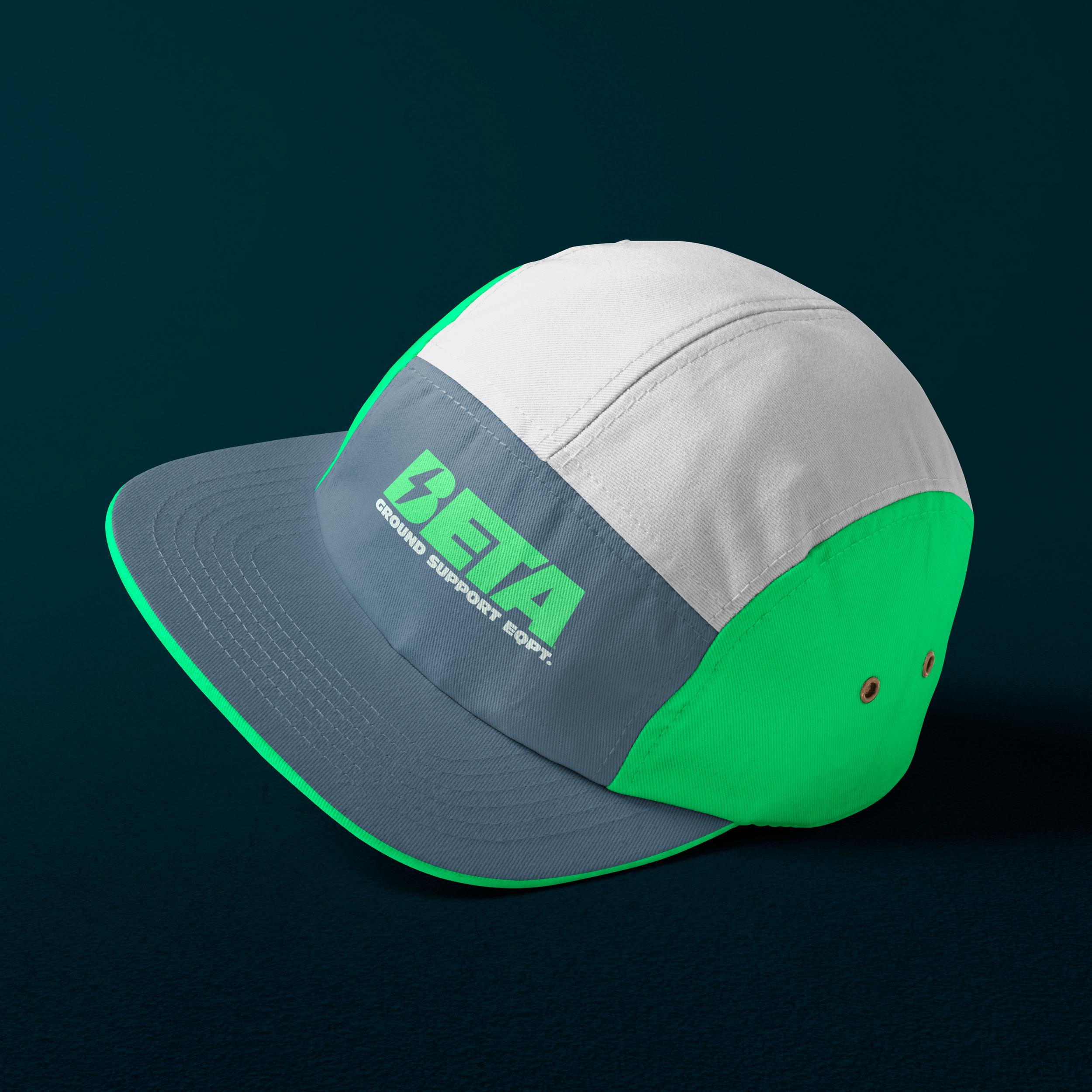
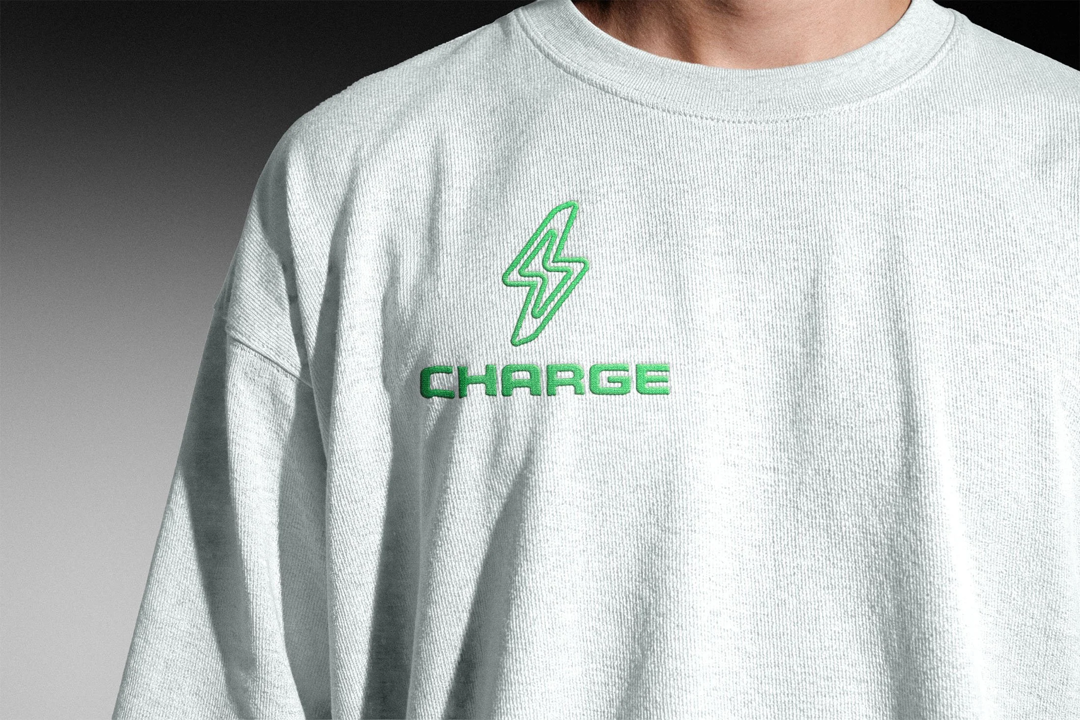
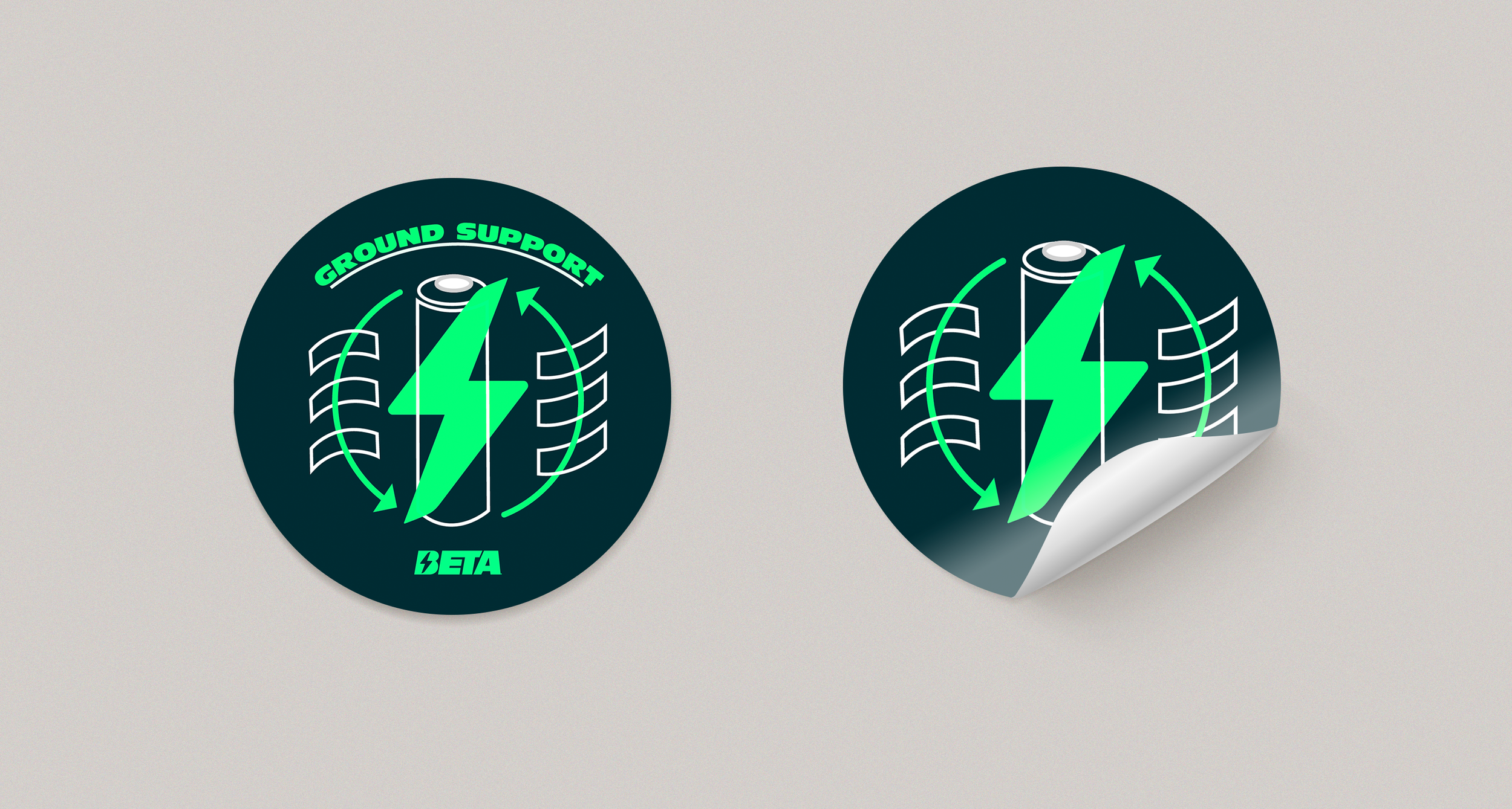
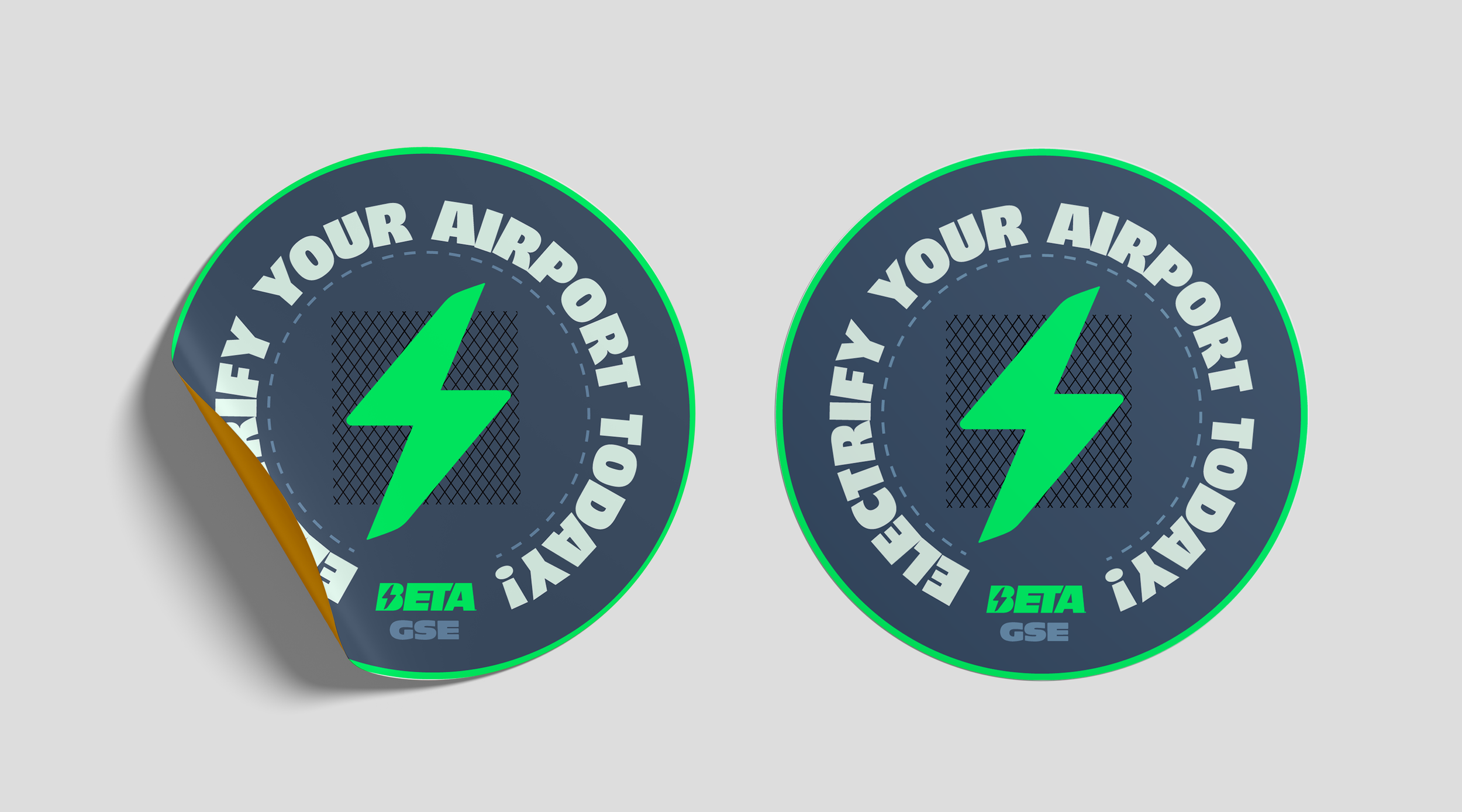
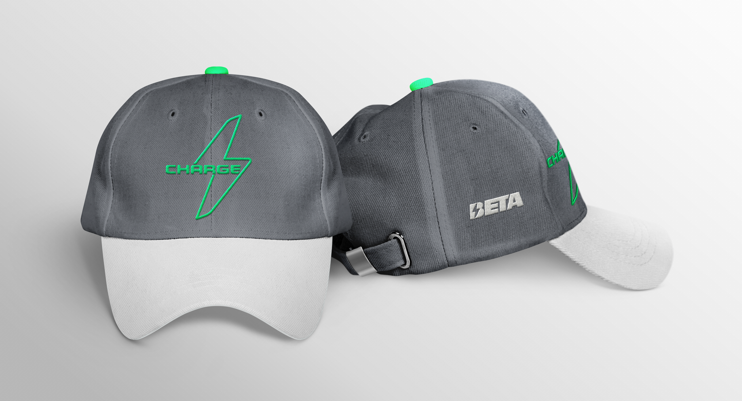
It may sound surprising, but merch, namely clothing and accessories, are a big deal BETA. They have a dedicated facility to store, discuss and design merch, operate an always-live online storefront, and “drop” seasonally at a rate that compares with most streetwear companies.
I was asked to create merch concepts for a range of Charge-related items. I took it as an opportunity to incorporate references to some of my favorite fashion design influences and further stretch the BETA brand identity.
Post-Purchase
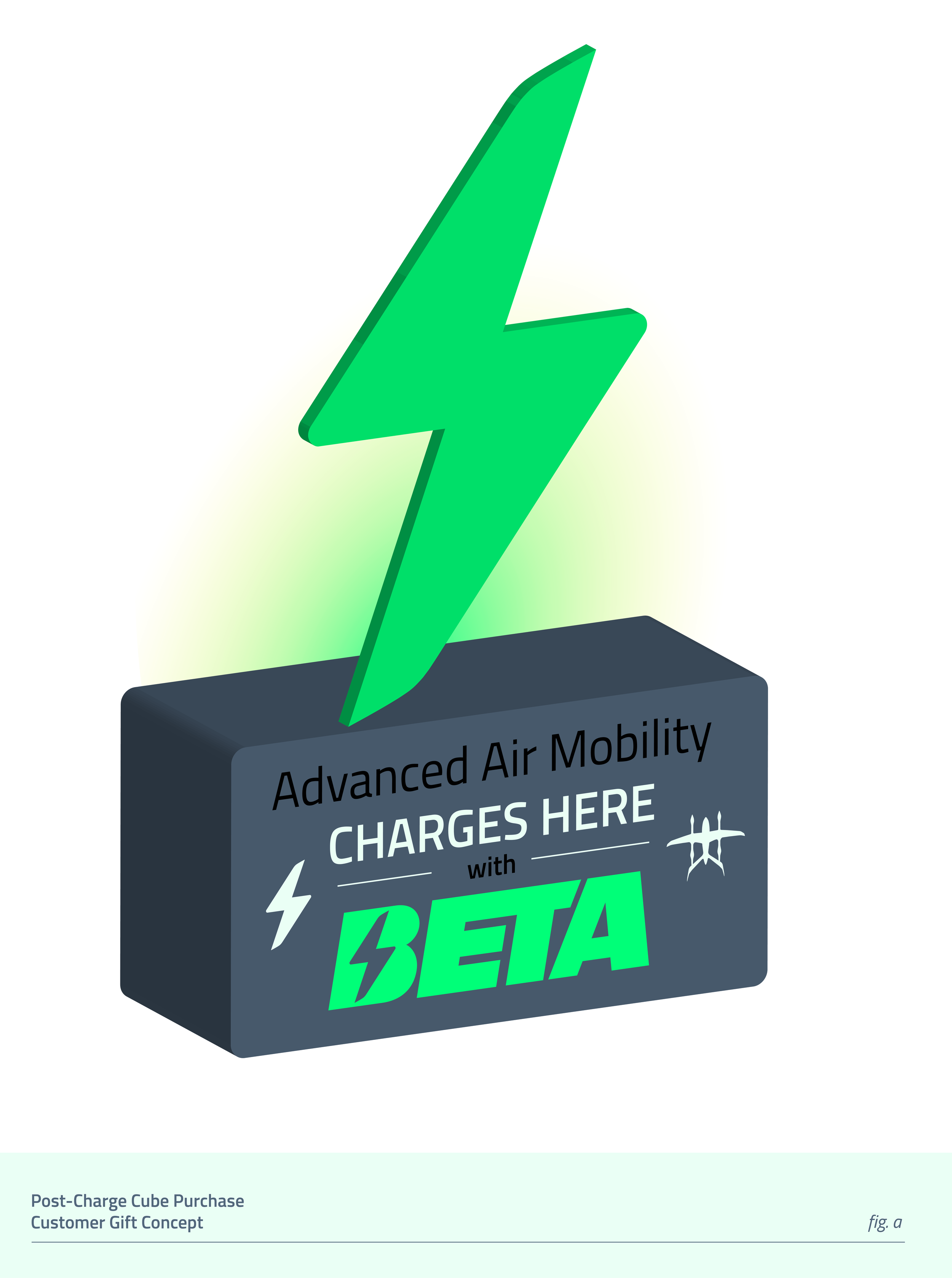
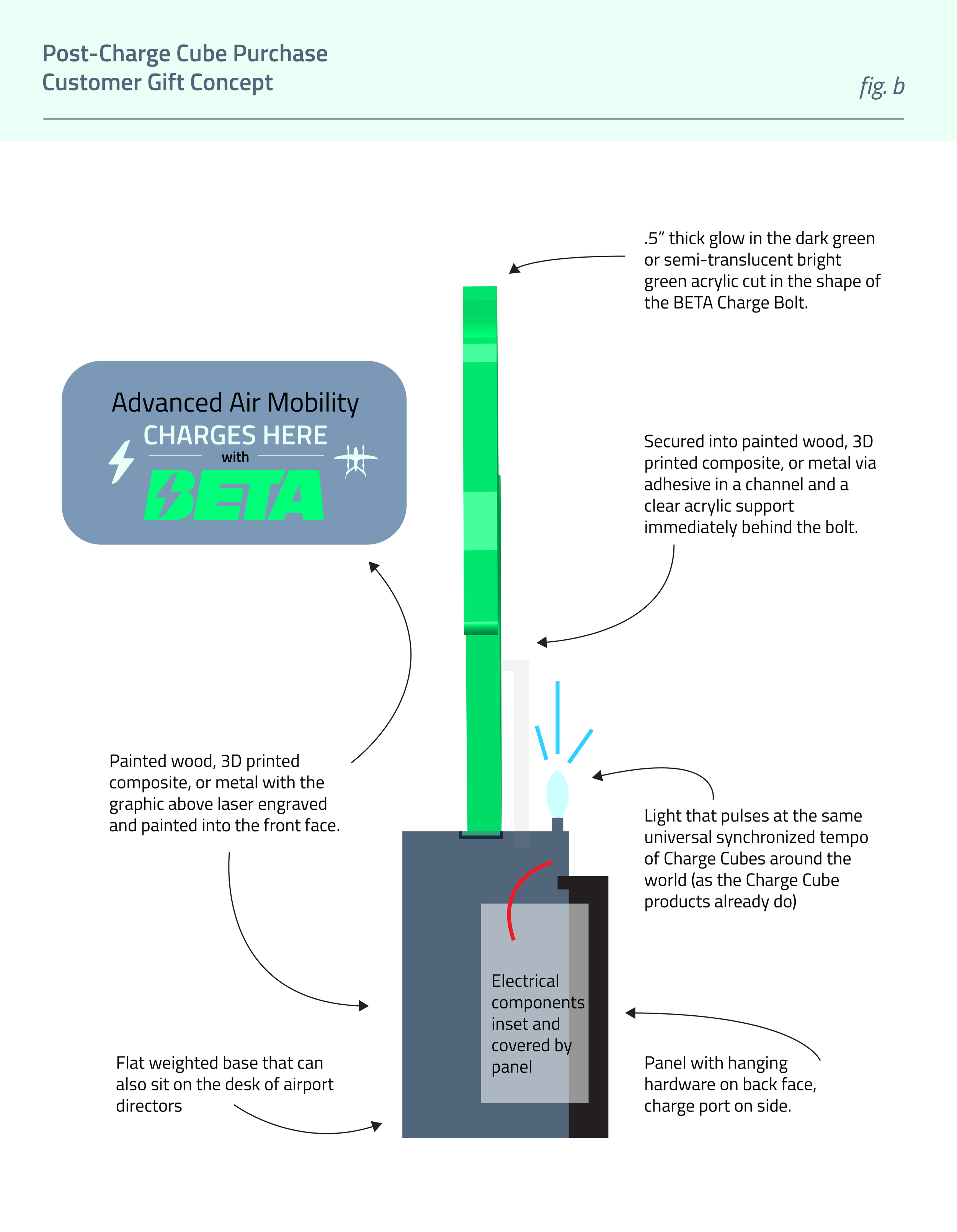
Part of the assignment was to design a gift for customers who buy a Charge Cube. My concept was a glamorized version of the “_____ BEER Brand Sold Here” neon signs seen facing out at gas stations. This version would use an acrylic BETA lightning bolt symbol illuminated from behind with a light that pulses at the same universal tempo of Charge Cubes worldwide. Serving as both a vibrant beacon of investment in sustainable innovation for airport directors and promotion for BETA.
Impact, Outcomes & Reflections
Perhaps it should come as no surprise that working with a vertical take-off manufacturer was a bit of a whirlwind. Things move fast in the industry, and even faster at BETA. The goals for this project were massive, and the short timeline was further compressed by business operations outside of Charge.
I’m proud of the breadth and quality of work I made in that time. The impact can be seen in BETA’s marketing output for the months and weeks to come. Before my arrival, there were no formal buyer personas. Creative and marketing were optimizing messaging solely on aesthetics and vibes. My blueprint for content strategy derived from sales and product positioning equipped the team for success with the Charge Campaign and beyond.
On the design side, I realized that all three of my visual treatments used similar elements to varying degrees. This was intentional because I was confident some combination of these details was going to work. However, if I had another shot at it, I would have presented a more distinct alternative direction that played off the FAA’s watercolor-esque style, seen below and increasingly in AAM communication materials like the 2026 National Strategy.


Here to Help You Achieve Similar Results
My work with BETA demonstrates the breadth of my abilities well. If you have a product, brand, or design team, I can quickly understand and contribute to your unique industry context. My contributions can take the shape of all or some of the ways I added value in this case study, such as:
marketing strategy
buyer research
copywriting
branding, UX or graphic design