

Case Study:Tables Without Borders
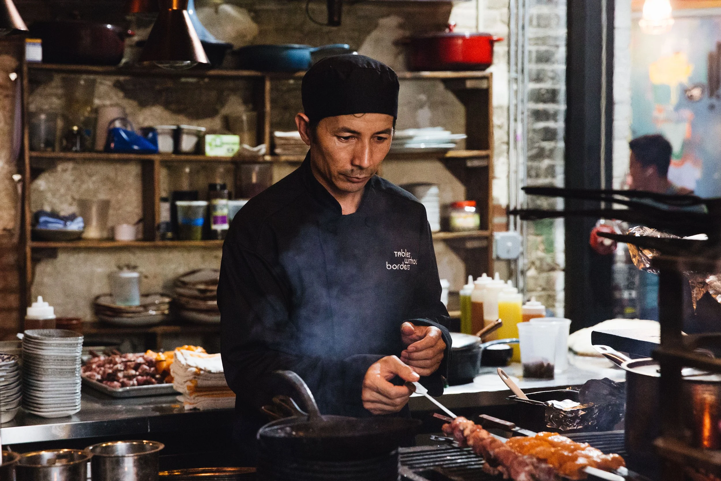
Purpose and profession converged when I got the opportunity to brand and build a digital presence for Tables Without Borders, a non-profit dinner series benefitting refugee chefs in Washington, D.C.
Purpose & Impact
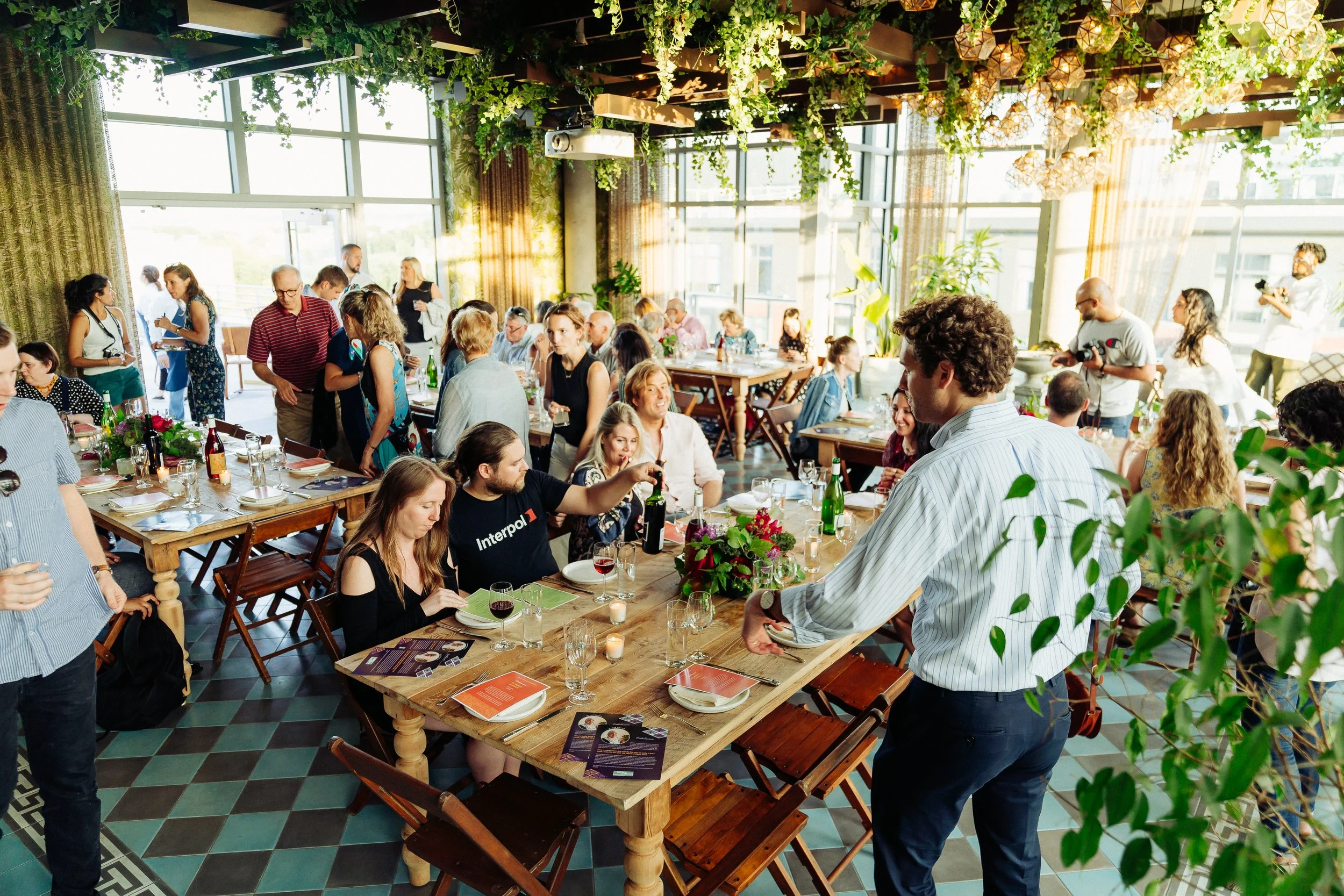
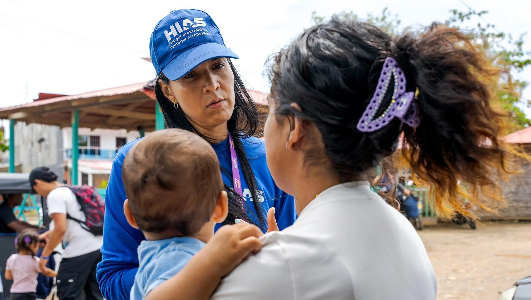
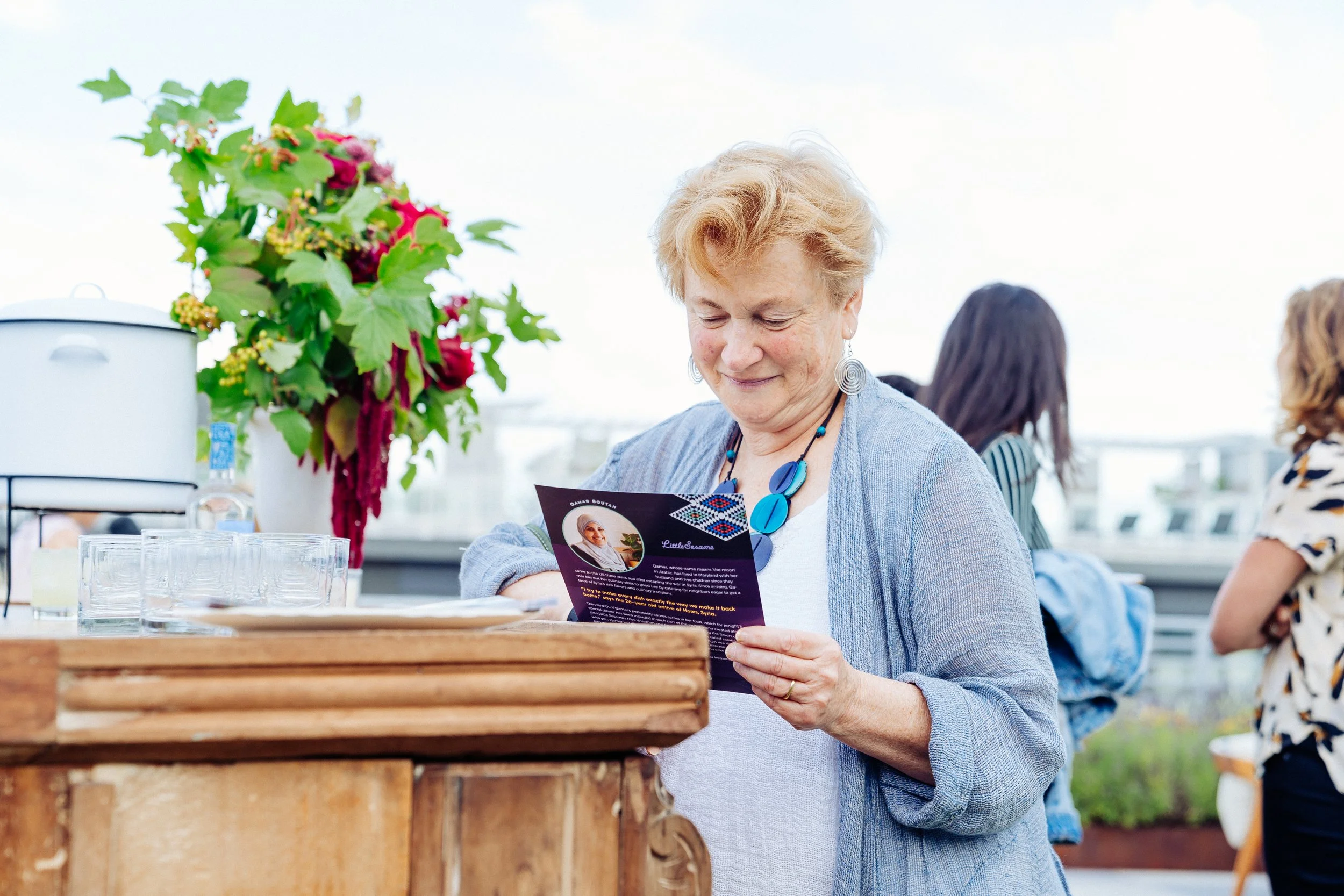
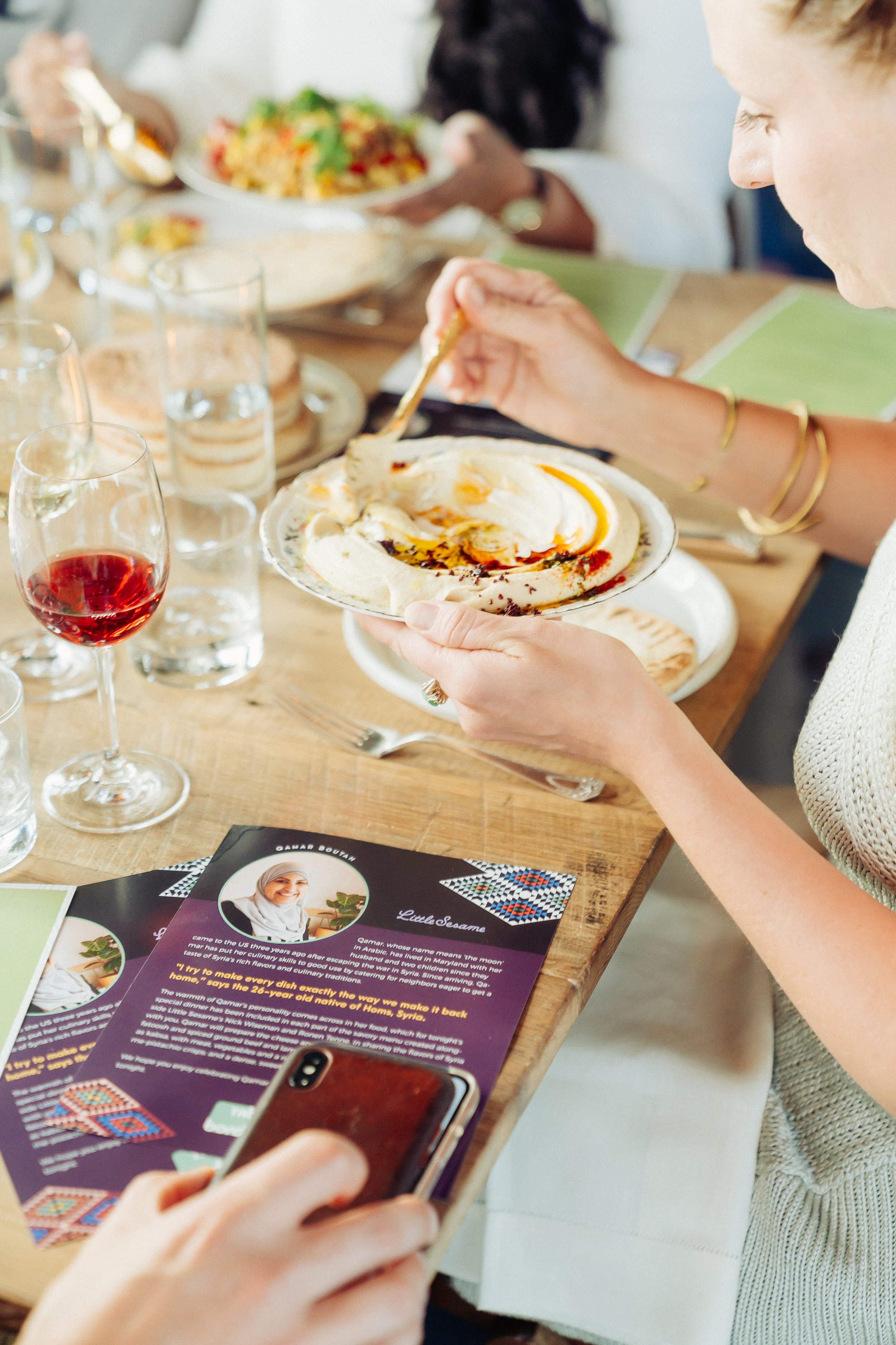
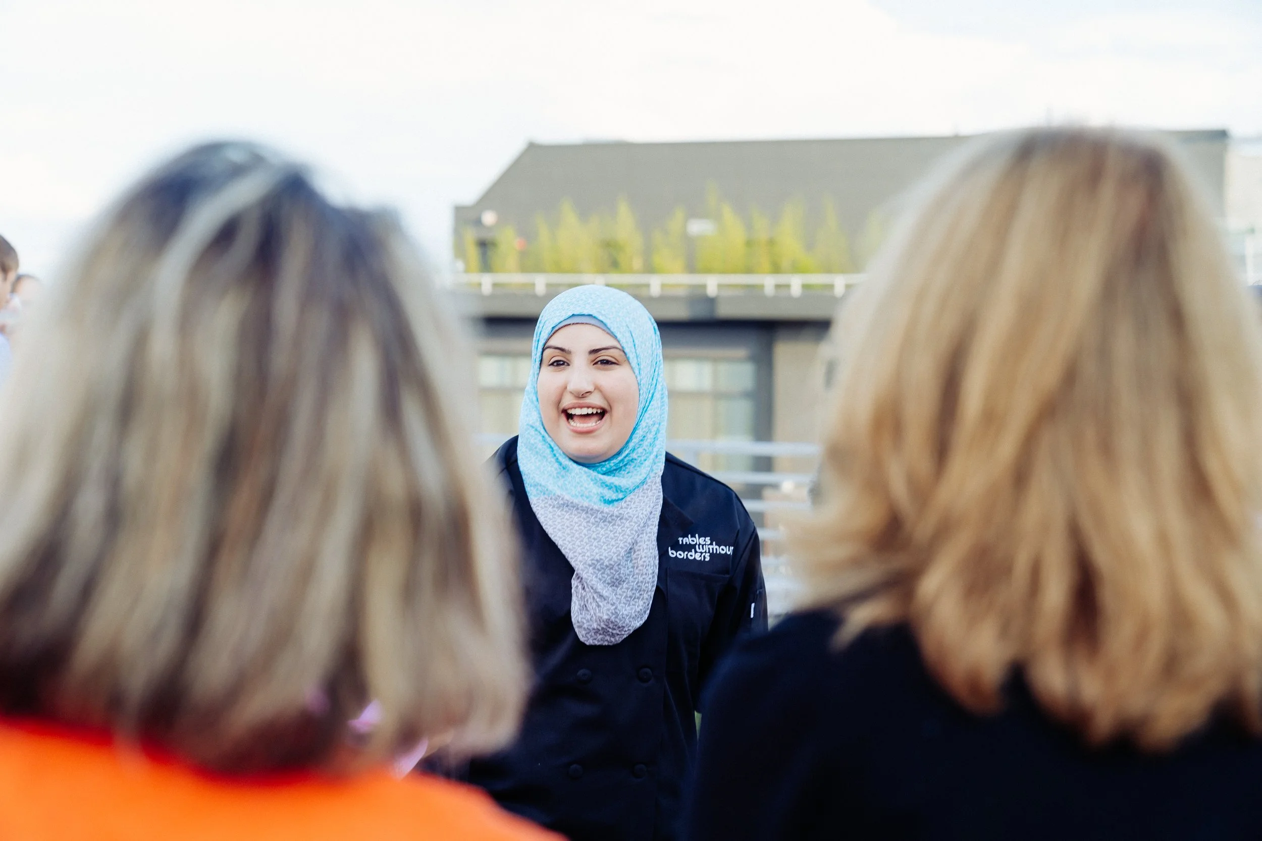
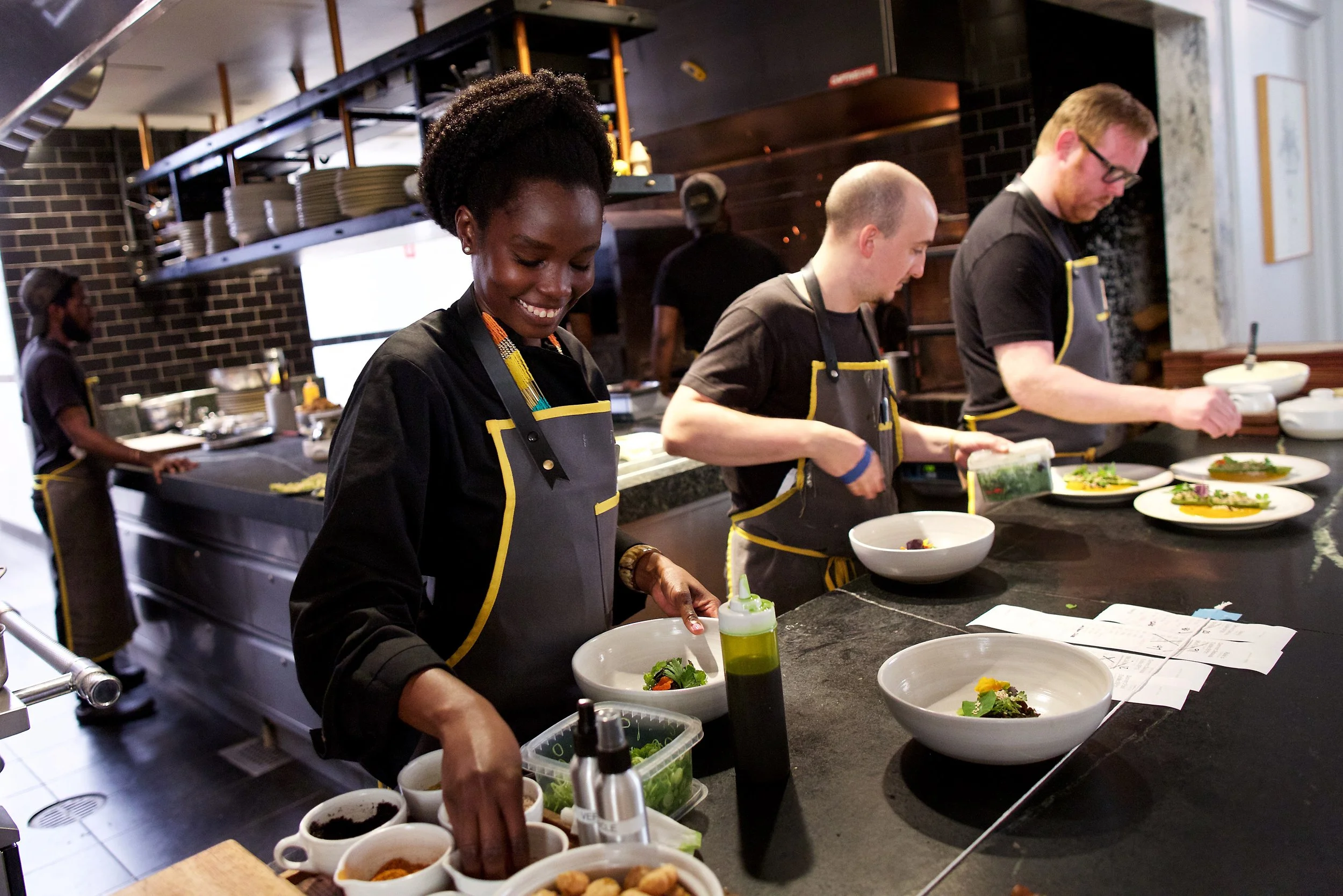
The event took place over six nights in June 2019 at some of D.C.’s most popular restaurants, where refugee chefs collaborated with head chefs to craft a menu representative of their home cuisine. A portion of the proceeds from each night, as well as the total donations raised, went to the refugee resettlement organization HIAS and participating refugee chefs.
The goal was to empower refugees with culinary experience, aid in the difficult resettlement process, and foster community through food.
My role was to communicate this powerful message by building a brand that confers respect, and designing a compelling digital and in-person donation experience.
The event was covered by the Washington Post, NPR, ABC News and NowThis, and raised more than $20,000 for refugees and asylum-seekers.
Target Audiences
I worked with the organizers of the event before they had secured any partners. So the brand was an important tool to appeal to these four different audiences chronologically, in unique ways during different stages of the project.
resettlement non-profits
participating refugee chefs
diners who
want to support refugees
restaurants
who want
to give back
What Each Audience Required
Initially, a degree of philanthropic legitimacy was required to forge partnerships with HIAS and local resettlement organizations connected with refugee chefs.
A cohesive brand presence also needed to be able to build trust and confidence with these chefs.
In addition, TWB needed to be vibrant and robust enough to solicit donations on its own, as well as sufficiently subtle and complementary to sit alongside the brand presence of partnering restaurants. As the first iteration of this event, it was necessary to rely on the brand equity of the more established restaurants to some extent, and highlight their participation in an exciting way.
However, we still needed to leverage every opportunity to differentiate the brand to the ethical diner, highlight the positive social impact, and distinguish the nights of this event from the regular DC dining scene.
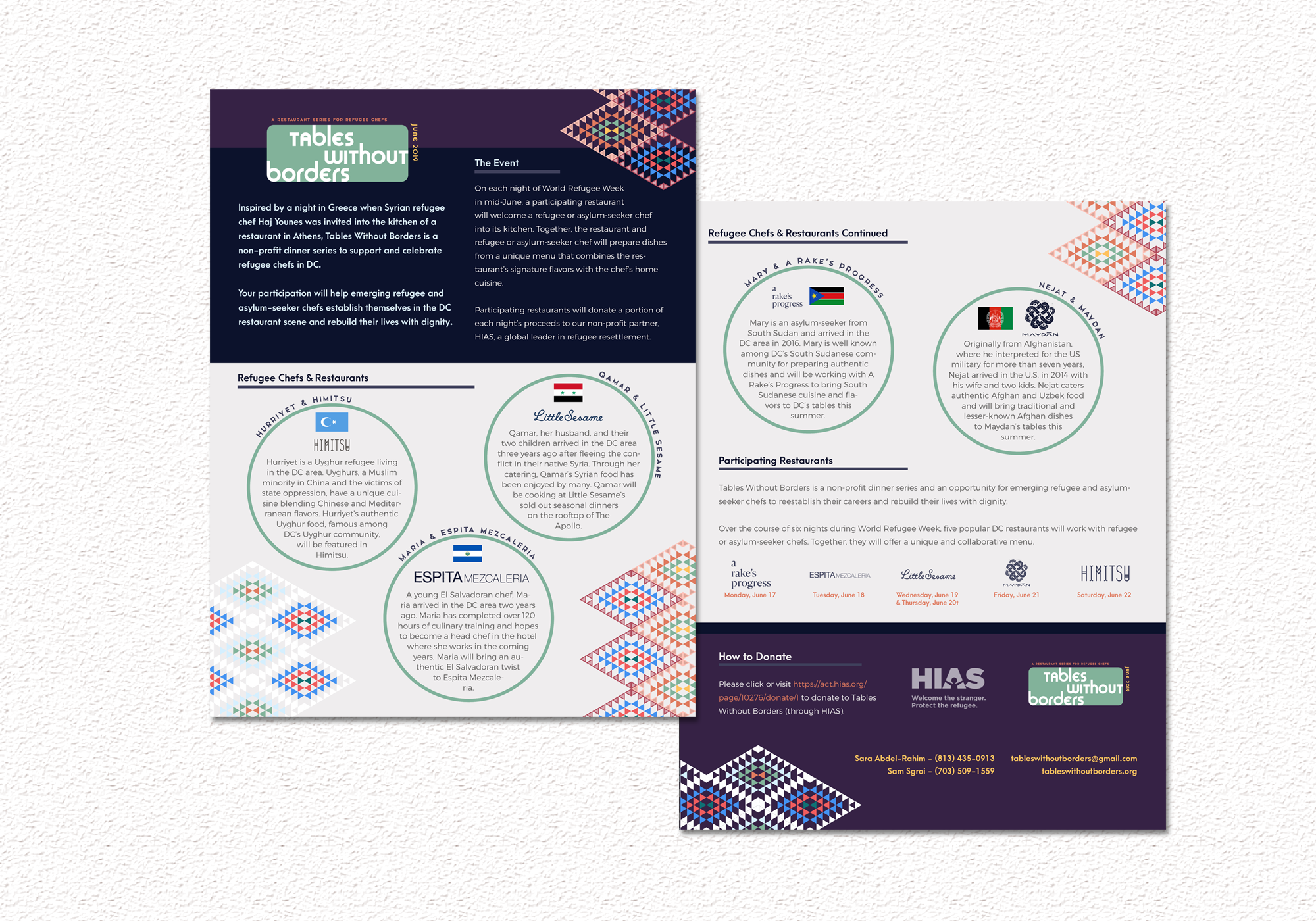
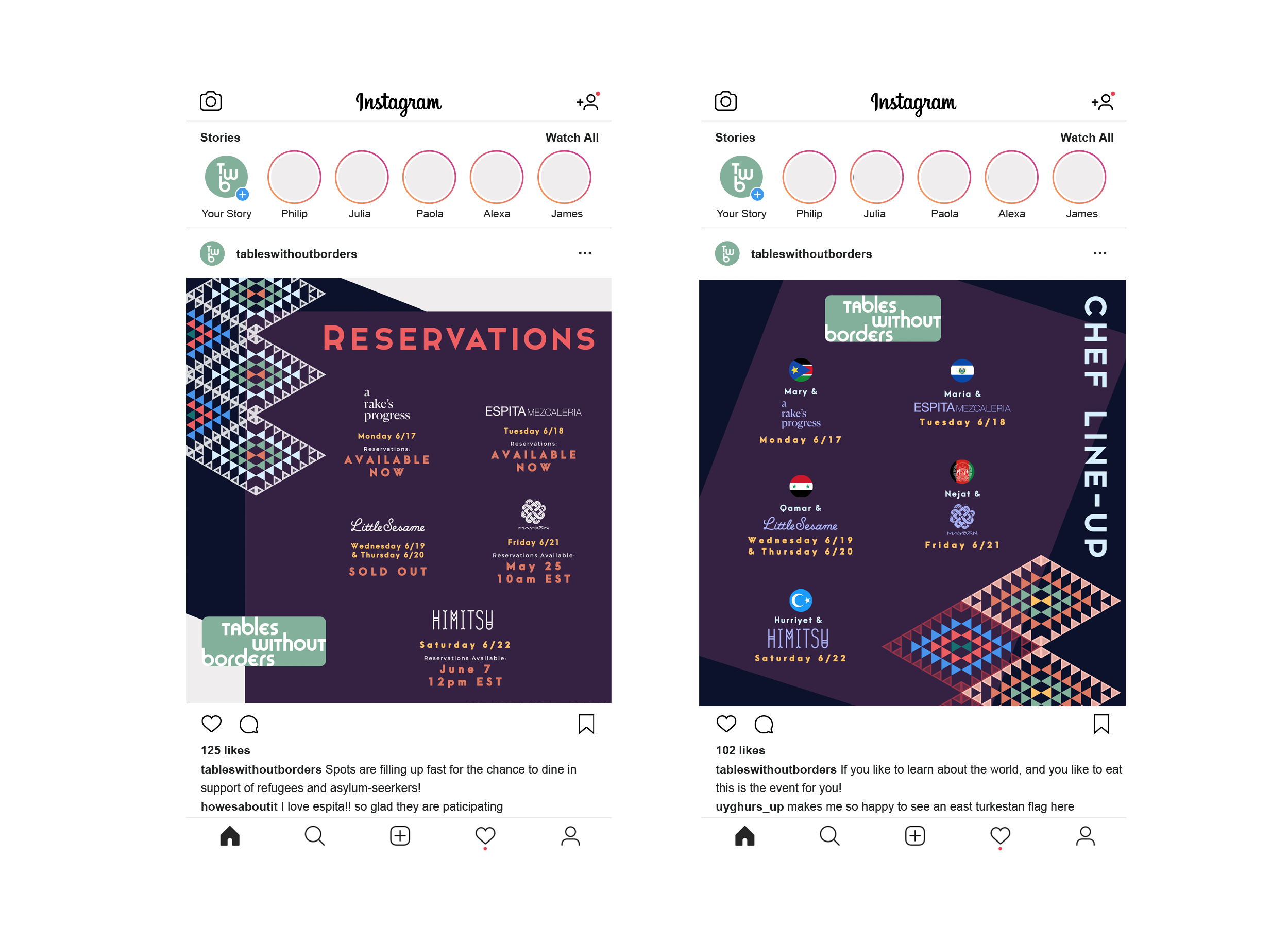
Above:An early flyer used with restaurants.
Right:An updated promotional asset after locations and chefs were confirmed.
Building the Brand:
Defining Values
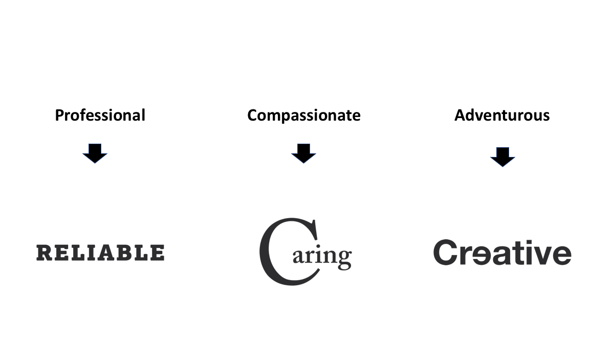
Using the rigid definition of values outlined by my Values to Visuals approach, I worked with the event organizers to choose three main values they wanted to convey:
Professional
Compassionate
Adventurous
Values to Visual Conventions
From there, I translated these ideas to visual concepts based on widely established design conventions: slab serifs are trustworthy, swooping lines and humanist serifs are soft and approachable.
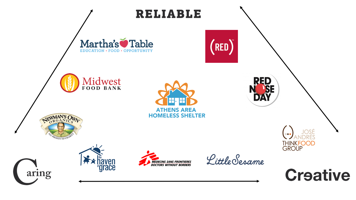
Visual Conventions & Industry Research
Next, I did research on logo marks in adjacent spaces that invoked these values, and plotted them across the brand values on a 3-point axis. I wanted whatever mark I made to be able to sit seamlessly alongside these logos.
I also made a particular effort to incorporate local businesses as reference points whenever possible, given that this was a local event with an express focus on the surrounding community.
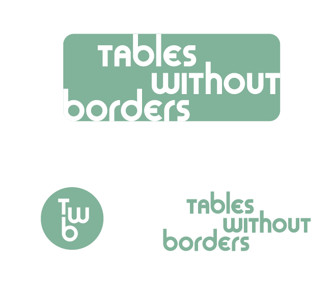
After exploring several different approaches, I presented the five options below.
The organizers and I narrowed it down to the two shown here.
Both logos also had a strong visual pun that built off the name nicely. In the end I opted, because I felt that it more accurately represented the brand’s values and the visual language I wanted to employ in service of those values.
Logo Reflections
While the hand-drawn option is compelling for the non-profit world, and becoming more and more prevalent in professional contexts, this approach was lacking in legibility in single color versions.
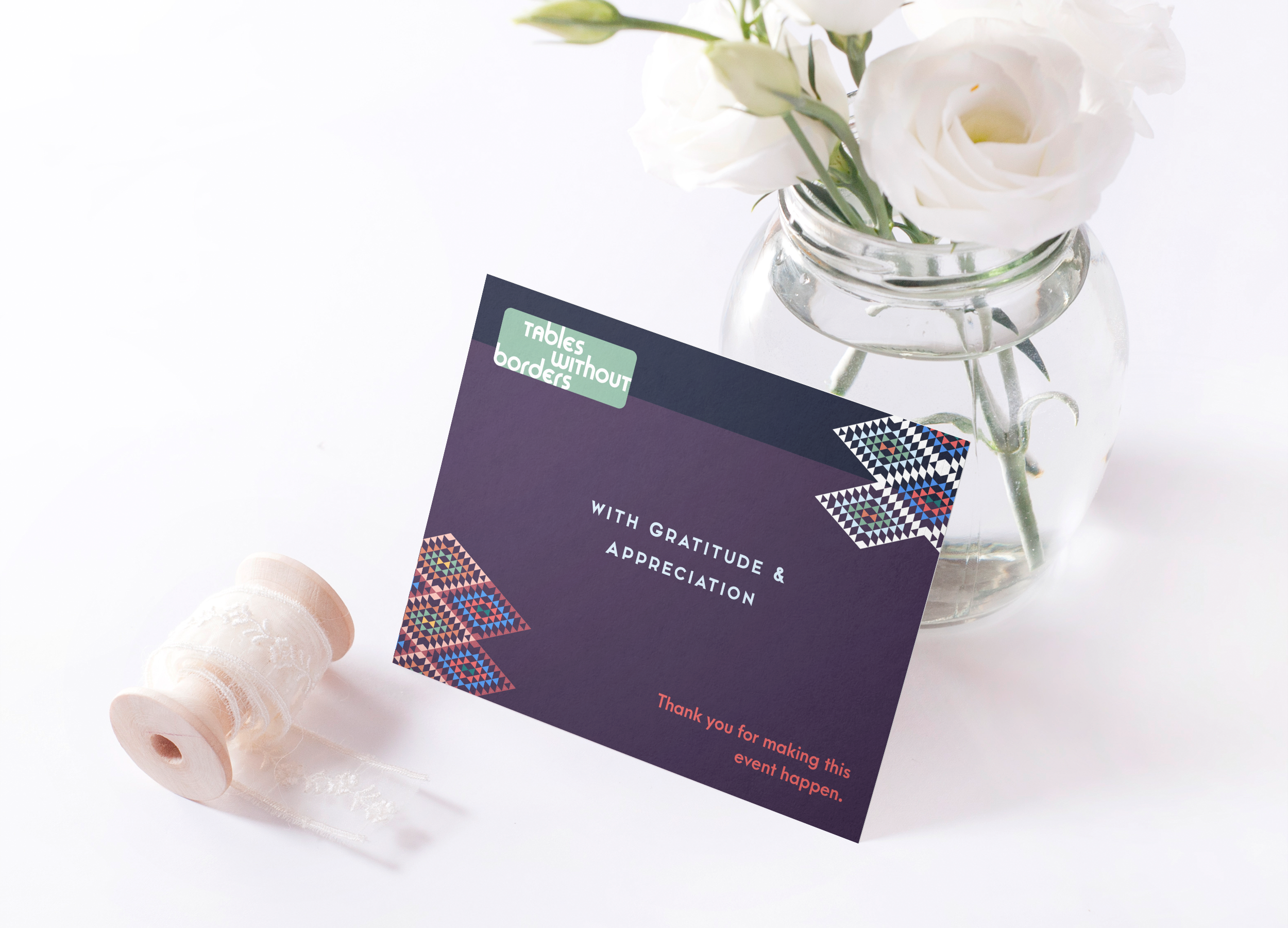
The final logo, shown in green, satisfied enough of the adventurous and compassionate characteristics through an eccentric typeface and visual representation of lacking borders. It’s also bolder, geometric and more conducive to a grid system.
Turning a Logo Into a Brand
The next step was to bring the logo to life with a flexible identity system capable of accommodating the wide variety of intended audiences. I was immediately drawn to the following ideas:
Using vibrant palettes to convey diversity and approachability
Using some kind of pattern that extended off the edges as a brand element, to reinforce the idea of transcending borders
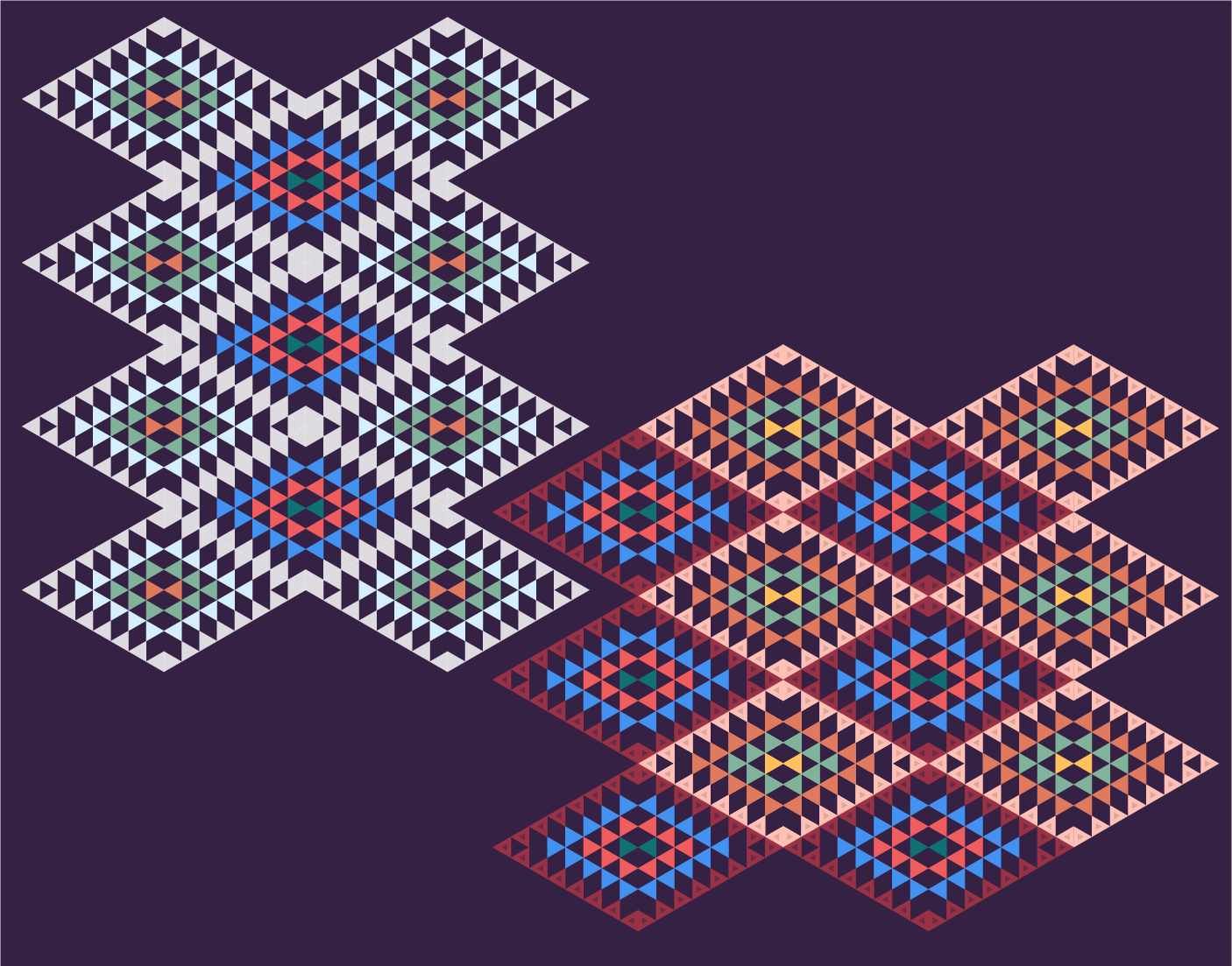
Recognizing that TWB was striving to work with chefs of all nationalities, I needed a pattern that was going to be culturally ambiguous but still representative of everyone involved. One thing that all refugees and asylum-seekers have in common is movement; they’ve all immigrated in search of community and a safer or better situation.
The simplest visual way to represent movement is a triangle. It’s a dynamic geometric shape that contrasts the rounded edges of the logo nicely. So I started there, building out triangle patterns, before choosing one that pointed triangles inwards towards each other, representing the unity and coming together facilitated by the event.
I experimented with warm, earthy color palettes before finding one that felt diverse, but still cohesive with the logo. The purple background was the final touch before moving to typography and building out a brand identity system.
At every point of the process, I tried to keep the core brand values central. In the name of balancing professionalism, compassion and adventure, I opted for a crisp, super legible sans-serif for headers, the workhorse Montserrat with reduced weight for the body copy, and a striking, eccentric display type for CTA’s.
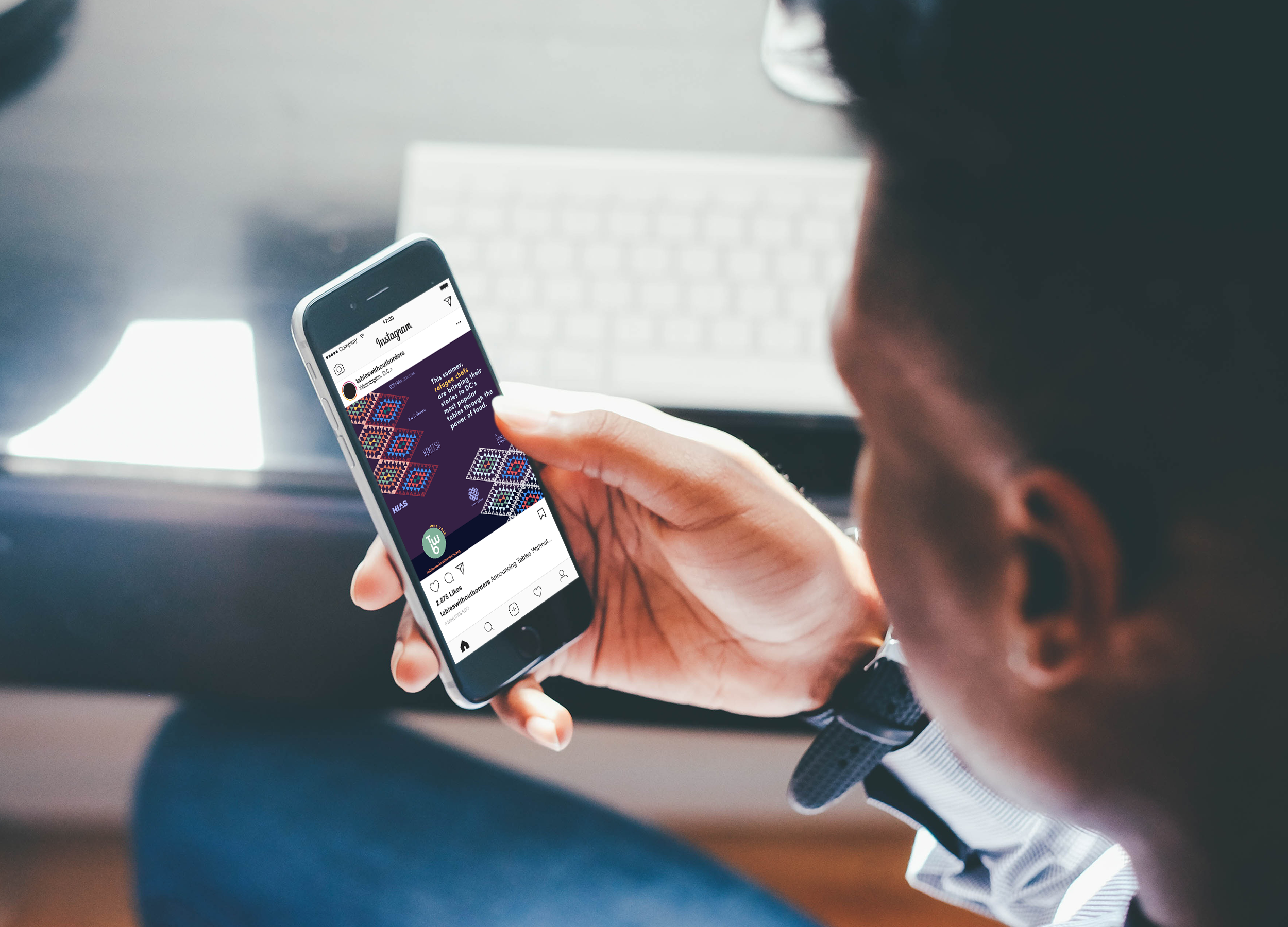
Building a Web Presence & Beyond
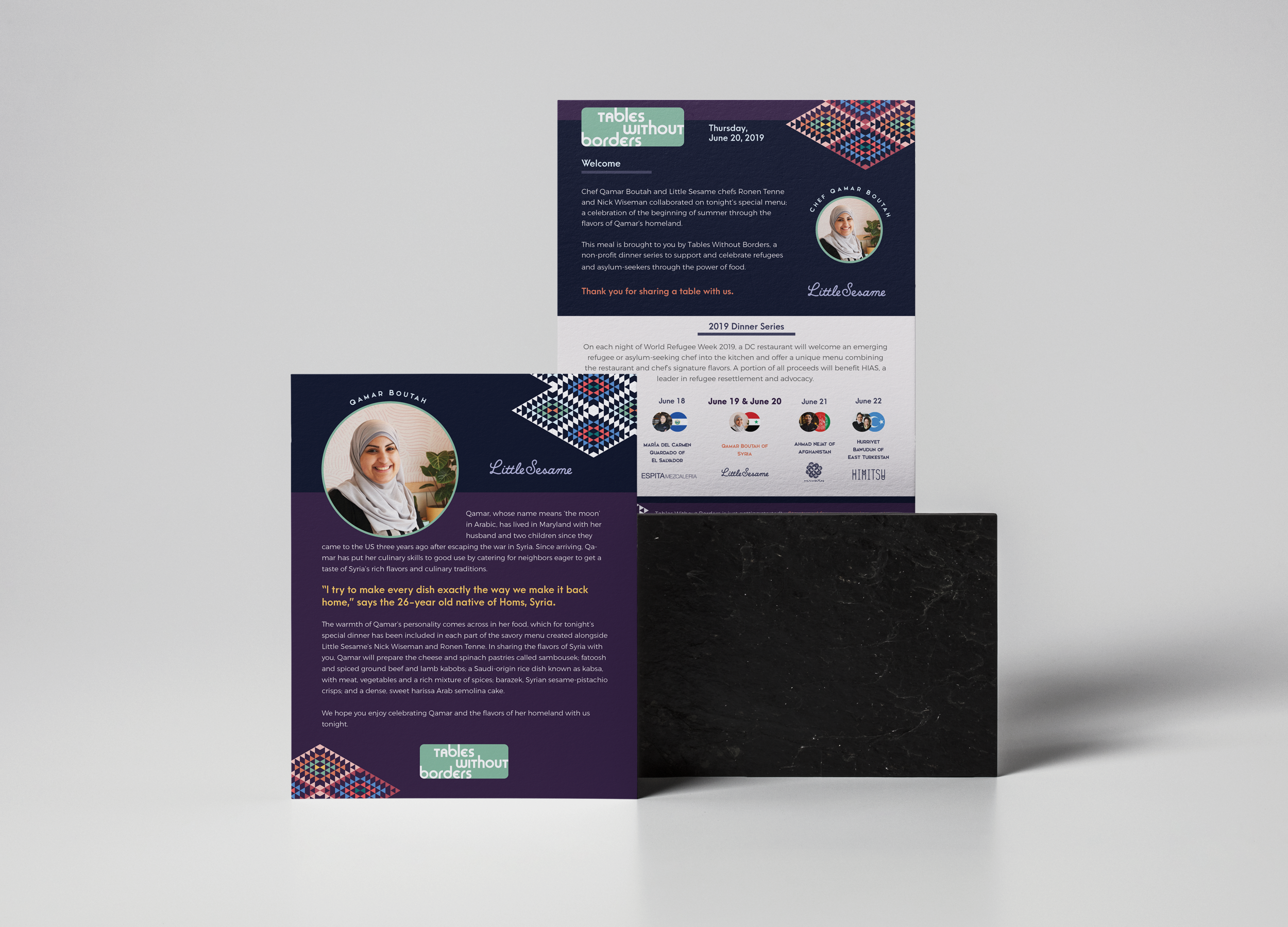
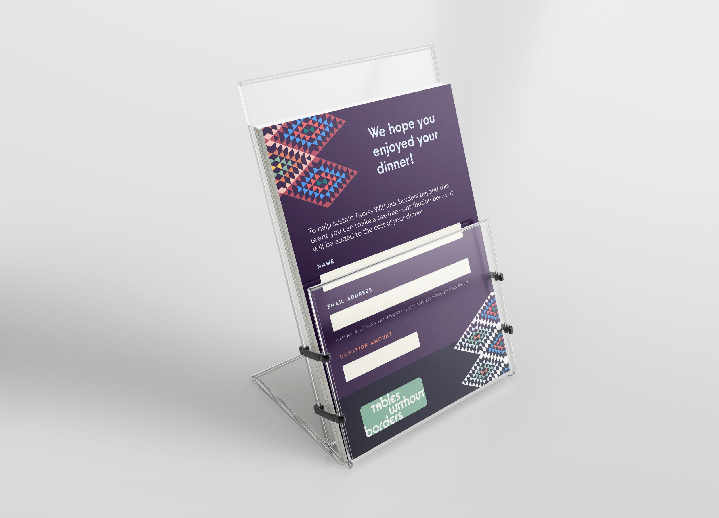
Once the brand system was finalized, it was time to apply it across a website and various digital and print promotional materials. The hosted dinners needed menu inserts, donation cards and table top FAQ cards.
When the site first launched, none of the event details or logistics had been finalized, and the targeted action of the site was to drive users to the HIAS-supported donor page.
As the event came together, further optimizations included a donation page to match the HIAS campaign (no longer live) and rotating highlights of the participating chefs.
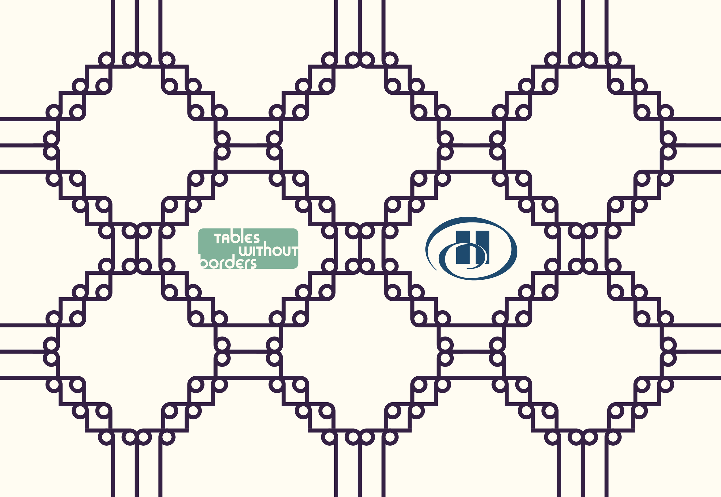
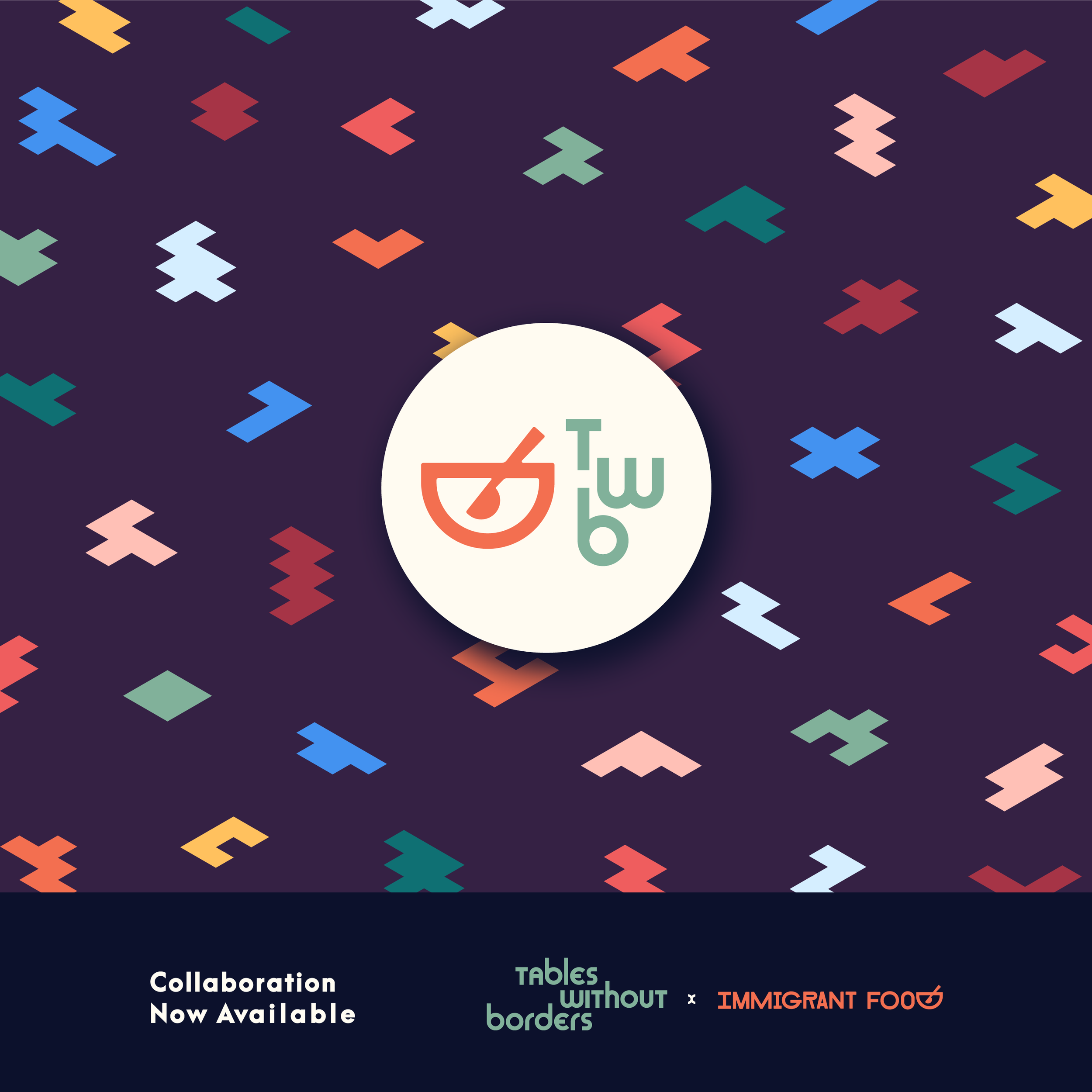
I continued to optimize the site and update the brand for further partnerships with Immigrant Food and Hilton.
I’d love to help you achieve similar results.
Feel free to get in touch even if you aren’t ready to get started with your project, but still have questions. A lot can be accomplished with just a conversation!